Here are my thoughts.
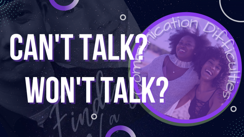
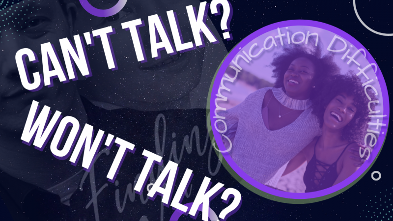
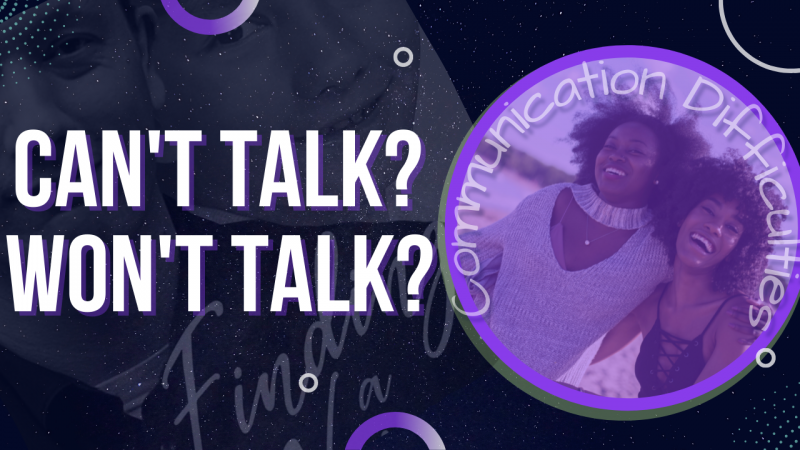
This is likely the best thumbnail of them all. But here's what I believe you should consider. The main text is too big. You shouldn't impede the way it looks if you want people to be able to see clearly what the thumbnail is saying. Shrinking the text enough to not fall on top of the circle will make the text more clear to read properly and doesn't cover the circle image that looks nice. Also, if you plan on having text on an image like the one inside the circle but are not concerned that it gets blocked because it's not the main text then why bother including it? Makes no sense if it doesn't matter if it's there.
My only other gripe is that you're covering the faces on the thumbnail. The first thumbnail on the first post had the green arrows literally covering the person's face. Not sure why anyone would put a person into an image only to cover them. This thumbnail is not as bad but the 2 images in the background have circles covering the faces making them harder to distinguish. Why? Should the faces not be seen? Is this on purpose? I'm not sure I understand. The faces in the circle can be seen but are obscured by the purple filter. I would think if you're using people's faces on purpose you would want them to be seen, not hidden behind objects, text or filters.
These are just my opinions. They may not be how others see them. It's your choice to consider them or not. Remember, this is your channel, your thumbnails, your choices.
View attachment 12156


