Last edited:
You are using an out of date browser. It may not display this or other websites correctly.
You should upgrade or use an alternative browser.
You should upgrade or use an alternative browser.
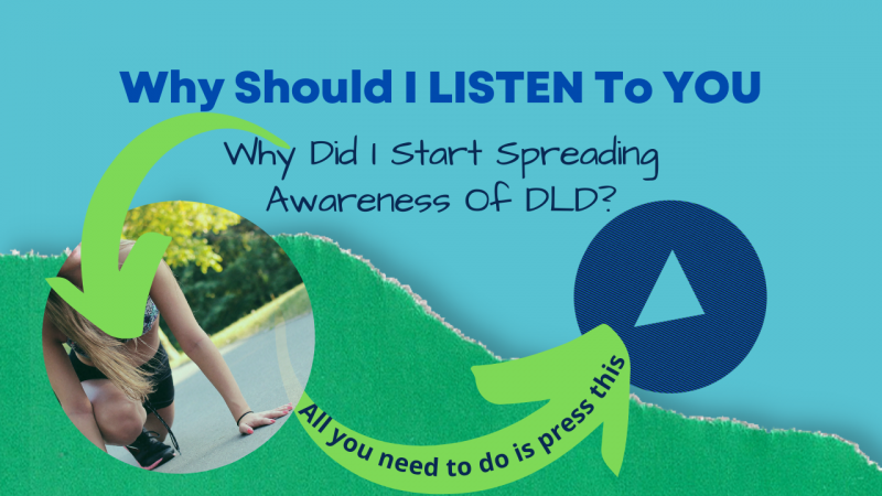
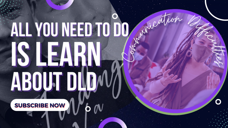
Thumbnail Feedback New design of Thumbnail...Awesome or terrible...I let you decide...?
- Thread starter Dysphasia PV
- Start date
The new thumbnail is so much better than your first attempt. I bet you can still develop this into a more eye-catching one.
Cheers!
Cheers!
The new thumbnail is so much better than your first attempt. I bet you can still develop this into a more eye-catching one.
Cheers!
What would you change about the new design if you were designing it?
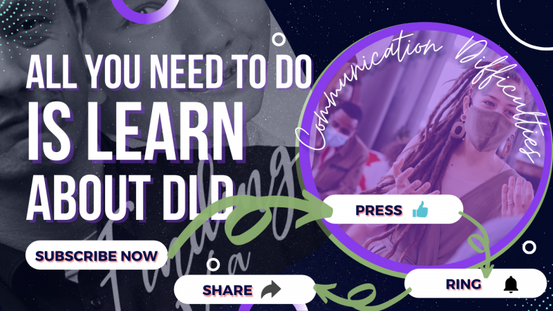
Readability is an issue. There are a LOT of elements going on at the same time. You may want to consider a simpler design without so many background elements. There is a lot of text to read also. People generally won't read every piece of text you have placed on the thumbnails. Most viewers will look at a thumbnail for 2 seconds at most.
Readability is an issue. There are a LOT of elements going on at the same time. You may want to consider a simpler design without so many background elements. There is a lot of text to read also. People generally won't read every piece of text you have placed on the thumbnails. Most viewers will look at a thumbnail for 2 seconds at most.
So would the original 'new design' be better than the one you replied to?
So would the original 'new design' be better than the one you replied to?
My comments were on your latest version with the 4 call to action buttons. Too many CTAs and too many elements make it busy to read.
Generally, your thumbnails are much more readable now than prior versions. At this point, it is all about refinement. It is a never-ending process.
1. Script fonts are generally unreadable if the message in the text is important to you.
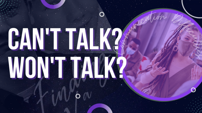
2. Generally, background images should support the theme or message of the thumbnail in some way. The images with face masks, I think about Covid19, not anything that has to do with communication inability.
As of your current design, your thumbnail emphasizes word messaging than any imagery messaging.
The stock foto with the girl wearing the mask is a picture about communication. She's talking to a group.
Generally, your thumbnails are much more readable now than prior versions. At this point, it is all about refinement. It is a never-ending process.
1. Script fonts are generally unreadable if the message in the text is important to you.
2. Generally, background images should support the theme or message of the thumbnail in some way. The images with face masks, I think about Covid19, not anything that has to do with communication inability.
As of your current design, your thumbnail emphasizes word messaging than any imagery messaging.
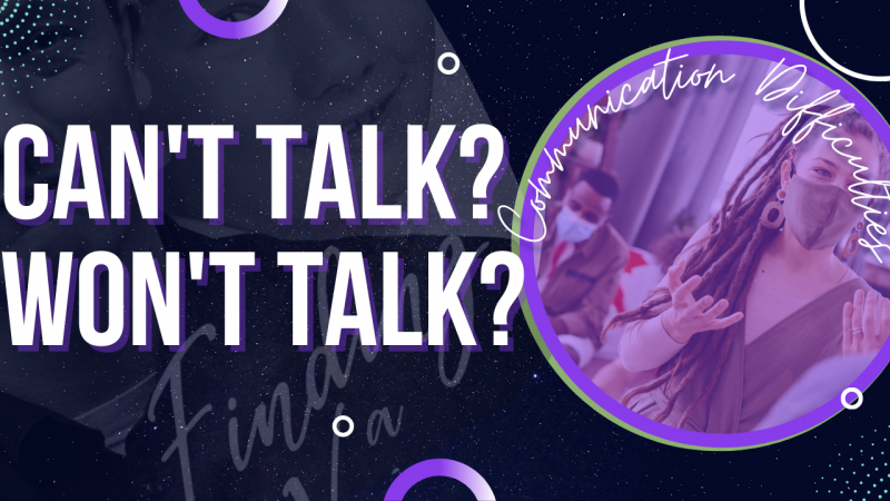
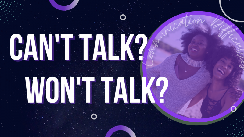
Here's the revised version:
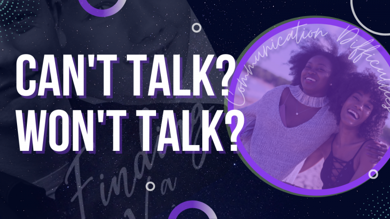
The "Communication Difficulties" text kind of blends into the circle too much. I would also not try to decipher it if I was passing through looking at thumbnails. I think you can just remove it entirely or change the font to be thicker and similar to the "can't talk" one without the drop shadow.
Maybe move the "CAN'T TALK? WON'T TALK?" higher and you can fit in "DLD Q's" or something with DLD so we know what this thumbnail is about.
Maybe move the "CAN'T TALK? WON'T TALK?" higher and you can fit in "DLD Q's" or something with DLD so we know what this thumbnail is about.
The "Communication Difficulties" text blends into the circle too much. I would also not try to decipher it if I passed through looking at thumbnails. I think you can remove it entirely or change the font to be thicker and similar to the "can't talk" one without the drop shadow.
Maybe move the "CAN'T TALK? WON'T TALK?" higher, and you can fit in "DLD Q's" or something with DLD, so we know what this thumbnail is about.
But, wouldn't it bring people in if they just see 'Can't talk? Won't talk?'. I don't want to give them too much info about what my video is all about.
I would suggest keeping the "Communication Difficulties" on there as from what I understand that is a description of what the video is actually about. However, if you squash that image down to the size of a YouTube thumbnail with the font being thin and a similar colour to the background it might be hard for some to read. Eyes will generally be attracted towards the bigger text as it takes no effort to see it, so the "Communication Difficulties" will likely be over-looked.But, wouldn't it bring people in if they just see 'Can't talk? Won't talk?'. I don't want to give them too much info about what my video is all about.
I would suggest keeping the "Communication Difficulties" on there as from what I understand that is a description of what the video is actually about. However, if you squash that image down to the size of a YouTube thumbnail with the font being thin and a similar colour to the background it might be hard for some to read. Eyes will generally be attracted towards the bigger text as it takes no effort to see it, so the "Communication Difficulties" will likely be over-looked.
Are you talking about the book cover image that I should shrink down??
I'm not suggesting you shrink anything down. What i'm saying is if you shrink that whole image down that you posted to a YouTube thumbnail size then with the font of "Communication Difficulties" being thin and a similar colour to the background it might be hard for some to read.Are you talking about the book cover image that I should shrink down??
No, I think you are misunderstanding what i'm saying.
If you squish the entire image down to a YouTube Thumbnail size, then this is how it will generally look.

That's a typical Thumbnail size, not a 1920 x 1080 or anything, the actual size of a YouTube thumbnail is approx 360x200 (when in Thumbnail form).
So now looking at that the "Communication Difficulties" is going to be hard for possibly a lot of people to read or even notice because the font is small, thin, and blends in with the colour behind it. People's eyes will be immediately be attracted to CAN'T TALK? WON'T TALK? because it stands out. So although the "Communication Difficulties" gives a description of what the video is about, there's not much point having it on there if it looks like that because many will likely not notice that text being there?
If you squish the entire image down to a YouTube Thumbnail size, then this is how it will generally look.
That's a typical Thumbnail size, not a 1920 x 1080 or anything, the actual size of a YouTube thumbnail is approx 360x200 (when in Thumbnail form).
So now looking at that the "Communication Difficulties" is going to be hard for possibly a lot of people to read or even notice because the font is small, thin, and blends in with the colour behind it. People's eyes will be immediately be attracted to CAN'T TALK? WON'T TALK? because it stands out. So although the "Communication Difficulties" gives a description of what the video is about, there's not much point having it on there if it looks like that because many will likely not notice that text being there?
No, I think you are misunderstanding what i'm saying.
If you squish the entire image down to a YouTube Thumbnail size, then this is how it will generally look.
View attachment 12149
That's a typical Thumbnail size, not a 1920 x 1080 or anything, the actual size of a YouTube thumbnail is approx 360x200 (when in Thumbnail form).
So now looking at that the "Communication Difficulties" is going to be hard for possibly a lot of people to read or even notice because the font is small, thin, and blends in with the colour behind it. People's eyes will be immediately be attracted to CAN'T TALK? WON'T TALK? because it stands out. So although the "Communication Difficulties" gives a description of what the video is about, there's not much point having it on there if it looks like that because many will likely not notice that text being there?
Tbh, the recommended size for a thumbnail is 1280 x 720 (as given by YouTube themselves: https://support.google.com/youtube/answer/72431?hl=en#zippy=,image-size-resolution)

