You are using an out of date browser. It may not display this or other websites correctly.
You should upgrade or use an alternative browser.
You should upgrade or use an alternative browser.
Thumbnail Feedback Thumbnail with Face or not?
- Thread starter Mario So
- Start date
To be honest, your first and last thumbnail options there grab my attention the most. I don't usually care about faces in thumbnails personally, but others might. Do you have enough data on the differant styles of thumbs and what kind of CTR you're getting on them to establish the data of what the audience prefer?
Thanks for the feedback. I don't have enough data on the different thumbs yet unfortunately. I have heard that some people like faces and others don't so just trying to get a sense of what people think.To be honest, your first and last thumbnail options there grab my attention the most. I don't usually care about faces in thumbnails personally, but others might. Do you have enough data on the differant styles of thumbs and what kind of CTR you're getting on them to establish the data of what the audience prefer?
Thanks for the feedback. I don't have enough data on the different thumbs yet unfortunately. I have heard that some people like faces and others don't so just trying to get a sense of what people think.
On average people tend to connect with humans more! HOWEVER, it's different per audience. For example at TubeBuddy when we didn't have a human in the thumbnails it felt artificial, and not relate-able, add me in and more relatable. For tech/ film-making a bit of both is key. I find show casing the product can work, but it all depends how well the shot is. I'd keep testing and see which your audience and new viewers are reacting to the most! Similar to what Beanie said.
Thanks for the feedback Andrew! That is what I'm seeing across the board for tech and filmmaking: a balance of epic product shots and some personality in faces.On average people tend to connect with humans more! HOWEVER, it's different per audience. For example at TubeBuddy when we didn't have a human in the thumbnails it felt artificial, and not relate-able, add me in and more relatable. For tech/ film-making a bit of both is key. I find show casing the product can work, but it all depends how well the shot is. I'd keep testing and see which your audience and new viewers are reacting to the most! Similar to what Beanie said.
I'll work on that and test!
The 2 thumbnails you have your face in are not great thumbnails for being eye catching the other 2 thumbnails you worked harder on, maybe add your face over them images and see what you think? I try and spend more time with thumbnails now make sure its the BEST i can make. Ensure the background image behind my face reflects the video or i interact with the object in the behind image.
Don't forget the "BYOG" rule. Blue, Yellow, Orange, Green. A colorful thumbnail will pop out more.
The 2 thumbnails you have your face in are not great thumbnails for being eye catching the other 2 thumbnails you worked harder on, maybe add your face over them images and see what you think? I try and spend more time with thumbnails now make sure its the BEST i can make. Ensure the background image behind my face reflects the video or i interact with the object in the behind image.
I think this is a fair bit of feedback, I felt the face ones didn't have as much planning as the others. Doesn't mean that's true, but it is how it looks to me.
Thanks for the feedback! Yes sometimes when I'm done filming a video I forget to take a good quality still for the thumbnail. Need to work the thumbnail into the overall work flow.The 2 thumbnails you have your face in are not great thumbnails for being eye catching the other 2 thumbnails you worked harder on, maybe add your face over them images and see what you think? I try and spend more time with thumbnails now make sure its the BEST i can make. Ensure the background image behind my face reflects the video or i interact with the object in the behind image.
Yes I definitely need to spend more time on planning the thumbnails too.I think this is a fair bit of feedback, I felt the face ones didn't have as much planning as the others. Doesn't mean that's true, but it is how it looks to me.
Yes I definitely need to spend more time on planning the thumbnails too.
I'm guilty of it too... haha however, I'm working on getting better! That's all anyone can do
That's right! Always room to do better.I'm guilty of it too... haha however, I'm working on getting better! That's all anyone can do
hey,
IMO If you're promoting your brand, then your face is the strongest identity. That's what people will remember over anything else. putting your face in thumbnails would mean people will know it's your content so will result in higher CTR.
I myself haven't got around to do that but it will be added bonus.
True, but I do like some of the other thumbnails w/o your face on it. If you want to keep those thumbnails (w/o faces), I'd recommend creating a logo and/or border that'll tell people that it is a video from your channel.IMO If you're promoting your brand, then your face is the strongest identity.
Also, for the thumbnails with your in it, I notice the white spots above your hair. I used to have an issue with that as well (I would wear a hat to alleviate that problem actually lol). Down below is a tutorial on how to get the fine detail of hair, but leave out the background.
Last edited:
Thanks for the feedback. Yeah that's what I thought about as well. I think I'll have to test it more and see what works best for my channel.hey,
IMO If you're promoting your brand, then your face is the strongest identity. That's what people will remember over anything else. putting your face in thumbnails would mean people will know it's your content so will result in higher CTR.
I myself haven't got around to do that but it will be added bonus.
The idea about the border for the thumbnails without faces is brilliant! And thanks for that tutorial! It'll come in very handy!True, but I do like some of the other thumbnails w/o your face on it. If you want to keep those thumbnails (w/o faces), I'd recommend creating a logo and/or border that'll tell people that it is a video from your channel.
Also, for the thumbnails with your in it, I notice the white spots above your hair. I used to have an issue with that as well (I would wear a hat to alleviate that problem actually lol). Down below is a tutorial on how to get the fine detail of hair, but leave out the background.
View: https://www.youtube.com/watch?v=T4gRSHwvWmA
Hi tubebudy friends,
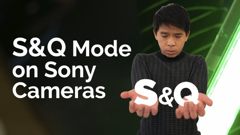
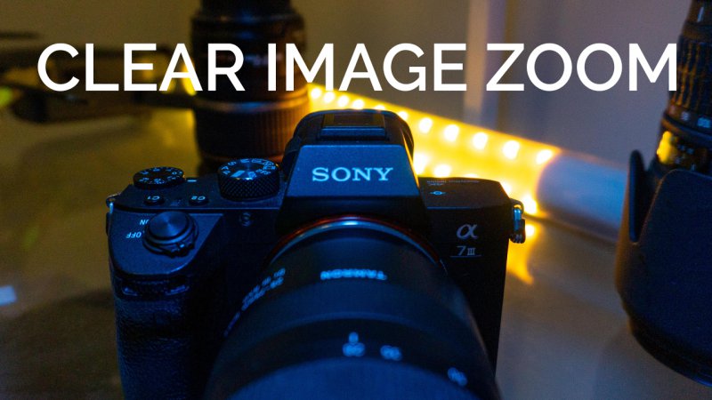
I have been trying to experiment thumbnails without my face versus those with a shocked, funny, weird, face on them. But being a small channel I'm still having trouble figuring out which way works best for my channel. Any thoughts?
View attachment 4328
View attachment 4330
View attachment 4331
View attachment 4332
I've always heard that thumbnails with faces get more clicks but I'm trying to figure this one out too, it seems different for so many people so I am also a bit confused.
Thumbnail 1,2,&3 definitely got my attention tho. Good luck!!!
Thanks for the feedback! Yeah trying to figure out what works best. Good luck to you as well!I've always heard that thumbnails with faces get more clicks but I'm trying to figure this one out too, it seems different for so many people so I am also a bit confused.
Thumbnail 1,2,&3 definitely got my attention tho. Good luck!!!
I've always heard that thumbnails with faces get more clicks but I'm trying to figure this one out too, it seems different for so many people so I am also a bit confused.
Thumbnail 1,2,&3 definitely got my attention tho. Good luck!!!
On average they get more compared to those without them. This does depend the audience. If you're a smaller channel with not that large of a following, products, or what you're talking about might do better. Once you hit a level your face is SO powerful in branding. That level is dependent on your audience. HOWEVER, in GENERAL thumbnails with faces tend to do better.
What if you did a thumbnail where one half didnΓÇÖt show your face and the other did?Thanks for the feedback. I don't have enough data on the different thumbs yet unfortunately. I have heard that some people like faces and others don't so just trying to get a sense of what people think.


