• Guest - Earn a FREE TubeBuddy Upgrade for being active on the forums! Click Here to learn how you earn free upgrades for TubeBuddy!
  • Guest - TubeBuddy has a discord! Click Here to join in the conversation!

Thumbnail Feedback How do you decide on which Thumbnail template to use?

rosab

New Member
TubeBuddy Pro
6
5
My question here will be: How do you make them consistent? I read somewhere that you should keep colours, text the same. How do you decide on a template then?
I cannot seem to find anything that is consistent with my channel or to keep the thumbnails more or less the same. If I look at the tubebuddy thumbnails, they tend to follow a theme: Tubebuddy.png
Any advice will be appreciated.
 
  • Like
Reactions: anggitoga81

Stanley | Team TB

Amazingly Decent and Not-At-All Terrible Fishing
Administrator
TubeBuddy Staff
2,644
25
Subscriber Goal
250000
I don't really aim for consistency... there is some value in it but nowhere near as much value as making that thumbnail stand alone as the single greatest thing that stands out against all the rest of the thumbnails it is shown against when people are looking for videos to watch. Consistency has far less value than this. Who cares if they look different?
 

bbogue1

New Member
2
2
I'm a novice beginner. Joey775's advice is pretty well founded in the marketing community. They are proven to work when you produce an product and encourage your target audience to shop for your brand repeatedly. Here is my question: How is thumbnail produced?
 

GrooveOn

Familiar Member
55
7
I don't use any templates its easy to create a catchy thumbnail, do not over think it and remember that is only small in size so don't make it too busy.
Here's what I do:
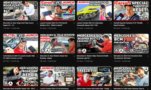
Whilst making your video, think of why you are making it, what are you doing that is different from the rest. I then play my finished video and look for a good point where there is something catchy or interesting that a viewer would be intrigued. Take a screen shot and use that as your main image, you can overlay other images if needed. Then the other important point is your text, keep it clear a good size and avoid too many words. Depending on your channel content, if its a 'how to channel' use captions like 'Did you know this secret tip', 'I cant believe this worked' , 'Use this method' etc you get the idea. I just use my previous thumbnail for my next video and keep the same font and style. Have an image that people recognise too, this could be yourself, or Logo etc
 

Attachments

  • Screenshot 2024-09-06 111214.png
    Screenshot 2024-09-06 111214.png
    1.5 MB · Views: 15