• Guest - TubeBuddy has a discord! Click Here to join in the conversation!

Thumbnail Feedback Which one would stop your scrolling?

Small Raven

New Member
TubeBuddy Pro
5
6
Subscriber Goal
100
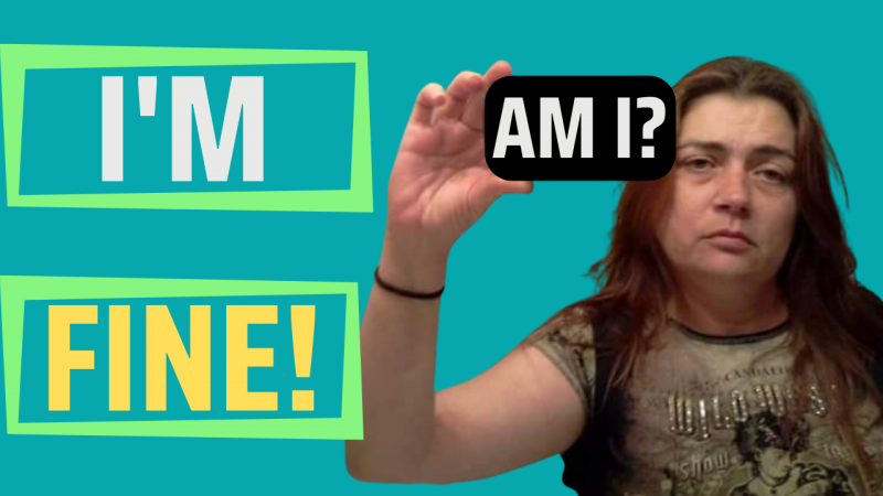
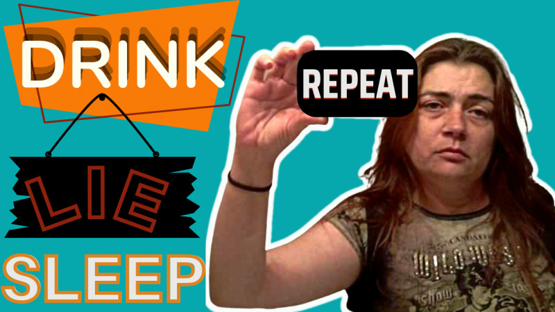
Good morning everyone! I'm new to creating content and everything that that entails. I was wondering which thumbnail would cause you to stop scrolling, click on it, and why. I appreciate you taking the time to evaluate and leave your feedback. Thank you in advance!
 

Attachments

  • I'M FINE! VID 3.png
    I'M FINE! VID 3.png
    394.6 KB · Views: 133
  • DRINK, LIE, SLEEP VID 3.png
    DRINK, LIE, SLEEP VID 3.png
    627.2 KB · Views: 135

TCC learncanva4yt

Known Member
TubeBuddy Star
100
11
Subscriber Goal
2500
Honestly I can't tell what the middle word on Drink, Lie, Sleep so the one with I'm Fine - is easier to read, but it wouldn't stop by scroll. One piece of advice I received early on was to search videos like I was creating to get an idea of what the most popular viewed videos were in that topic. I'm assuming that your video is potentially about depression or chronic illness, but there isn't anything there that makes me want to click. I like the outline on you on the right. I'd do some work on the text alignment and potentially skip the boxes around each word. You might consider simply changing the one on the right - to the same words, but use a big bold font withou whatever is going on behind them so it's easier to read - and all one color with a text effect. Hope that helps.
 

Combat Chicken

New Member
8
2
Honestly, I would not, for a bunch of different reasons. In the first one there's different colors and frames you put the text in which makes it looks like it doesn't belong together. The second one starts with "Drink" which may be a trigger to some people and straight up offputting to others. However, I do like the white outline you did on yourself in the second thumbnail. It also doesn't bother that the pictures are more pixelated because of the size of the thumbnail.
 

Wilson IS

Familiar Member
53
5
Subscriber Goal
100.000
Vou julgar pelo que vejo na miniatura.
A pessoa da foto tem uma expressão muito pra baixo cada expressão me dá desânimo eu com certeza não clicaria em nenhuma
O design da segunda miniatura é mais chamativo, mas parece que a ênfase está na bebida, pois é a palavra que mais se destaca. deitado quase não aparece e dormindo bem, branco com contorno laranja acho que não combina muito bem.
 

Wilson IS

Familiar Member
53
5
Subscriber Goal
100.000
Honestamente... seu rosto parece muito deprimido/triste, então não há como eu clicar nele. Minha mente subliminarmente seguiria em frente.

Talvez um rosto feliz à esquerda (estou bem!) e depois um rosto triste à direita (estou?)
[/CITAR]
a miniatura não é minha mas achei muito boa sua ideia