• Guest - Earn a FREE TubeBuddy Upgrade for being active on the forums! Click Here to learn how you earn free upgrades for TubeBuddy!
  • Guest - TubeBuddy has a discord! Click Here to join in the conversation!

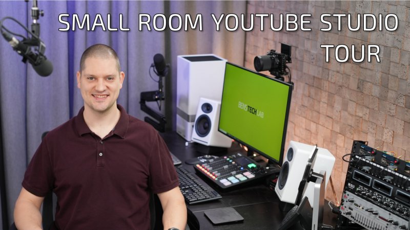
Thumbnail Feedback Choose 1 of 3 Thumbnails: YouTube Studio Tour

BensTechLab

Known Member
TubeBuddy User
113
12
www.benstechlab.com
Subscriber Goal
1000
I'm still not that good at thumbnails... and sometimes I forget to always take a dedicated high res photo for thumbnail use!

My studio tour video will drop in the next couple days (editing is done), and I'm struggling with the thumbnail design before I publish.

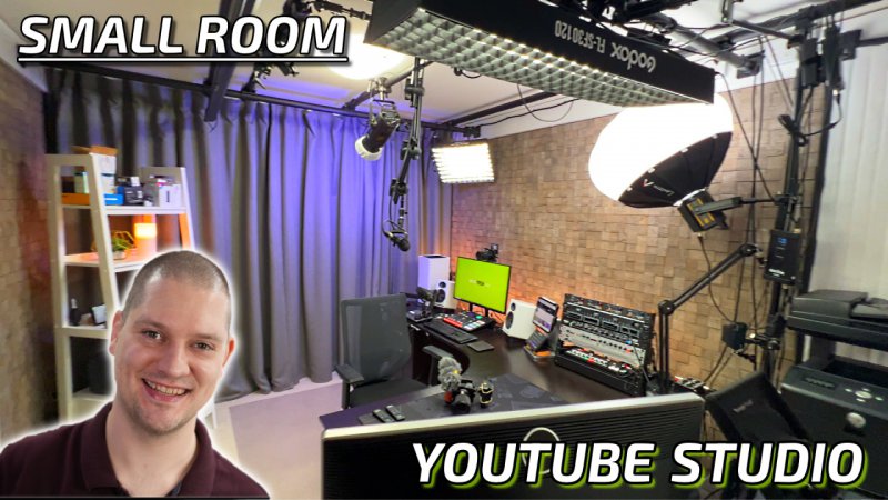
I think the first option is the most attractive for "gear nerds", but it's also lower quality as this is a frame from the video rather than a dedicated photo. It has a little bit of motion blur or soft focus.

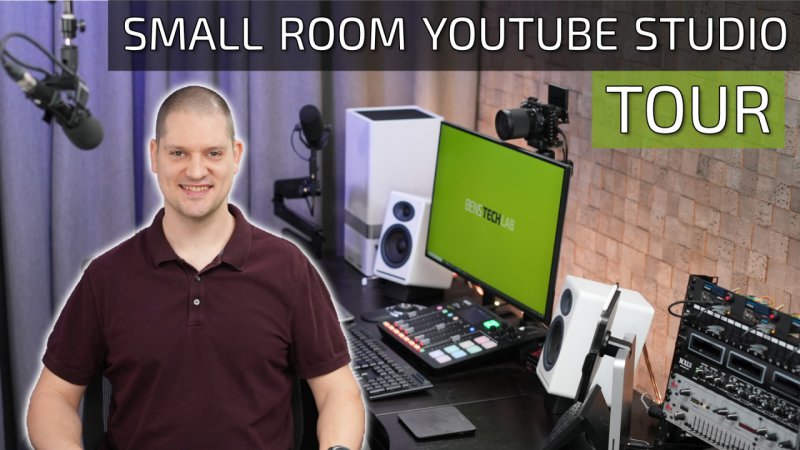
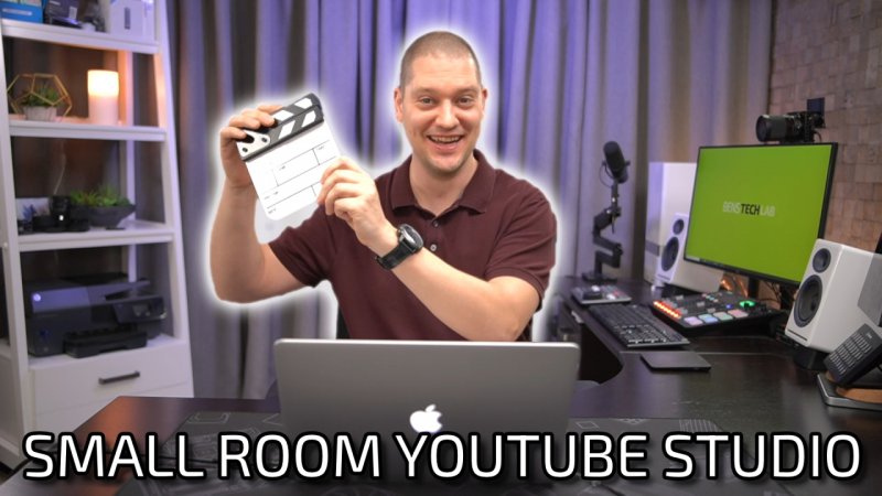
The second and third options are from a dedicated higher quality photo rather than video frame, so they are a nicer quality image, but maybe doesn't show the full scope of the studio.

I would love your comments, suggestions or feedback!!

Option 1:
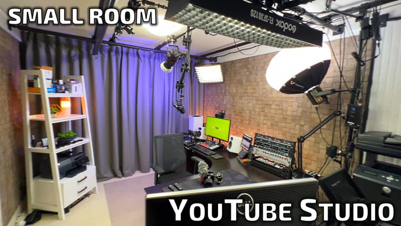
BensTechLab Studio Tour Option 1.jpg

Option 2:
BensTechLab Studio Tour Option 2.jpg

Option 3:
BensTechLab Studio Tour Option 3.jpg

P.S. I can't take a new photo anymore as I've actually completely replaced my black desk! This was a goal of mine for sometime, so get a desktop that has a bit more character on video than plain black.
 
  • Like
Reactions: Chaotic_Sloth

MattCommand1

On sabbatical
TubeBuddy Pro
Trusted User
1,020
25
Subscriber Goal
5000
Geez! What a setup you got in that room! I am so jealous! However, some of the equipment is beyond my technical abilities! LOL! Is this in your home or in your office?
 
  • Like
Reactions: The Jungle Explorer
OP
OP
BensTechLab

BensTechLab

Known Member
TubeBuddy User
113
12
www.benstechlab.com
Subscriber Goal
1000
Geez! What a setup you got in that room! I am so jealous! However, some of the equipment is beyond my technical abilities! LOL! Is this in your home or in your office?
Yes sir, home office! And yah it didn't start this way... but you slowly collect one more light, one more camera, etc. My first videos I had 2 cameras, 2 lights, 1 mic.

Any thoughts on the thumbnail choices? Both good? One better than the other if you saw it on YT?
 

The Jungle Explorer

I should have been born 200 years ago!
TubeBuddy Pro
549
19
thejungleexplorer.com
Subscriber Goal
20000
Here is me feeling the same jealousy Matt is. ;) Nice Studio! Makes mine look like a dump. Wait! Mine IS a DUMP! :joy:

As far as thumbnails go, honestly. I do not like any of them. They are too busy and not clear on what the video is about. At least to me. I am not gonna say that I am the best at thumbnails by a long shot, but what I am learning more and more is, simply is better. In fact, I was up most of the night studying this very subject and I was looking at channels that had videos with 100K views in the last week and their thumbs were simply white backgrounds with bold black text.
 
  • Like
Reactions: BensTechLab

Yours Truly

Familiar Member
TubeBuddy Pro
64
10
Subscriber Goal
1000
I like either 1 or 3. #1 shows the full room, which really showcases "small studio." It shows an overview of everything that you have. #3 though I also like because it looks personal because there is a photo of you (I'm assuming) on it. It also doesn't give away too much of the room. I personally have to say I like #3.....but #1 is really good too.......
 
  • Like
Reactions: BensTechLab
OP
OP
BensTechLab

BensTechLab

Known Member
TubeBuddy User
113
12
www.benstechlab.com
Subscriber Goal
1000
Here is me feeling the same jealousy Matt is. ;) Nice Studio! Makes mine look like a dump. Wait! Mine IS a DUMP! :joy:

As far as thumbnails go, honestly. I do not like any of them. They are too busy and not clear on what the video is about. At least to me. I am not gonna say that I am the best at thumbnails by a long shot, but what I am learning more and more is, simply is better. In fact, I was up most of the night studying this very subject and I was looking at channels that had videos with 100K views in the last week and their thumbs were simply white backgrounds with bold black text.
I do understand this... I think for most of my thumbnails for product reviews it should be WAY simpler with just one focus. But I think this one video is a bit unique compared to most and might merit some more detail. At least that what I'm gonna do to start! We'll see how it performs.
 
OP
OP
BensTechLab

BensTechLab

Known Member
TubeBuddy User
113
12
www.benstechlab.com
Subscriber Goal
1000
Ok here's two more options based on community feedback!! Let me know if either of these are better than all of the above.

One option adding my face onto the thumbnail to make it more personal. And another option that just really de-clutters (but doesn't show the "behind the scenes" look, but rather the "A-Camera shot" look).

Adding Face:
Option 8.jpg


Decluttered "A-Cam Shot":
Option 10.jpg
 
OP
OP
BensTechLab

BensTechLab

Known Member
TubeBuddy User
113
12
www.benstechlab.com
Subscriber Goal
1000
For those following this thread, the 3rd thumbnail produced a 3.2% CTR which is "ok", but not great. I think it was "prettier" than some other thumbnails but maybe doesn't communicate what the video is about in a glance.

Therefor today I changed the thumbnail on my YouTube Studio Tour video to see if the CTR will increase. It's an experiment! Let's learn what works!

If anyone is interested in truly studying and learning... here's my thumbnail CTRs to date:
BensTechLab Thumbnail Analysis.jpg


P.S. The top 9 thumbnails above were all created in PowerPoint with an unedited photo because I had no skills! Hopefully that is encouraging to some people just starting out... sometimes you just use what you've got. However, I have since purchased Affinity Photo and am learning more thumbnail editing skills.