• Guest - Earn a FREE TubeBuddy Upgrade for being active on the forums! Click Here to learn how you earn free upgrades for TubeBuddy!
  • Guest - TubeBuddy has a discord! Click Here to join in the conversation!

YouTube Opinion Is it just me, or do Click Bait thumbnails make everyone angry?

Damon

Trusted User
Trusted User
2,779
25
Subscriber Goal
10000
I believe deception is wrong. I read your point about how it is impossible to fit a more descriptive title on a thumbnail and that the forced confines of the thumbnail to necessitate the need for a very short title. It is a completely valid argument. Unfortunately, it in no way makes a valid excuse to use clickbait thumbs. It seems to me that you are attempting to make the argument that it has to be Clickbatish because it is too difficult to do anything else on a thumbnail. It is a very strong argument that I think a lot of people will agree with, Maybe everyone else on here will agree with it. But in my book, wrong is wrong, and there is never a valid excuse or reason to do wrong. In my book, deception is wrong.

My question is, was how would you approach the thumbnail? It's one thing to say "wrong is wrong," it's another to provide an actual solution to the problem. You have defined the problem very well, as is your custom. Can you move beyond stating the problem and actually provide a solution?

Again I was simply playing Devil's advocate, not trying to be the Devil himself. As I mentioned this above thumbnail is not my kind of thumbnail. I don't and won't use that kind of thumbnail, but what is the solution? How do you make a thumbnail that is attractive and honorable?

In other words telling someone something is wrong, then not providing an example of what is right isn't helping at all.

I often find that asking a question naturally leads people to a thought process. In other words my thumbnail would have been something like "More Views 2022?," probably with a picture of me shrugging my shoulder because the truth is I don't know what will happen in 2022. It also provides a way to make ongoing content on the subject throughout the year as to provide real data on any claim or assertions made. Then for 2023, I can site data from 2022 and try to make a prediction based on past data. Thus for 2023 adding a graphic about the growth or decline.

You are correct in that wrong is wrong, but as the Good Book says you gotta give people a way out otherwise they'll just perish.

Man, I miss Andrew. I really liked him. We got along so well. I did not realize that his leaving was a result of the sellout. I knew things felt different around here. Now I know why. Thanks for the info.

I never meant to construe that Andrew left as a result of the buy-out. Andrew left of his own volition. However, chronologically he did leave after TB was sold by about a year or two as I can best remember. There may or may not be a correlation between the buyout and the Andrew's decision to leave. Andrew's YouTube channel is still going. Check him out there: https://www.youtube.com/channel/UCGSlY9e6ZpWmaSxPhtd73iA
 
Last edited:
OP
OP
The Jungle Explorer

The Jungle Explorer

I should have been born 200 years ago!
TubeBuddy Pro
549
19
Subscriber Goal
20000
My question is, was how would you approach the thumbnail? It's one thing to say "wrong is wrong," it's another to provide an actual solution to the problem. You have defined the problem very well, as is your custom. Can you move beyond stating the problem and actually provide a solution?

Again I was simply playing Devil's advocate, not trying to be the Devil himself. As I mentioned this above thumbnail is not my kind of thumbnail. I don't and won't use that kind of thumbnail, but what is the solution? How do you make a thumbnail that is attractive and honorable?

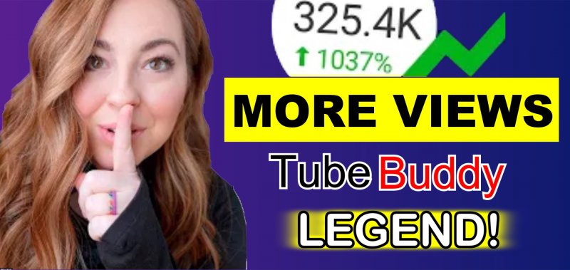
Thanks. I had actually thought of doing this very thing, but did not have the time at the moment. Still on a tight time crunch, so I just grabbed a screenshot of the existing thumb and made some quick mods. I think something like this would work just fine and be perfectly upfront.
Picture4.jpg
 
Last edited:

Nothin' But Gadgets

Recognized Member
TubeBuddy Pro
81
12
Thanks. I had actually thought of doing this very thing, but did not have the time at the moment. Still on a tight time crunch, so I just grabbed a screenshot of the existing thumb and made some quick mods. I think something like this would work just fine and be perfectly upfront.
View attachment 11628

WOW! Yeah, this is a good example of what a Click Worthy thumb should look like. It is big and bold. Easy to see on a smartphone screen, and completely honest about what it is about. Great Job! I can't wait to see how all the people in favor of the clickbait thumb work up a sweat trying to tear this apart. I am sure that will give pages of the reasons why.
 

Damon

Trusted User
Trusted User
2,779
25
Subscriber Goal
10000
Yeah, that's something much more to what I'd click on. Actually this makes the lady's picture with the "Shhhh!" much more believable. In fact this approach is simpler, easier to understand, and would probably attract more sales on the back side because you're helping people make a buying decision.

This basic sales engine shows the benefit of more views as a result of using the features found in the Legend is simple. I'd much rather have back-end sales than upfront views or subs. I'm a firm believer that people who want to be entertained don't want to buy anything, and would wager that the people who would click on the second thumbnail would be far more interested in upgrading their subscription or buying Legend status if they have not paid for TB already. Those clicking on the first would probably never buy much of anything. (Of course this is all speculation based on my own life experience.)

The further a person is toward making a buying decision, the viewer views you'll have. That's a good thing because you don't waste time with people who aren't interested in buying anything.