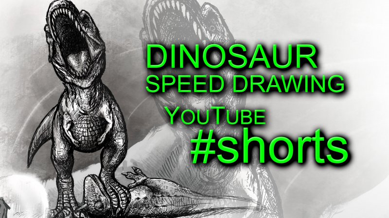
Shorts on YouTube are interesting. I don't have access to shorts shelf on the home page, but after uploading some shorts, I DO get to have a shorts shelf on my channel home page. On the home page these videos don't get a thumbnail, but rather a preview of the main bit of action, but on the video page, and in playlists, they have traditional video thumbnails so I thought I'd make some thumbnails for their display in that area.
These drawings were done vertically, so I've tried to find a nice balance of actually showing the art a bit, because in shrunk down format, the vertical nature means you see less of what the artwork actually is anyway, so I've tried experimenting with crop.
I've also gone with a colour I normally don't like, but the high contrast and green I was hoping would grab attention if shown in suggested and recommended, so I went with something simple but bold.
It's going to be interesting to see where shorts and thumbnails FOR shorts go, but I'm interested to know what you think on first impression.


