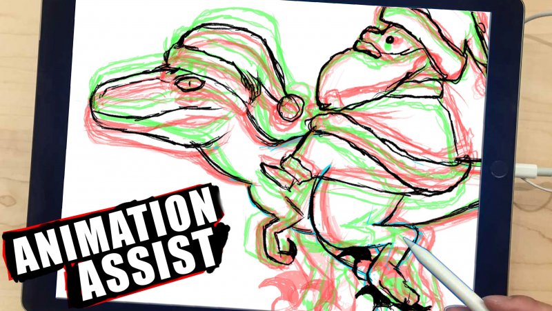
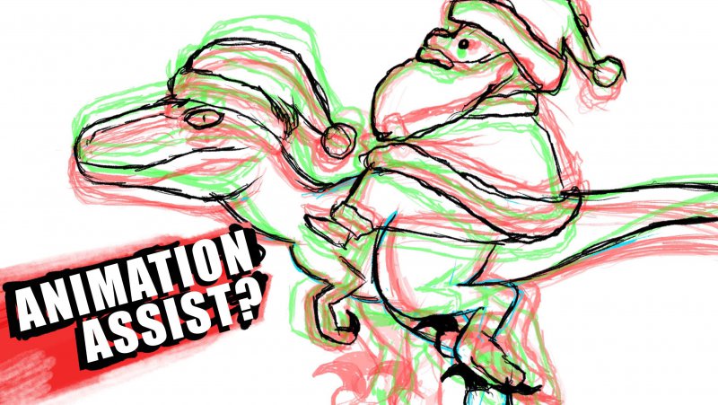
This is one of those thumbnails where I'm not entirely sure if it translates well. I will be A/B testing this one in about a week or so (maybe sooner if the CTR is low, but I can't see what the CTR is yet) but my main question is do you prefer this with, or without the ipad boarder (and do you like the slight slant?)

I'm not sure weather to keep the focus on the digital aspect (with the ipad) or go with the one below (without the ?) and focus more on the artwork rather than the app itself.

And I guess overall, does it translate well enough that this is actually a bunch of frames transitioning together? Fun fact, that's actually how it looks in the app while animating.
I do like the corner banner and grungy background with the black boarder, but as always, I'm not 100% sold and always open to new ideas and experiments.

I'm not sure weather to keep the focus on the digital aspect (with the ipad) or go with the one below (without the ?) and focus more on the artwork rather than the app itself.

And I guess overall, does it translate well enough that this is actually a bunch of frames transitioning together? Fun fact, that's actually how it looks in the app while animating.
I do like the corner banner and grungy background with the black boarder, but as always, I'm not 100% sold and always open to new ideas and experiments.
