
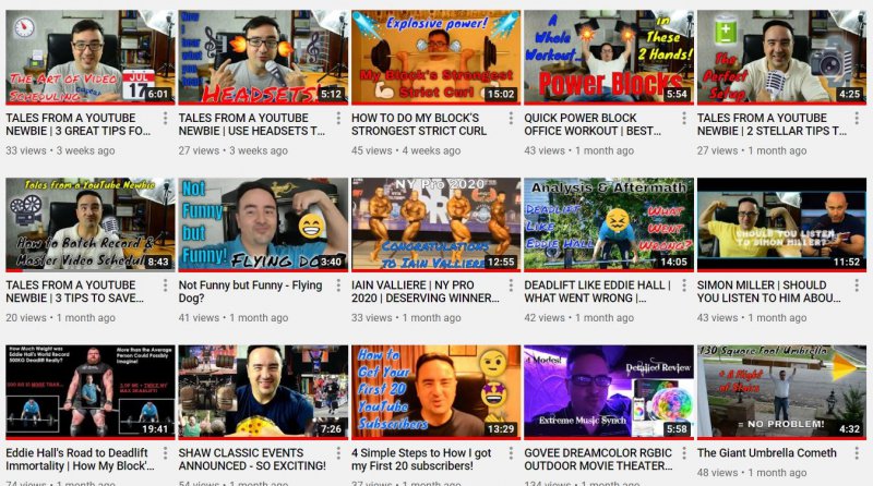
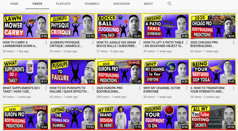
I'm so pleased and relieved after about 40 hours of rework to share my completed new set of thumbnails using a standard look and feel, lessons learned from Roberto Blake, Nick Nimmin, Sean Cannell, and Vanessa Lau, and clear legible graphics and messaging. I redid all 56 thumbnails. Have a look at samples of the before and after. For anyone eager to learn how I did this, I had to learn a few skills along the way and would be happy to share. Feel free to reach out.
You are using an out of date browser. It may not display this or other websites correctly.
You should upgrade or use an alternative browser.
You should upgrade or use an alternative browser.
Thumbnail Feedback My Revamped Standard Thumbnail Format is Now Complete!
- Thread starter MyBlocksStrongestMan
- Start date
Wow! That's a ton of work. I love the look and feel. Definitely give you a "brand" feeling.

I like the blue and yellow color scheme on your thumbnails. What did you use to edit them, I mean what software?
Really nice. It is a great improvement. I am also interested in the software you used to do it.
OP
OP
I appreciate it! The first thumbnail took me probably 16 hours by itself, but then I had a great template to make the 55 others with very small changes on each. I'm using Inkscape and it's like any other program. I don't know everything it can do until I learn the right questions to ask on Google to learn about the features. The Inkscape filters were a game changer! So awesome for free software!Wow! That's a ton of work. I love the look and feel. Definitely give you a "brand" feeling.
I u
I used Inkscape. It's free software and VERY robust. I didn't want to make any Adobe purchases since I have no revenue being generated from my brand yet, so I tried GIMP but just couldn't understand how to even get started with it. Inkscape is great! If you want to talk more about it, you can email me some time although I'm thinking that I should make a how to video about it. russobusinessconsulting@gmail.comI like the blue and yellow color scheme on your thumbnails. What did you use to edit them, I mean what software?
Thank you. Much appreciated. I used Inkscape, and there seems to be some interest on this forum about the software I used so I'll probably make a video soon about how to use it to make thumbnails. Making a video now after I struggled through all the lessons should help others save lots of time.Really nice. It is a great improvement. I am also interested in the software you used to do it.
Thanks for sharing the informationThank you. Much appreciated. I used Inkscape, and there seems to be some interest on this forum about the software I used so I'll probably make a video soon about how to use it to make thumbnails. Making a video now after I struggled through all the lessons should help others save lots of time.
Wow, that's some improvement definitely helpful to us seeing the side by side. Thanks for sharing
OP
OP
Thanks for the kinds words. Happy to share. For me, it was all about finding people whose thumbnails attract my attention and taking queues from them. In my case, all these people had their own videos about how to make thumbnails so it made it easier to implement those ideas and add my twist.Wow, that's some improvement definitely helpful to us seeing the side by side. Thanks for sharing
Very big improvements so far, especially in the simplifying of the text and overall cleanliness.
I do want to point out a few things though, and after what youΓÇÖve said about changing up such a huge amount of thumbs you might not like hearing this, in which case, try these on a small batch of thumbnails first.
first of all the colour of the text background. Yellow and red are very specific to Nick NimminΓÇÖs style of thumbnail branding. whenever I see other people go with that style of thumbnail text banners (and a lot do it, it works well visually, which is why a lot go with it) but whenever I see that, especially in those colours, I canΓÇÖt help but think Nick Nimmin.
Luckily youΓÇÖre in a differant niche because if you werenΓÇÖt there would definitely be comparisons made. IΓÇÖd experiment a bit more with the colouring
speaking of colour. The blue of your background IΓÇÖm not a fan of. The lighter blue trending towards purple isnΓÇÖt so bad, but the bold blue I just canΓÇÖt stand from a design stand point. It reminds me too much of Microsoft publisher and Microsoft PowerPoint, again, IΓÇÖd do more experimenting with colour, you could even play with subtle texture or even light patterns for the background to make it slightly less flat
Thirdly, IΓÇÖm not sold on the black and white photography. From a design standpoint and ΓÇ£using colour as storyΓÇ¥ black and white often associates with depression, sadness, anxiety, serious stories. The only time I really see black and white photos being used is when a sad depressing serious story is being told, and judging by the titles, that seems to be far from the case. IΓÇÖd go back to using colour photos personally.
on the plus side, my criticisms are only colour theory based, your composition is a lot better and youΓÇÖve really tidied things up. IΓÇÖd just refine your colour choice and selections. The colour of the text banners run a very fine line to looking like a Nick Nimmin copycat. I know you were inspired by him rather than wanting to copy him, but first impressions in the space will veer towards that kind of interpretation.
These are very much on the right path though!
So study pattern and colour theory some more ΓÇ£color theoryΓÇ¥ in google should show some graphic design articles around topic of colour theory. And ΓÇ£ΓÇÿpatterns in designΓÇ¥ ΓÇ£pattern designsΓÇ¥ and. ΓÇÿPattern as a design elementΓÇ¥ whoΓÇÖll help you continue your learning in the thumbnail space")
YouΓÇÖre doing a great job with your improvements though
I do want to point out a few things though, and after what youΓÇÖve said about changing up such a huge amount of thumbs you might not like hearing this, in which case, try these on a small batch of thumbnails first.
first of all the colour of the text background. Yellow and red are very specific to Nick NimminΓÇÖs style of thumbnail branding. whenever I see other people go with that style of thumbnail text banners (and a lot do it, it works well visually, which is why a lot go with it) but whenever I see that, especially in those colours, I canΓÇÖt help but think Nick Nimmin.
Luckily youΓÇÖre in a differant niche because if you werenΓÇÖt there would definitely be comparisons made. IΓÇÖd experiment a bit more with the colouring
speaking of colour. The blue of your background IΓÇÖm not a fan of. The lighter blue trending towards purple isnΓÇÖt so bad, but the bold blue I just canΓÇÖt stand from a design stand point. It reminds me too much of Microsoft publisher and Microsoft PowerPoint, again, IΓÇÖd do more experimenting with colour, you could even play with subtle texture or even light patterns for the background to make it slightly less flat
Thirdly, IΓÇÖm not sold on the black and white photography. From a design standpoint and ΓÇ£using colour as storyΓÇ¥ black and white often associates with depression, sadness, anxiety, serious stories. The only time I really see black and white photos being used is when a sad depressing serious story is being told, and judging by the titles, that seems to be far from the case. IΓÇÖd go back to using colour photos personally.
on the plus side, my criticisms are only colour theory based, your composition is a lot better and youΓÇÖve really tidied things up. IΓÇÖd just refine your colour choice and selections. The colour of the text banners run a very fine line to looking like a Nick Nimmin copycat. I know you were inspired by him rather than wanting to copy him, but first impressions in the space will veer towards that kind of interpretation.
These are very much on the right path though!
So study pattern and colour theory some more ΓÇ£color theoryΓÇ¥ in google should show some graphic design articles around topic of colour theory. And ΓÇ£ΓÇÿpatterns in designΓÇ¥ ΓÇ£pattern designsΓÇ¥ and. ΓÇÿPattern as a design elementΓÇ¥ whoΓÇÖll help you continue your learning in the thumbnail space
YouΓÇÖre doing a great job with your improvements though
OP
OP
Thanks for the feedback. I was indeed inspired by Nick Nimmin because I think his style is very legible for the viewer. I tried to differentiate by rounding the text background color corners and adding Inkscape filters to change the look without making the words illegible. For example instead of a flat red background like Nick uses, some of mine look like glass or aluminum. However, I could change the reds and yellows or maybe use them more sparingly. Regarding the main background color, I also like the purple one better and was aiming for that gradient on all my thumbnails. I'm honestly not sure why they aren't all the same since I used the same template for all of them. Regarding the "Vogue" facial filter from my Android phone, I honestly used it because it makes my skin look better, especially under my eyes, and this is very important to me, so although you make very valid points, I'm going to stick with that for now.Very big improvements so far, especially in the simplifying of the text and overall cleanliness.
I do want to point out a few things though, and after what youΓÇÖve said about changing up such a huge amount of thumbs you might not like hearing this, in which case, try these on a small batch of thumbnails first.
first of all the colour of the text background. Yellow and red are very specific to Nick NimminΓÇÖs style of thumbnail branding. whenever I see other people go with that style of thumbnail text banners (and a lot do it, it works well visually, which is why a lot go with it) but whenever I see that, especially in those colours, I canΓÇÖt help but think Nick Nimmin.
Luckily youΓÇÖre in a differant niche because if you werenΓÇÖt there would definitely be comparisons made. IΓÇÖd experiment a bit more with the colouring
speaking of colour. The blue of your background IΓÇÖm not a fan of. The lighter blue trending towards purple isnΓÇÖt so bad, but the bold blue I just canΓÇÖt stand from a design stand point. It reminds me too much of Microsoft publisher and Microsoft PowerPoint, again, IΓÇÖd do more experimenting with colour, you could even play with subtle texture or even light patterns for the background to make it slightly less flat
Thirdly, IΓÇÖm not sold on the black and white photography. From a design standpoint and ΓÇ£using colour as storyΓÇ¥ black and white often associates with depression, sadness, anxiety, serious stories. The only time I really see black and white photos being used is when a sad depressing serious story is being told, and judging by the titles, that seems to be far from the case. IΓÇÖd go back to using colour photos personally.
on the plus side, my criticisms are only colour theory based, your composition is a lot better and youΓÇÖve really tidied things up. IΓÇÖd just refine your colour choice and selections. The colour of the text banners run a very fine line to looking like a Nick Nimmin copycat. I know you were inspired by him rather than wanting to copy him, but first impressions in the space will veer towards that kind of interpretation.
These are very much on the right path though!
So study pattern and colour theory some more ΓÇ£color theoryΓÇ¥ in google should show some graphic design articles around topic of colour theory. And ΓÇ£ΓÇÿpatterns in designΓÇ¥ ΓÇ£pattern designsΓÇ¥ and. ΓÇÿPattern as a design elementΓÇ¥ whoΓÇÖll help you continue your learning in the thumbnail space
YouΓÇÖre doing a great job with your improvements though

OP
OP
Thank you! Much appreciated. After the initial work, it actually makes things much easier going forward because I now have a template and don't need to figure out a thumbnail style from scratch each time anymore.Wow! That's a ton of work keep up the great work
How are they doing? Any update?Thank you! Much appreciated. After the initial work, it actually makes things much easier going forward because I now have a template and don't need to figure out a thumbnail style from scratch each time anymore.
OP
OP
No noticable performance difference yet but I think that's because I still haven't refined step 1, which is making content that solves a problem that many people are seeking a solution for. The title and thumbnail come into play after the search is performed so I have to provide the right solution in search results before my title, thumbnail and description can have a chance to help me attract a viewer.How are they doing? Any update?
Amazing work!
I like the black and white photos, it is your own touch that is not seen much and will definitely stand out.
As for the Nick Nimmin copycat issue, I don't see that at all. If you look at the gaming community you will see a lot of videos have the same font and same color schemes on different channels, and nobody has an issue with it.
Keep you the good work and good luck on your journey!
OP
OP
Thank you! It's great to hear all the kind words. Very motivating!Amazing work!
I like the black and white photos, it is your own touch that is not seen much and will definitely stand out.
As for the Nick Nimmin copycat issue, I don't see that at all. If you look at the gaming community you will see a lot of videos have the same font and same color schemes on different channels, and nobody has an issue with it.
Keep you the good work and good luck on your journey!
Ooh! I like your channel! I used to have so much fun with aircraft sims and I didn't know truck sims existed until I saw your channel. Lots of fun. I subscribed.Amazing work!
I like the black and white photos, it is your own touch that is not seen much and will definitely stand out.
As for the Nick Nimmin copycat issue, I don't see that at all. If you look at the gaming community you will see a lot of videos have the same font and same color schemes on different channels, and nobody has an issue with it.
Keep you the good work and good luck on your journey!
Thanks again for the support. I actually decided to make 3 videos on my channel based on the feedback here: how to make a profile pic in Inkscape, how to make a channel banner in Inkscape, and how to make a thumbnail in Inkscape. The first one is already public and the other 2 are scheduled to release over the coming days.Amazing work!
I like the black and white photos, it is your own touch that is not seen much and will definitely stand out.
As for the Nick Nimmin copycat issue, I don't see that at all. If you look at the gaming community you will see a lot of videos have the same font and same color schemes on different channels, and nobody has an issue with it.
Keep you the good work and good luck on your journey!