• Guest - Earn a FREE TubeBuddy Upgrade for being active on the forums! Click Here to learn how you earn free upgrades for TubeBuddy!
  • Guest - TubeBuddy has a discord! Click Here to join in the conversation!

Channel Review I need thumbnail help or suggestions

Stanley | Team TB

Amazingly Decent and Not-At-All Terrible Fishing
Administrator
TubeBuddy Staff
2,641
25
Subscriber Goal
250000
You have the skills necessary to make solid thumbails in your niche, it looks to me like you simply need to refine those skills. And that is totally not surprising considering the point you are in on your YT journey. You are very early on and have not had the time nor have you made enough videos to find your footing.

Two things:
Make TONS of videos. This is the only way you are going to learn what you need to do to improve your thumbnails AND content. You just need to get through that first 100 videos. it takes time but man by the time you hit #100 you will have a vastly different point of view on your content, your thumbnail style, production schedule... all of it.

Take a deep look at your competition. You want to look at the individuals who make the best thumbnails. Emulate them. Improve on their work. make your thumbnails better than theirs. But also you want to look at the grouping of thumbnails in search for every video you make BEFORE you make it. You want to see what everybody is doing and you need to make your thumbnail different. It needs to be more skilled and/or more eye-catching than the rest but you also want it to stand out against them. So for example if everybody has green thumbnails maybe find a way to make yours red. If everybody is going dark then you go light. You want to combine the skill/talent of the greatest thumbnail makers in your targeted search results with a design perspective that comes across as different than the rest. Sometimes that means more text or less text, things like that.
 
OP
OP
SonicNebula

SonicNebula

Familiar Member
TubeBuddy Legend
59
9
Oh, iv looked at the giants, that are doing what I am doing. and They are worse than me in my opinion. No SEO, no thumbnail optimzation. usually just a still of the video or their logo and a still thats it. I need to dig deeper into smaller channels to see effort. like me. lol but i love that advice search the song what are they posting. how can I stick out. I dunno why I didn't think of that. I was just thinking of making it bright and big, somewhat actaully being lazy about it but i realize I cannot do that. For example, having one thumbnail for all. Good branding but obviously horribel for click through. but as this is such a niche what do I want? then again being new you need the click through. so it's a catch 22 for me. I like the idea of using my one that was custom made but same time I know its gonna get old and people will be like that guy.

The first thing studies what they are doing, second what can I do differently and better. Text is a hard subject. Artist given, song? maybe not maybe just leave that for title. make the picture more eye catching. and I need to stop putting my logo in them probably. putting the quality down. I just thought maybe someone had an easy way idea but thumbnails are probably one of the hardest things on YT. well its all hard. re doing SEO if it changes because as a music niche I have to research keywords constantly instead of just adding. but thats the reason TB created keyword search so. Also keep ahead of the game on the video production which I am trying to improve actually. probably going to need to invest in good software not going to be cheap at all. FL studios.
 
OP
OP
SonicNebula

SonicNebula

Familiar Member
TubeBuddy Legend
59
9
I dont mean to double post but i cannot edit, I need to get to 100 correct. But I want to make the videos better. I think thats going to be my main focus right now get upload up but get my quality up that way not only do people want the music but its like wow that looks nice so much nicer than a random slide show of random pictures. lol if you dunno who i am talking about i am sorry :p
 

itstom

Active Member
TubeBuddy Pro
34
7
Subscriber Goal
1000
As Stanley mentioned above it looks like you have skills and you just need to keep making more videos to get more knowledge and improve skills.

But to expand a bit more on the thumbnails themselves.
You should definitely use a more readable fonts when making thumbnails.
Good practice is to zoom out your thumbnail to the approximate size of thumbnails you would see in your feed and see if you can read the text without leaning forward.
Another thing I've noticed in thumbnails is that you use colors that are not easily visible on the backgrounds so combine that with less readable font and smaller font size people won't be able to
read anything from your thumbnails.

I think your Alison thumbnails were really good and they just needed a better font and a more carefully chosen color.
I would probably suggest using same color for your "record" title e.g. A.L.I.S.O.N in white and Takeoff! in some other color if you want to involve more color into thumbnails.

Remember that you also have to find your own style and you will get it with time and practice :)
Your content is good and you can hear the amount of time spent in learning how to produce it so now focus a bit on learning
how to edit etc. :)

Hope this helped!
 
  • Love
Reactions: Cool One

Cheche004

Known Member
TubeBuddy User
114
11
Subscriber Goal
10000
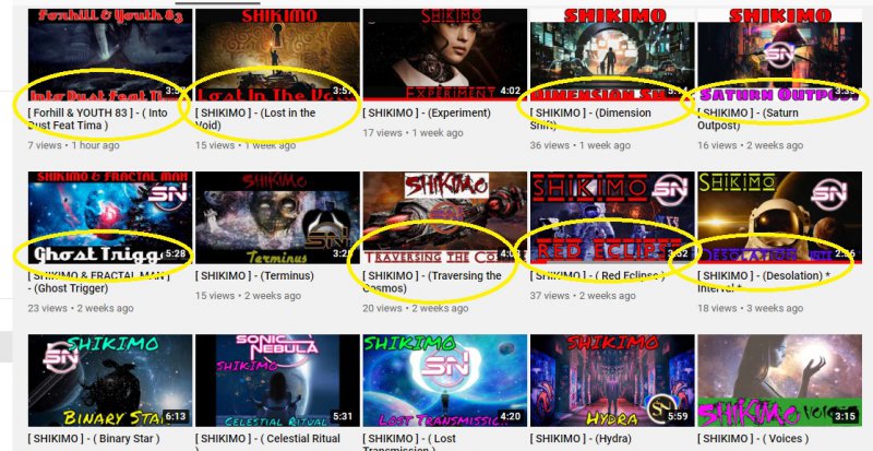
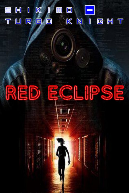
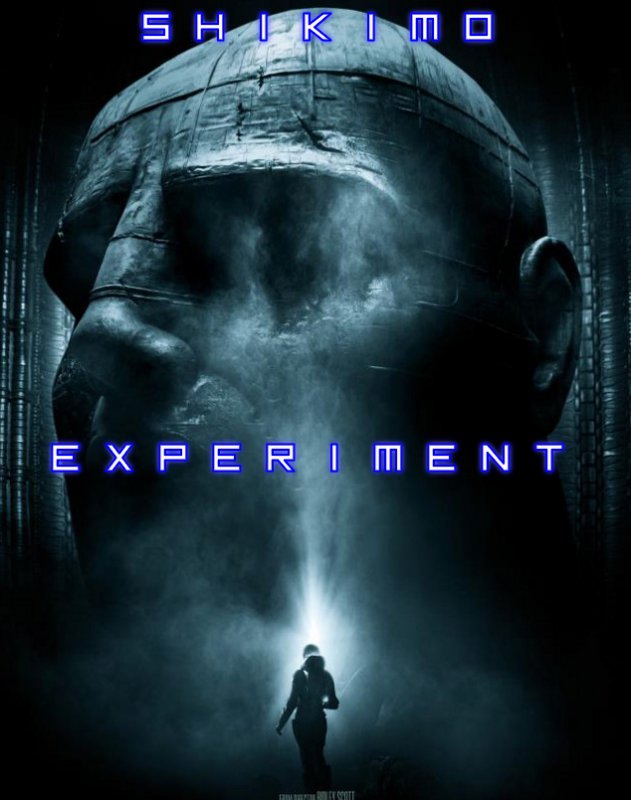
User name: SonicNebula
Title of thread: I need thumbnail help or suggestions
Self review: they are not good, very simple text saying artist and song from a still from video 5/10
Channel review or Video review? Channel review
Link to channel: https://www.youtube.com/channel/UCdT5ioktTl2RihF5Q4BTkjg
Link to other review post: https://community.tubebuddy.com/index.php?threads/33130/
They are unique, But I dont feel like clicking on it. You have to make sure you use bright colours and nice pictures on it. Make something you would click on. Try searching some related niche videos and check they thumbnails and get some idea.
 

Paranormal 369

New Member
TubeBuddy User
12
5
Hey, firstly i like what your doing with your channel and i have subscribed.. Regarding the video images which i like, i would try to mix them up a little by introducing other images through fading and blending, all of which can be done very easily with the different free software platforms available.

In regards to your thumbnails i think the titles and the image contradict each other, so neither is grabbing your attention and pulling you in.. i feel you should keep the SHIKIMO title the same colour and design on all you thumbnails so people recognise it better.. I also feel that the titles on a lot of the thumbnails aren't easy to read due to the font and the colours used... Again these are an easy fix with free software etc

I'm not thumbnail genius but id be happy to help you with these, maybe on your next thumbnail you could send me something to see what i could do.... i hope this helps, keep up the good work

HEY, i hope you don't mind i was bored so had a little mess around with your titles etc
 

Attachments

  • Untitled.jpg
    Untitled.jpg
    320.7 KB · Views: 132
  • rWg0d1603942051.jpg
    rWg0d1603942051.jpg
    918.7 KB · Views: 130
  • TPBBh1603941335.jpg
    TPBBh1603941335.jpg
    249.5 KB · Views: 135
  • J4K6W1603940893.jpg
    J4K6W1603940893.jpg
    509.4 KB · Views: 132

TurtleA1

New Member
6
5
Subscriber Goal
1500
Hello, I like what you have going so far on your banner. It's perfect along side your Logo. On the other hand the thumbnails do need work, As suggest before I. Blending is needed, I'd say stick to a text font thats clean & bold add shadowing & glow filters ect. The videos you have about 1 month ago are more clickable but still need work. I'd first take a step back see what others are doing, Grab their ideas toss your own ideas in with it and go ham. Try to make all new thumbnails that all kinda blend to bring the viewer to the next video along with titles.
 

Raval Kaur

New Member
3
2
Hello,

I just went through your thumbnails. If you look at them from far, they don't attract the viewer. They just look very cluttered. I think if you stick with one EYE-CATCHING font and colour and stay consistent with it you might see a difference! Also if you are using a dark background try to keep the text white!
Another thing I would suggest is keeping the background light and the fonts dark. maybe light blue background with Black text! Hope this helps