You are using an out of date browser. It may not display this or other websites correctly.
You should upgrade or use an alternative browser.
You should upgrade or use an alternative browser.
Thumbnail Feedback How can I make it better?
- Thread starter Maryprecious
- Start date
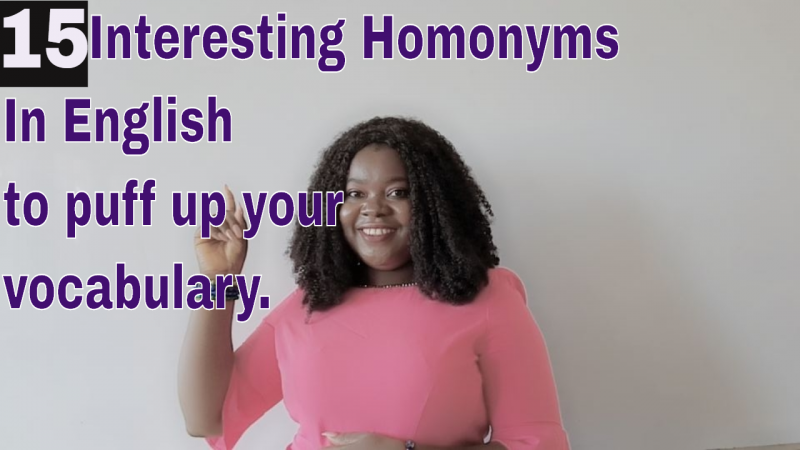
Can you move yourself over to the right slightly so the text isn't over your face?
Do you need all the text? It looks a little busy.
The purple text doesn't stand out overly well against the background, I would look at contrasting colours.
I like your expression, it looks friendly and inviting.
Do you need all the text? It looks a little busy.
The purple text doesn't stand out overly well against the background, I would look at contrasting colours.
I like your expression, it looks friendly and inviting.
Because you have a hot pink top on, bright green or bright blue would compliment it. I don't think you need all the text - just putting Interesting homonyms or English homonyms would be enough because the rest would be in the title or description.
You're welcome, If you want to put a picture of the new one up when it's ready I'd be happy to give you my thoughts - but be warned I'm not always right 
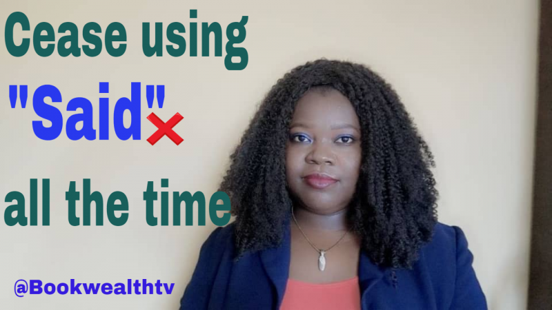
I would try using brighter colours because those are a little dark and don't really pop.@Karin B kindly take a look at this my Thumbnail. My laptop developed fault yesterday that's I wasn't really active and couldn't send it to you for help as said.
I would remove the red X, it looks a little out of place and doesn't really add anything.
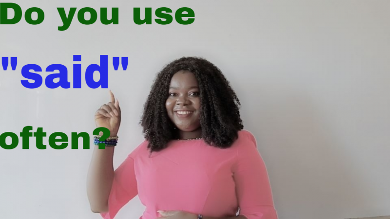
Have you thought about turning it into a question - Do you use 'said' too often? Questions help to draw people in.
Can you take another picture with a bit more expression? Over the top gestures may look silly to us, but it looks good on a small screen and if people are scrolling.
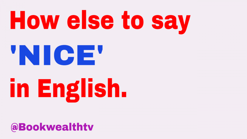
I like that you are keeping a similar theme with your thumbnails, maybe you can find a text and/or colour that you always use to help with your branding.
Thanks so much will effect the corrections now.I would try using brighter colours because those are a little dark and don't really pop.
I would remove the red X, it looks a little out of place and doesn't really add anything.
Have you thought about turning it into a question - Do you use 'said' too often? Questions help to draw people in.
Can you take another picture with a bit more expression? Over the top gestures may look silly to us, but it looks good on a small screen and if people are scrolling.
I like that you are keeping a similar theme with your thumbnails, maybe you can find a text and/or colour that you always use to help with your branding.
You're welcome. Check out Sunny's channel. I think her yellow thumbnails really pop - https://www.youtube.com/c/SunnyLenarduzzi/featured
If you are teaching English, maybe you could make red, white and blue your theme.
If you are teaching English, maybe you could make red, white and blue your theme.
okayYou're welcome. Check out Sunny's channel. I think her yellow thumbnails really pop - https://www.youtube.com/c/SunnyLenarduzzi/featured
If you are teaching English, maybe you could make red, white and blue your theme.
I couldn't download the changed version but the question, "Do you often use" is in red while said is in blue. I rephrased it to "Which other way can you use said?
Attachments
Well .. I would Suggest .. cut your pic as sticker .. make the background little blur and little dark .. use better Attractive font ... enlarge ..
In my option, it should make good difference
In my option, it should make good difference
That's looking good. I like @kitchen c/o ammama idea of using your profile picture, it's friendly and professional looking. If you take a few more pictures for future use, maybe stand a little to the right so you are slightly off centre, it will give you more room for text without cutting off body parts. 
I definitely think you need to find another font, because that font isn't doing much for the thumbnail. Do you know what it's called? and does the program you use give you option for other fonts? I'd even try going with all caps for the thumb text.
You have a lovely photo. Make that photo a lot bigger in the thumbnail, place it more to the right, and then have your text bigger, in a differant font, in caps, to the left and the layout should look better.
You have a lovely photo. Make that photo a lot bigger in the thumbnail, place it more to the right, and then have your text bigger, in a differant font, in caps, to the left and the layout should look better.
Thanks so much Beanie for your candid advice and suggestion. ❤️I definitely think you need to find another font, because that font isn't doing much for the thumbnail. Do you know what it's called? and does the program you use give you option for other fonts? I'd even try going with all caps for the thumb text.
You have a lovely photo. Make that photo a lot bigger in the thumbnail, place it more to the right, and then have your text bigger, in a differant font, in caps, to the left and the layout should look better.


