Last edited:
You are using an out of date browser. It may not display this or other websites correctly.
You should upgrade or use an alternative browser.
You should upgrade or use an alternative browser.
Thumbnail Feedback Definitely spending a lot more time to think and improve my thumbnails
- Thread starter Mario So
- Start date
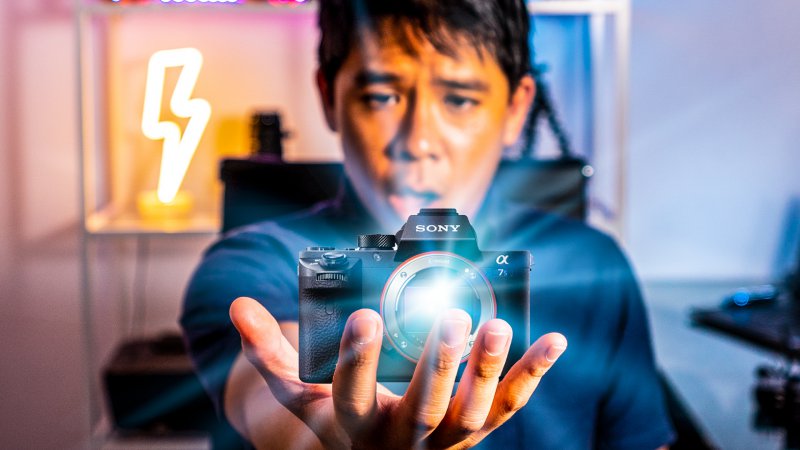
Thanks! The title of the video is "Sony a7siii: What we know about it" I hope the thumb and the title complement each other.Awesome... striking colors, but I donΓÇÖt really know what it is about exactly, if you want to play the mystery card it will do a good job.
Hi.. I like the pic but if someone is asking you what your thumbnail means .. then your Thumbnail is Incomplete. That's the reason why people are asking to add a little text to it.
We often scroll so fast that we may not read the title. Just the pic. SO ..., good work on thumbnail.. just small text about content would be great. All the Best !!
We often scroll so fast that we may not read the title. Just the pic. SO ..., good work on thumbnail.. just small text about content would be great. All the Best !!
Thanks. So far my CTR for this is through the roof since the Title of the video tells you what this video is about. The thumbnail adds that bit of suspense and I guess it's making people click.Looks good. But a small suggestion is to add text right or left to the pic.
It looks great, Just need to add bit information texts on it
Thanks for the feedback. Yeah I see what people mean regarding the text. But so far this thumbnail has the highest CTR in any of my recent videos. It's probably the combo of text and thumbnail. Who knows but I will definitely be testing whether text or no text works best. I know some niches do better with no text as long as you have a compelling title and a very high impact/quality image.Hi.. I like the pic but if someone is asking you what your thumbnail means .. then your Thumbnail is Incomplete. That's the reason why people are asking to add a little text to it.
We often scroll so fast that we may not read the title. Just the pic. SO ..., good work on thumbnail.. just small text about content would be great. All the Best !!
I donΓÇÖt know about thumbnails at all .but think thumbnails make pay attention right away.good idea.and I love the way you think outside the box.Thanks for the feedback. Yeah I see what people mean regarding the text. But so far this thumbnail has the highest CTR in any of my recent videos. It's probably the combo of text and thumbnail. Who knows but I will definitely be testing whether text or no text works best. I know some niches do better with no text as long as you have a compelling title and a very high impact/quality image.
What are the current impressions and CTR?Thanks. So far my CTR for this is through the roof since the Title of the video tells you what this video is about. The thumbnail adds that bit of suspense and I guess it's making people click.
Great looking thumbnail
Though I think the coloring on your face is quite... orange XD
Here is my thumbnail from my latest video. Thumbnail creating is now part of the workflow. It's as important as the video itself!
What are your thoughts? View attachment 6640
I like it, but what is the video title I feel that helps with context of the thumbnail
Yes that's true and thank you!I donΓÇÖt know about thumbnails at all .but think thumbnails make pay attention right away.good idea.and I love the way you think outside the box.
Thanks! It's about 12% right now and yes that's on purpose. I over saturate it to help draw some attention to it.What are the current impressions and CTR?
Great looking thumbnail
Though I think the coloring on your face is quite... orange XD
I updated the post to reflect the title for more context.Awesome... striking colors, but I donΓÇÖt really know what it is about exactly, if you want to play the mystery card it will do a good job.
Thanks Andrew and oops, I edited the post to include the Title.I like it, but what is the video title I feel that helps with context of the thumbnail
Title: Sony a7siii: What We Know So Far and Why I Might Not Be Getting It

