• Guest - Earn a FREE TubeBuddy Upgrade for being active on the forums! Click Here to learn how you earn free upgrades for TubeBuddy!
  • Guest - TubeBuddy has a discord! Click Here to join in the conversation!

Thumbnail Feedback New thumbnail

Soulkiller956

Mobile Gamer trying to get into YouTube
TubeBuddy User
25
6
www.youtube.com
Subscriber Goal
5000
I designed again new one.. hows it
 

Attachments

  • a_1594663579115.png
    a_1594663579115.png
    539.8 KB · Views: 165

kitchen c/o ammama

Distinguished Poster
TubeBuddy User
648
18
Subscriber Goal
5000
The background and the person seem to be good.

I have no idea about PUBG and if 18 kills is good or great.

There are 3 different fonts and 3 colors ... to much happening .

If a gamer by Image can see clearly that it's PUBG, then i don't think you may need to add the words " PUBG" again.

If the main motive behind your video is about 18 kills , then focus that font alone so that it's catchy.

I hope I'm correct .. waiting for others to reply if they agree with me or not.
 
  • Like
Reactions: Soulkiller956

TanookiAlex

Very Well-Known Member
TubeBuddy Star
322
15
www.youtube.com
Subscriber Goal
20000
Don't get me wrong, the thumbnail is pretty good, but i don't really like the assortment of the boxes and blue and red. the blue personally isn't my taste and comes off as a bit bland to me.
background is great, like how the person/helmeted character is the focal point. your text needs to be changed to a consistent font however.
7/10 (Please don't take this personally, this is critique and i just want to help you approve)
 
  • Love
Reactions: Soulkiller956

Kari B

Well-Known Member
TubeBuddy User
267
13
Subscriber Goal
100000
I would reduce the text a little as it's bigger than the image. Is all the text needed or could you cut some out as it's a little busy? White text on a blue background can be hard to read on a small screen as it goes a little fuzzy. With a few tweaks, I think this will be a good thumbnail.
 

BraveStar

Life ain't no Nintendo Game
TubeBuddy User
2,113
24
Subscriber Goal
1000
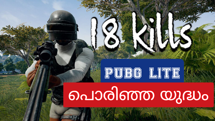
As a gamer here is what I believe makes a good gaming thumbnail. First I always recommend including the logo for the game you're playing. This draws a lot of attention to people looking for a specific game before they even read the text. Second I am extremely picky about perfection and the text in the blue box is not centered. Also, the boxes themselves are a bit too big, perhaps make them a bit smaller so there isn't so much empty space around the text. And you wanna make sure not to cover the main part of the image, in this case, the PUBg character. And last, the 18 kills text blends a little with the background and thus doesn't entirely stand out. The background has a lot of dark from the shadows and light from the clouds in the sky thus making the black and white colors of the text blend too much. You want that particular text to pop so maybe different colors from the background or an outer glow with a color that pops. That's my thoughts on a thumbnail for a gaming channel.