
You are using an out of date browser. It may not display this or other websites correctly.
You should upgrade or use an alternative browser.
You should upgrade or use an alternative browser.
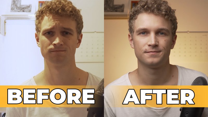
Thumbnail Feedback Thumbnail A or B [YouTube Lighting Tutorial]
- Thread starter NiklasVoss
- Start date
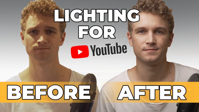


Second one give a bit more info on what u r going to push
First one js kinda dull
First one js kinda dull
out of the two, the second one is good as it clearly shows the difference.
However I like "lightning for YouTube" in the first one.
Maybe a mix with 2nd thumbnail with a caption "lightning for youtube "??
However I like "lightning for YouTube" in the first one.
Maybe a mix with 2nd thumbnail with a caption "lightning for youtube "??
I agree with the others, the second thumbnail shows the lighting difference a lot better with the different background than the first thumbnail ")
Some people can gloss over the first thumbnail and not even see the difference.
Some people can gloss over the first thumbnail and not even see the difference.
OP
OP
looks dull and not bright. Maybe because l love bright colors. There isn't much lighting to the picture. I hardly c the difference between the before and after
The second photo definitely works better for lighting, but I'm wondering if "Before after" could be changed to a cross and tick? I think that could make it look more interesting.