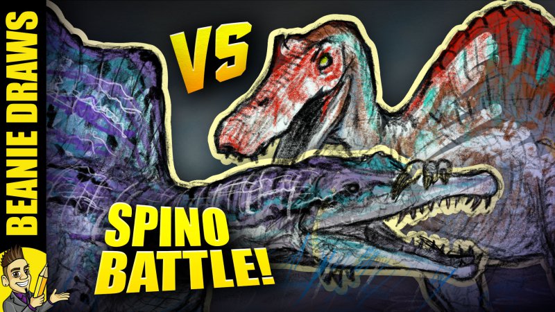
So this video is about 2-3 years old now, has had about 3% click through rate from aboput 100k+ impressions, so I don't think I fully got the idea of the video out in the original thumb. It'a too wordy, focuses TOO much on my brand I think, and taks away from the story of the thumb visually. It's meant to be an artwor of two differant spinosaurus's battling. The one to the right is the old version from Jurassic Park 3 when there were very few fossils found to show how it actually looked.
The one on the left, is the NEW version, re-constructed after 2018/19 when new fossils were discovered that showed the leg bone, more spine bones, and gave a much better indication of how it looked.
I've been receiving complaints about my old depiction being "wrong" so this video was a satirical statement that there's lot's of arguments over the old and new spinosaurus, so I drew both of them fighting each other.
Evidently the story wasn't sold and people weren't as interested as they "should" have been. My spinosaurus videos tend to perform a lot better than this one, so this thumbnail obviously missed the mark.
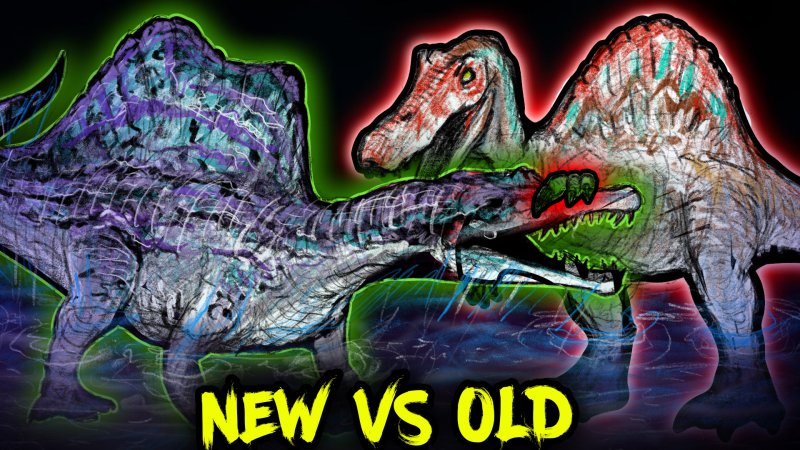
I've made two versions. Derral Eves did a video recently about thumbnails and the importance of using eye catching elements and colour. so I've experimented with using colour as a concept for "good" vs "bad".
The NEW spinosaurus to the left, you can see a lot more of it's quadpedal stance in the water, which is how it looks scientifically. So this is the "GOOD" design, the "correct" verion,m so it's in green.
The OLD spinosaurus, from Jurassic Park 3 is outdated. It's "BAD" because it's "Incorrect" and "Wrong" so it's red.
I'm not entirely sure if I like the colour outlines, but it's an experiment I want to try and play around with.
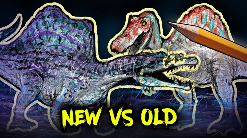
This one is the same concept, just not using green and red, and going with a less stated yellow outline which might look better shrunk down.
The problem is I can't A/B test both comparing them to the original. So I'm going to have to A/B test them individually in seperate periods.
So with all that context explained. Which one do you think will capture the most attention?
The one on the left, is the NEW version, re-constructed after 2018/19 when new fossils were discovered that showed the leg bone, more spine bones, and gave a much better indication of how it looked.
I've been receiving complaints about my old depiction being "wrong" so this video was a satirical statement that there's lot's of arguments over the old and new spinosaurus, so I drew both of them fighting each other.
Evidently the story wasn't sold and people weren't as interested as they "should" have been. My spinosaurus videos tend to perform a lot better than this one, so this thumbnail obviously missed the mark.

I've made two versions. Derral Eves did a video recently about thumbnails and the importance of using eye catching elements and colour. so I've experimented with using colour as a concept for "good" vs "bad".
The NEW spinosaurus to the left, you can see a lot more of it's quadpedal stance in the water, which is how it looks scientifically. So this is the "GOOD" design, the "correct" verion,m so it's in green.
The OLD spinosaurus, from Jurassic Park 3 is outdated. It's "BAD" because it's "Incorrect" and "Wrong" so it's red.
I'm not entirely sure if I like the colour outlines, but it's an experiment I want to try and play around with.

This one is the same concept, just not using green and red, and going with a less stated yellow outline which might look better shrunk down.
The problem is I can't A/B test both comparing them to the original. So I'm going to have to A/B test them individually in seperate periods.

So with all that context explained. Which one do you think will capture the most attention?
