• Guest - Earn a FREE TubeBuddy Upgrade for being active on the forums! Click Here to learn how you earn free upgrades for TubeBuddy!
  • Guest - TubeBuddy has a discord! Click Here to join in the conversation!

Banner help

TheRoutineInstructor

Recognized Member
TubeBuddy User
82
7
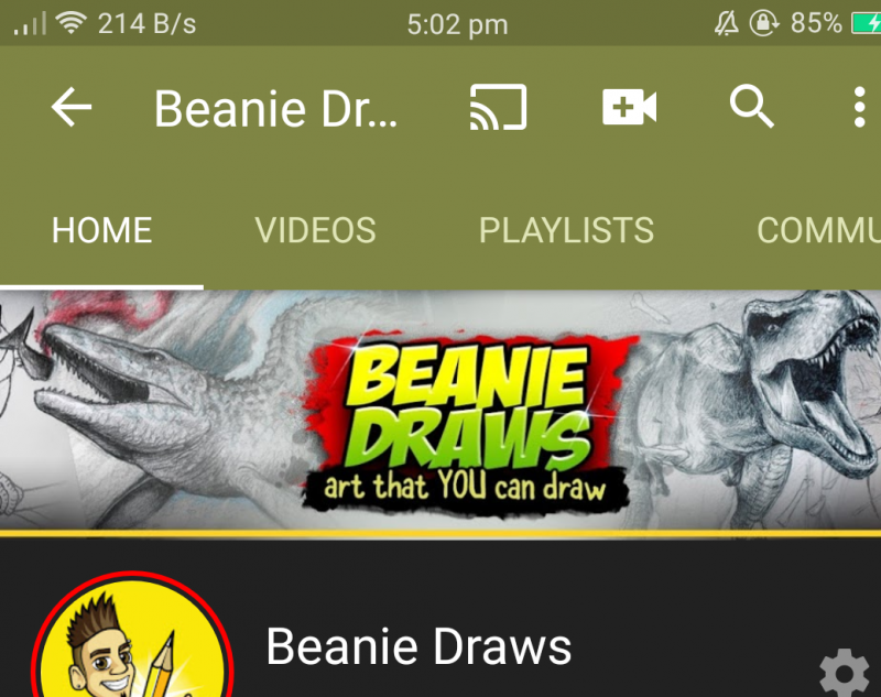
How do you make your banner so it's perfect size for all 3 for tv, tablet, phone. I got it right on my phone but tv or tablet won't display whole of photo for banner. This is my banner and I had to set it in middle of a 16.9
Ratio so it would look ok on phone. Only way i know how to do it. Is it possible to get all 3 to look way it is on all 3?
Any help be appreciated thank you
20200517_130203.png
 

Beanie Draws

Mythical Poster
2,883
27
www.youtube.com
Subscriber Goal
30000
Ok, so the channel banner is an illusive thing. And because YouTube is watched on so many differant devices, it won't appear the same on all devices.
The TV is the max size you'll want, but depending on your audience, they might not ever sewe that.

Your best bet is to design for the "safe are" this is what mobile users will see and is the minimum safe are where things won't get cut off. If you don't put any graphics in the area of desktop max, all that area will be blank, which is why you should put something in there that isn't important where you don't mind if people will see it or not.

Blank-YouTube-Banner-Template-PSD.jpg
 
OP
OP
TheRoutineInstructor

TheRoutineInstructor

Recognized Member
TubeBuddy User
82
7
Ok, so the channel banner is an illusive thing. And because YouTube is watched on so many differant devices, it won't appear the same on all devices.
The TV is the max size you'll want, but depending on your audience, they might not ever sewe that.

Your best bet is to design for the "safe are" this is what mobile users will see and is the minimum safe are where things won't get cut off. If you don't put any graphics in the area of desktop max, all that area will be blank, which is why you should put something in there that isn't important where you don't mind if people will see it or not.

View attachment 5650
Thanks
 
  • Like
Reactions: Beanie Draws

Beanie Draws

Mythical Poster
2,883
27
www.youtube.com
Subscriber Goal
30000
View attachment 5672I
Couldn't help myself i changed it to this one now ;) i like it little darker to blend in with banner colour.
One last tip on your one, I'd make the background of the middle bar stretch out a big and fade out if you know how to do that? that way it will blend out better for desktop :) just for aesthetic reasons, but that looks great and will be perfect for tv :)
 
OP
OP
TheRoutineInstructor

TheRoutineInstructor

Recognized Member
TubeBuddy User
82
7
One last tip on your one, I'd make the background of the middle bar stretch out a big and fade out if you know how to do that? that way it will blend out better for desktop :) just for aesthetic reasons, but that looks great and will be perfect for tv :)
Don't know how to do that :rolleyes:
That would be good to do that.
 
  • Like
Reactions: Beanie Draws

Stanley | Team TB

Amazingly Decent and Not-At-All Terrible Fishing
Administrator
TubeBuddy Staff
2,644
25
Subscriber Goal
250000
One thing to mention with these banners; YouTube is going to do an overall 'scan' of the average color and use that as the design color on your mobile presentation. So for example @TheRoutineInstructor the majority of your banner is that dark green color. YT is likely going to make the toolbar dark green for your page on a mobile device. This isn't always the case; there are some colors that YT doesn't use (I just don't know enough about it to be able to explain it). But playing with the color of your banner is how you adjust the colors of your toolbar.
 
OP
OP
TheRoutineInstructor

TheRoutineInstructor

Recognized Member
TubeBuddy User
82
7
One thing to mention with these banners; YouTube is going to do an overall 'scan' of the average color and use that as the design color on your mobile presentation. So for example @TheRoutineInstructor the majority of your banner is that dark green color. YT is likely going to make the toolbar dark green for your page on a mobile device. This isn't always the case; there are some colors that YT doesn't use (I just don't know enough about it to be able to explain it). But playing with the color of your banner is how you adjust the colors of your toolbar.
Cool thanks for the heads up about that.
 
  • Like
Reactions: Stanley | Team TB
OP
OP
TheRoutineInstructor

TheRoutineInstructor

Recognized Member
TubeBuddy User
82
7
Ok changed it again and I love it. 1st one is tv size and for some reason had to crop 1ml to show you guys but works perfectly for tv.
2nd 1 is for laptop
3rd for phone
Looks good on all 3 very happy now ;)
20200527_141253.png
20200527_135843.png
20200527_135957.png
 
  • Like
Reactions: Beanie Draws

thepiedcrafter

New Member
8
4
One thing to mention with these banners; YouTube is going to do an overall 'scan' of the average color and use that as the design color on your mobile presentation. So for example @TheRoutineInstructor the majority of your banner is that dark green color. YT is likely going to make the toolbar dark green for your page on a mobile device. This isn't always the case; there are some colors that YT doesn't use (I just don't know enough about it to be able to explain it). But playing with the color of your banner is how you adjust the colors of your toolbar.

Thanks for sharing! I need to revisit my banner to follow this suggestion :)