• Guest - Earn a FREE TubeBuddy Upgrade for being active on the forums! Click Here to learn how you earn free upgrades for TubeBuddy!
  • Guest - TubeBuddy has a discord! Click Here to join in the conversation!

Thumbnail Feedback 3 best and 3 worst CTR thumbnails from my channel

Niki Proshin

Known Member
118
9
Would be interesting to know your opinion on why these thumbnails perform well or not.
I've also found out that CTR goes down when impressions go up.
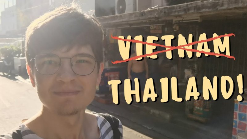
1.jpg uploaded in February, 1047 impressions, 9.2% CTR
2.jpg uploaded in May, 760 impressions, 9% CTR

3.jpg uploaded in May, 5,109 impressions, 8.3% CTR
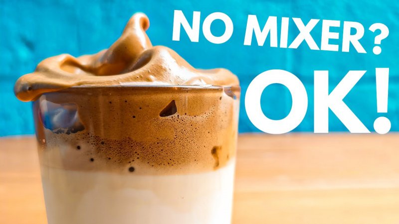

4.jpg uploaded in April, 2,233 impressions, 1.5% CTR
5.jpg uploaded in February, 1,491 impressions, 2.2% CTR
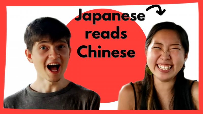
6.jpg uploaded in April, 2,956 impressions, 2.7% CTR
 
  • Like
Reactions: hkaris

Steve the Barman

Known Member
TubeBuddy Star
144
11
stevethebarman.com
Subscriber Goal
10000
Just a quickie response (I'm really not the one to ask about thumbnails, because my Idea of Good is opposite to most peoples...and the experts! :joy: )

However, what i would say, the Top 3...i get a very clear idea of WHAT the Video is about just from the Thumbnail.
The Bottom 3, I don't! It's that simple.

Okay in the middle bottom one, i get you're hitch-hiking... but where the heck is that? And where are you hiking from? It kind of bears no relevance if you know what i mean.
As for the No Mixer one... well, i'm talking to you here as a drinks expert, And i have no idea what that Video could be about.

So i guess that would be it in a nutshell. It has nothing to do with the look/design. Just the message they give off.

Hope that helps.
 
  • Like
Reactions: Niki Proshin

AJAX

New Member
20
4
Certainty true. Well high impressions somewhere between 10000 with a 8% CTR would yield 800 views. A video with 5000 impression and a 15% CTR would yield 750 views. The CTR is pretty important if you ask me.
 
  • Like
Reactions: Niki Proshin

Beanie Draws

Mythical Poster
2,883
27
www.youtube.com
Subscriber Goal
30000
So for the top 3 worst
I'd say the japanese reads chinese - the text doesn sit in the red dot which seems like a missed opportunity, and not a fan of the boarder. Your photography has definitely improved since this one.

vietnam thailand - without reading the title I don't know what's going on, and the photo works for contrast, but your face is all washed out (your photo editing skill shave improved significantly since then)

maybe the 2.49 fruit. it's a lot clearer, but the $2.49 text lets it down overall, and I think the colourful fruit still competes with you for attention


hitchhike to sukhothai is simple, effective (the hitchhike to is a little tricky to read, you could try a differant font there. but overall great expression, great contrast and colour of the background, and the font treatment of sukhothai is fantastic.

No mixer? ok! - Has fantastic colour that grabs my attention, and the blue and table work really well as a text framer.

Back to life! - I think the text treatment can be improved more, but overall the colour, the obvious thailand, your photo and "back to life" all work together well enough to tell the story to set up the reason for the click.


Really digging your evolution even in such a short amount of time! Great work mate!
 
  • Love
Reactions: Niki Proshin
OP
OP
Niki Proshin

Niki Proshin

Known Member
118
9
Just a quickie response (I'm really not the one to ask about thumbnails, because my Idea of Good is opposite to most peoples...and the experts! :joy: )

However, what i would say, the Top 3...i get a very clear idea of WHAT the Video is about just from the Thumbnail.
The Bottom 3, I don't! It's that simple.

Okay in the middle bottom one, i get you're hitch-hiking... but where the heck is that? And where are you hiking from? It kind of bears no relevance if you know what i mean.
As for the No Mixer one... well, i'm talking to you here as a drinks expert, And i have no idea what that Video could be about.

So i guess that would be it in a nutshell. It has nothing to do with the look/design. Just the message they give off.

Hope that helps.

Aha, easy as that! I agree, without seeing titles it's much harder to understand what's the video about. I'll pay more attention to that, thanks for feedback!
 
OP
OP
Niki Proshin

Niki Proshin

Known Member
118
9
So for the top 3 worst
I'd say the japanese reads chinese - the text doesn sit in the red dot which seems like a missed opportunity, and not a fan of the boarder. Your photography has definitely improved since this one.

vietnam thailand - without reading the title I don't know what's going on, and the photo works for contrast, but your face is all washed out (your photo editing skill shave improved significantly since then)

maybe the 2.49 fruit. it's a lot clearer, but the $2.49 text lets it down overall, and I think the colourful fruit still competes with you for attention


hitchhike to sukhothai is simple, effective (the hitchhike to is a little tricky to read, you could try a differant font there. but overall great expression, great contrast and colour of the background, and the font treatment of sukhothai is fantastic.

No mixer? ok! - Has fantastic colour that grabs my attention, and the blue and table work really well as a text framer.

Back to life! - I think the text treatment can be improved more, but overall the colour, the obvious thailand, your photo and "back to life" all work together well enough to tell the story to set up the reason for the click.


Really digging your evolution even in such a short amount of time! Great work mate!

Thank you, really valuable opinion! I guess it'll help my thumbnails evolve a bit more ;)
 
  • Love
Reactions: Beanie Draws

blackbeltsecrets

BlackBeltBarrister
284
15
www.blackbeltbarrister.com
Subscriber Goal
1000000
Would be interesting to know your opinion on why these thumbnails perform well or not.
I've also found out that CTR goes down when impressions go up.

View attachment 5465 uploaded in February, 1047 impressions, 9.2% CTR
View attachment 5466 uploaded in May, 760 impressions, 9% CTR
View attachment 5467 uploaded in May, 5,109 impressions, 8.3% CTR


View attachment 5468 uploaded in April, 2,233 impressions, 1.5% CTR
View attachment 5469 uploaded in February, 1,491 impressions, 2.2% CTR
View attachment 5470 uploaded in April, 2,956 impressions, 2.7% CTR
For me, the main difference is that the first 3 are easier to read. The latter 2 its not clear what the video is, and the first of the last 3 looks too commercial! Just my views.
 
  • Like
Reactions: Niki Proshin