• Guest - Earn a FREE TubeBuddy Upgrade for being active on the forums! Click Here to learn how you earn free upgrades for TubeBuddy!
  • Guest - TubeBuddy has a discord! Click Here to join in the conversation!

Thumbnail Feedback Which of these two would you most likely click on?

Immortal Explorer

Recognized Member
TubeBuddy User
99
10
Subscriber Goal
1000
Hi Guys

I'm loving this community and I've only been here a day.

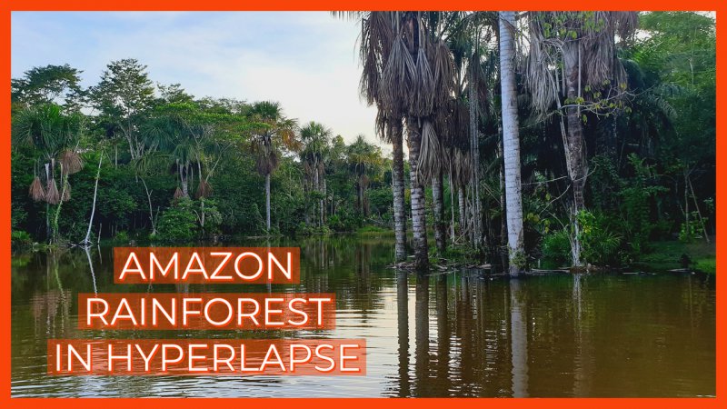
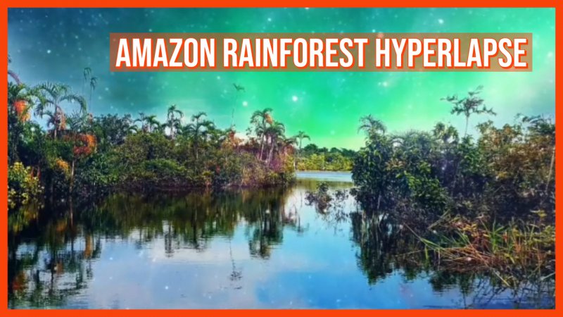
So this week I started really trying to optimise my channel, it's just been sitting dormant for like three years. Anyway, with that in mind, which of the below thumbnails would you be most inclined to click on please. This is for my travel vlog Immortal Explorer, it's only just starting out and is very raw.

All feedback is welcome

Many thanks

Alex
 

Attachments

  • Webp.net-resizeimage (21).jpg
    Webp.net-resizeimage (21).jpg
    1.2 MB · Views: 213
  • Webp.net-resizeimage (22).jpg
    Webp.net-resizeimage (22).jpg
    789.9 KB · Views: 208
Last edited by a moderator:

Ikerot

Not a mod
TubeBuddy User
2,400
32
Ikerot.com
Subscriber Goal
5000
I really like the second thumbnail because of the beautiful night and I think that catches my attention more than the first. My issue with the second thumbnail is that it's really blurry when I see it in full size.

Do you actually see that night in the video? If not, it might deter viewers who come to see what's on the thumbnail.
 
OP
OP
Immortal Explorer

Immortal Explorer

Recognized Member
TubeBuddy User
99
10
Subscriber Goal
1000
I really like the second thumbnail because of the beautiful night and I think that catches my attention more than the first. My issue with the second thumbnail is that it's really blurry when I see it in full size.

Do you actually see that night in the video? If not, it might deter viewers who come to see what's on the thumbnail.

Thanks, yeah I like the second, the only problem is that it is completely different to all my other thumbnails. They are all natural and this one looks like its computer generated, a bit.
 

Scuplex

Known Member
TubeBuddy User
136
12
i would pick the first one cause if my eye caught the second one in the recommendation tab in youtube i wouldnt press it at all! Colors are too much i like clean and clear thumbnails! But both are nice and cool to use ! :D
 

Beanie Draws

Mythical Poster
2,883
27
www.youtube.com
Subscriber Goal
30000
This is a tricky one. The right thumbnail is more beautiful, but might not completely translate in small forumat. In small formate the left definitely grabbed my attention more.

I will add that I think the text could be improced by using a more solid bold font. It somehow gets lost in the colour you put it on. I'd try experimenting with getting rid of the orange panel the text is sitting on, and going with a thicker bolder text, in white, and using a drop shadow. my instinct says that would work better so you can give that a try :)
 
  • Like
Reactions: Scuplex