• Guest - Earn a FREE TubeBuddy Upgrade for being active on the forums! Click Here to learn how you earn free upgrades for TubeBuddy!
  • Guest - TubeBuddy has a discord! Click Here to join in the conversation!

Thumbnail Feedback Please critique my Thumnail branding.

Immortal Explorer

Recognized Member
TubeBuddy User
99
10
Subscriber Goal
1000
Hi,

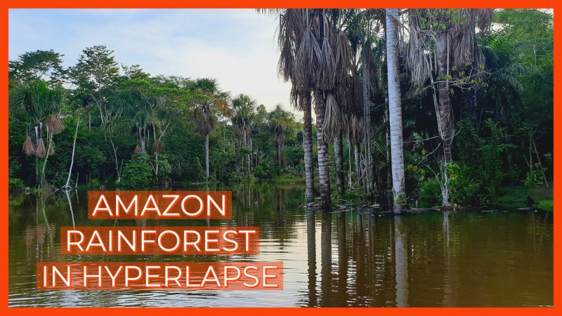
A few days ago Indecided I was going to stop procrastinating a d try and grow my channel. One of the first things I did was to try and implement branding on my thumbnails. I'd appreciate it if you guys could take a look and let m know what you think. I'm not saying they're perfect, but I'd say they are recognisable as being from the same channel when they appear on the search results.
What do you think?
Many thanks

Alex
 

Tamara Andrea

New Member
5
3
Hi! I think your off to a good start, however I would try to make your thumbnail as high quality as possible, I donΓÇÖt know if your using screenshots from videos or not, but iΓÇÿve learned that actually taking a high quality picture turns out the best. Also you want to make sure the font you use on your pictures are easy for EVERYONE to read. I personally have visual deficits, and had to really focus in on your picture to read the captions. Like I said your off to a great stat and I hope I helped! GL on growing your channel!!
 
OP
OP
Immortal Explorer

Immortal Explorer

Recognized Member
TubeBuddy User
99
10
Subscriber Goal
1000
Hi

Many thanks for the critique.

Yes I am still playing around with fonts its etc. By the way do you know that your TB subscribe button has an error on it?
Cheers

Alex
 

PhatBeetz

Recognized Member
87
7
Subscriber Goal
10
Hey Alex!

It looks like you have a solid foundation for expanding your reach on your channel. You already have some pretty nice videos on it!

I agree with Tamara. The font is a little too small and is not very prominent. Play around with your color palette until it "pops" with the background of your thumbnails that you've got.

Another suggestion I'd offer up is to choose backgrounds that are more representative of the overall content in the video. For example, one of your backgrounds has a collection of oil drums in the background. I'm not sure that I'd be drawn towards clicking on that tour if that's that first image I see (but I am rather curious as to why that's there).

Also, you're probably going to be compiling your tours into playlists for different regions. Perhaps set the text isn't obscured by YouTube's overlay.

Awesome stuff!

PB
 
OP
OP
Immortal Explorer

Immortal Explorer

Recognized Member
TubeBuddy User
99
10
Subscriber Goal
1000
Thanks for looking.

I have since taken the advice and changed the thumbnails so that the font is larger and in White, so much more readable.

With regard to the oil drums, here's the story. The Kapitari Ayahusca retreat (in question) runs a permaculture project to promote sustainable farming, the oil drums contains the natural fertilizer used. I coupled the oil drum picture with the title "Hidden secrets of the Kapitari center" in an almost shameless clickbait manner, as it may lead the viewer (most likely someone researching ayahuasca retreats) to think there is some dark and dirty secret, when in fact the opposite is true. And yes, the video does focus on the sustainable farmin permaculture tour, so the image is relevant.

Out of curiosity, Here's the previous thumbnail for the post, which do you think is better?
thanks
My Post (61).jpg
 
  • Like
Reactions: PhatBeetz

PhatBeetz

Recognized Member
87
7
Subscriber Goal
10
Ah, I see! That's indeed an interesting story about the oil drums.

I think the current one is fine based on the title and the background! The text does stand out a little bit more, but the font size is still too small for easy viewing on a phone. You might consider doing a phone check for your thumbnails if you consider modifying them in the future. I humbly confess that I tend to look at the thumbnails first and read titles second.
 
  • Like
Reactions: Immortal Explorer
OP
OP
Immortal Explorer

Immortal Explorer

Recognized Member
TubeBuddy User
99
10
Subscriber Goal
1000
Thanks for taking the tim to look mate, I'll be sure to impliment your advice.

Cheers

Alex
 

Debsterism

Active Member
TubeBuddy Star
28
9
Much better. So what is the "branding" part? You going to use that same font on everything?
 
OP
OP
Immortal Explorer

Immortal Explorer

Recognized Member
TubeBuddy User
99
10
Subscriber Goal
1000
Much better. So what is the "branding" part? You going to use that same font on everything?

I'll be using the orange/white colour scheme and orange border, and potentially the same font. But I need to look more into subscribing to some kind of graphics/thumbnail software. There's obviously loads I can do to make it look more professional. I just made that and my others with the trial version of Adobe Spark. My problem is that I am now back in England and so have a limited amount of footage I can use for uploading videos.

Cheers
Alex