• Guest - Earn a FREE TubeBuddy Upgrade for being active on the forums! Click Here to learn how you earn free upgrades for TubeBuddy!
  • Guest - TubeBuddy has a discord! Click Here to join in the conversation!

Thumbnail Feedback Which Style Looks Better?

BraveStar

Life ain't no Nintendo Game
TubeBuddy User
2,113
24
Subscriber Goal
1000
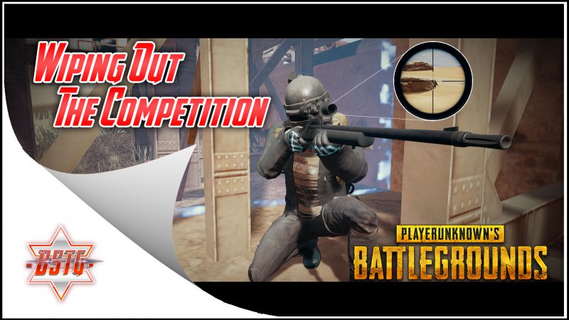
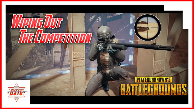
OK, so. I'm still experimenting with thumbnails for my videos trying to use tips and tricks that I have learned while maintaining some uniqueness in my thumbnails. Would like to get some feedback on these 2 thumbnails I am working on for a video I'll be uploading in the next few days. The one on the left was the previous style I was using, the one on the right is the new style. Please let me know what you think, especially if I am missing anything or have too much of anything.

29442945
 

TubeBuddy

Legendary Poster
12,450
33
www.tubebuddy.com
Subscriber Goal
5000
OK, so. I'm still experimenting with thumbnails for my videos trying to use tips and tricks that I have learned while maintaining some uniqueness in my thumbnails. Would like to get some feedback on these 2 thumbnails I am working on for a video I'll be uploading in the next few days. The one on the left was the previous style I was using, the one on the right is the new style. Please let me know what you think, especially if I am missing anything or have too much of anything.

View attachment 2944View attachment 2945

I like thumbnail one a bit more, but that's just me! I would maybe make the page peel effect a little less, but I'm curious what @Aaron would say :D
 

Aaron

Reputable Poster
TubeBuddy Legend
739
26
goldsteindigital.com
Subscriber Goal
1000
I'm more of a fan of the second one (with the red border) but both definitely need to be cleaned up a bit. On the first one the peel effect is choppy in some areas and in both the strokes are not in proportion.
 

RazzBarlow

Known Member
TubeBuddy Pro
181
12
Subscriber Goal
200
I'm more of a fan of option #2 myself. If it were me, I would move your main body of text a tick lower and to the right. It seems like you were trying hard to keep the text off of the figure in the photo. It wouldn't be the worst thing in the world if text overlapped a little onto him. But moving the text would move the "center of gravity" of the thumbnail a little bit.
 
OP
OP
BraveStar

BraveStar

Life ain't no Nintendo Game
TubeBuddy User
2,113
24
Subscriber Goal
1000
I like thumbnail one a bit more, but that's just me! I would maybe make the page peel effect a little less, but I'm curious what @Aaron would say :D

Thanks for the reply. I did like the first one when I learned to make the page peel. My only issue what repeating the peel every time was time-consuming and for some reason, I could not get it to look smaller. Perhaps with more practice, I can make it better. But I stopped using kinda for the reason @Aaron said, it just looked choppy and that was because I managed to make it into a template but the editing I did to turn it into a template to avoid having to repeat the peel effect just messed it up. So I was stuck with either having a badly editing page peel effect to avoid repeating the step or having to repeat the page peel effects every time I made a new thumbnail. The second thumbnail style is derived from one of the thumbnail templates in the TubeBuddy Member Perks. I figured rather than using one that might be used by many I would create my own based on one of them and maintain the simple look Roberto and others said are ideal for thumbnails.

I'm more of a fan of the second one (with the red border) but both definitely need to be cleaned up a bit. On the first one the peel effect is choppy in some areas and in both the strokes are not in proportion.

Thanks for the reply. What do you mean the strokes? On the text? I can fix that.

I'm more of a fan of option #2 myself. If it were me, I would move your main body of text a tick lower and to the right. It seems like you were trying hard to keep the text off of the figure in the photo. It wouldn't be the worst thing in the world if text overlapped a little onto him. But moving the text would move the "center of gravity" of the thumbnail a little bit.

Thanks for the reply. Yea, I was trying to avoid covering the character. But I think I understand what you mean. I will definitely experiment with moving the text to a more centered look.

I honestly like them both but if I had to chose I would say the second one x

Thank you. Ever since I learned that thumbnails are more than just icing on the cake I have made a big effort to make them unique, special and eye-catching. I never figured the thumbnail would be almost as time-consuming to do as the editing of the content itself. LOL
 
  • Like
Reactions: SocialAnxietyAnd Me

SocialAnxietyAnd Me

Active Member
TubeBuddy Pro
37
6
Thanks for the reply. I did like the first one when I learned to make the page peel. My only issue what repeating the peel every time was time-consuming and for some reason, I could not get it to look smaller. Perhaps with more practice, I can make it better. But I stopped using kinda for the reason @Aaron said, it just looked choppy and that was because I managed to make it into a template but the editing I did to turn it into a template to avoid having to repeat the peel effect just messed it up. So I was stuck with either having a badly editing page peel effect to avoid repeating the step or having to repeat the page peel effects every time I made a new thumbnail. The second thumbnail style is derived from one of the thumbnail templates in the TubeBuddy Member Perks. I figured rather than using one that might be used by many I would create my own based on one of them and maintain the simple look Roberto and others said are ideal for thumbnails.


Thanks for the reply. What do you mean the strokes? On the text? I can fix that.


Thanks for the reply. Yea, I was trying to avoid covering the character. But I think I understand what you mean. I will definitely experiment with moving the text to a more centered look.


Thank you. Ever since I learned that thumbnails are more than just icing on the cake I have made a big effort to make them unique, special and eye-catching. I never figured the thumbnail would be almost as time-consuming to do as the editing of the content itself. LOL
oh yes! It's probably the most important part of the upload as it contributes to SEO
 
  • Like
Reactions: BraveStar

Ikerot

Not a mod
TubeBuddy User
2,400
32
Ikerot.com
Subscriber Goal
5000
I actually like the second one because of the red border. It catches my attention a lot more than a thin black border, though I don't know about that weird arrow-like mark in the top right corner. Maybe if that was cut, the thumbnail would look better.

Also, like what @Damon said, it all depends on your audience and what they click. Have you done A/B testing on it?
 
OP
OP
BraveStar

BraveStar

Life ain't no Nintendo Game
TubeBuddy User
2,113
24
Subscriber Goal
1000
Well, which one did your audience click on? My preferences don't matter.

If I'm reading the analytics correctly (see image below), based on the last 5 videos with the last 2 using the new thumbnail template, it seems the new template is getting more thumbnail clicks. Am I reading this right? The blue and purple videos are the last 2 I uploaded.
2959


I actually like the second one because of the red border. It catches my attention a lot more than a thin black border, though I don't know about that weird arrow-like mark in the top right corner. Maybe if that was cut, the thumbnail would look better.

Also, like what @Damon said, it all depends on your audience and what they click. Have you done A/B testing on it?

LOL, the arrow-like mark in the corner? I was trying to make it seem like it's connected to the square at the other end with my logo. Just trying to do some kind of symmetry. What do you mean by cut? Removed?
 
OP
OP
BraveStar

BraveStar

Life ain't no Nintendo Game
TubeBuddy User
2,113
24
Subscriber Goal
1000
Here's something to think about. Does this thumbnail visually convey "Wiping out the competition" to me it doesn't.

Well, that's the difficult part of this image. How to show the player vs multiple players? I can't find a scene that shows that properly. That's why I put the crosshair imagine above the gun. But I do have an idea that could help make it seem more like it conveys the label.
 
OP
OP
BraveStar

BraveStar

Life ain't no Nintendo Game
TubeBuddy User
2,113
24
Subscriber Goal
1000
Yeah, take it off and see how it is lol

Or maybe just make another box in that corner? That's kinda like the thumbnail template I used to create this one kinda looked like.
 

Beanie Draws

Mythical Poster
2,883
27
www.youtube.com
Subscriber Goal
30000
OK, so. I'm still experimenting with thumbnails for my videos trying to use tips and tricks that I have learned while maintaining some uniqueness in my thumbnails. Would like to get some feedback on these 2 thumbnails I am working on for a video I'll be uploading in the next few days. The one on the left was the previous style I was using, the one on the right is the new style. Please let me know what you think, especially if I am missing anything or have too much of anything.

View attachment 2944View attachment 2945
I like the shape of the curve on the left, but I'd remove the fold element it'self. The white curved element will help stand out in dark mode, and in white mode will really give a nice shape element to your thumbnails. I'm not sure if the right would have the same effect.

Before going to the trouble of changing ALL your thumbnails. Make up a mock gallery of say 10, and apply the style to 10 thumb designs to each style, and then make a dark mode version, and a bright mode version.

I took a look and I'll say, in dark mode the white boarder does stand out, but the old style also looks very nice. I don't like the red frame, especially in dark mode.

In white mode, I can kind of see why you went with red, but you might be better of trying the boarder in black rather than red so that it plays better in dark mode. But I do like the shape of the colour in white mode (but I'd actually but the ep numbers in the top right so you have a nice clean white space.

There's a lot of food for thought for you there hehe :p
 

Attachments

  • Screenshot (2000).png
    Screenshot (2000).png
    252.8 KB · Views: 246
  • Screenshot (2001).png
    Screenshot (2001).png
    365.7 KB · Views: 250
  • Like
Reactions: BraveStar

Beanie Draws

Mythical Poster
2,883
27
www.youtube.com
Subscriber Goal
30000
Well, which one did your audience click on? My preferences don't matter.
the visual catching of attention I don't think is niche based, and if you were to see either thumbs, which would grab your attention more. That makes you the audience. There is no audience if there's no click. You make part of the audience by simply looking and deciding if you'd click on the thumb or not. Just my thoughts :)
 

Damon

Trusted User
Trusted User
2,779
25
www.blackwarriorlures.com
Subscriber Goal
10000
the visual catching of attention I don't think is niche based, and if you were to see either thumbs, which would grab your attention more. That makes you the audience. There is no audience if there's no click. You make part of the audience by simply looking and deciding if you'd click on the thumb or not. Just my thoughts :)

But even you posted one of your dinosaur thumbnail once before, and the one everyone picked here was not the one your audience pick on your channel. Your audience wanted the black and white version as I remember. Everyone here wanted the color version because it was visually "more" stimulating.

Facts are facts. Niche had nothing to do with it. People act in different ways when fantasizing vs reality. Here we're imagining which one we'd click on. That put us in a different mind frame. We're having to fantasize and think about which thumbnail we would click on.

Where as when his audience in inundated with 50 other videos to watch in thier feed, what decision do they make at that moment? One is fantasy. The other is reality.

Giving us two thumbnails to compare is unrealistic because there may be 100 thumbnails in the persons feed vying for their attention. And many of those thumbnails may be more click worthy than yours.

Its the old Sun Tzu really, one of the ancient books that everyone should read. I forget exactly quotation but its something like once you subject your plans to the enemy, it's time for another plan. In other words sitting here in this "insulated/isolated" forum choosing between two thumbnails is not realistic. Once subjected to the rest of the world--every thumbnail in his audience's feed--the results may tally very differently from what was chose by many here.

It has nothing to do with niche. It has everything to do with the Art of War as taught by Sun Tzu and others. Even Einstein taught this. Reality and our perception of reality are two different things. So our perception of which is the better thumbnail and what his audience clicks on are two different things.