You are using an out of date browser. It may not display this or other websites correctly.
You should upgrade or use an alternative browser.
You should upgrade or use an alternative browser.
Thumbnail Feedback Choose my thumbnail! What do you think?
- Thread starter gsweeting
- Start date
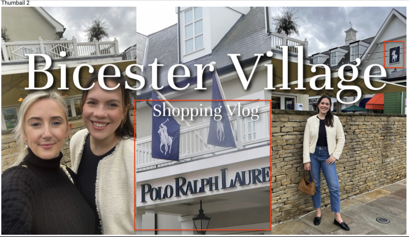
I would choose the second one, I don't know why maybe because of the pretty blonde girl
I do not know your brand, however with that said, I share what I see:
TN#1 - seems to be about food (2 of 3 panels). Is this what your channel/video is all about, or is it more than food?
TN#2 - I wonder if you are distracting from your Brand in this TN with nearly 1/3 of your image having PRL on it. Unless your brand is Polo Ralph Lauren.
TN#1 - seems to be about food (2 of 3 panels). Is this what your channel/video is all about, or is it more than food?
TN#2 - I wonder if you are distracting from your Brand in this TN with nearly 1/3 of your image having PRL on it. Unless your brand is Polo Ralph Lauren.
Attachments
This is so helpful thank you. I didn't think about having another brand in there!I do not know your brand, however with that said, I share what I see:
TN#1 - seems to be about food (2 of 3 panels). Is this what your channel/video is all about, or is it more than food?
TN#2 - I wonder if you are distracting from your Brand in this TN with nearly 1/3 of your image having PRL on it. Unless your brand is Polo Ralph Lauren.
@Alex_T @jawadsoomro thanks guys I didn't even think about the fork, really appreciate it
It's a bit busy. Why not have just one image? The text could also be placed at the bottom as it obscures much of your image.

