• Guest - Earn a FREE TubeBuddy Upgrade for being active on the forums! Click Here to learn how you earn free upgrades for TubeBuddy!
  • Guest - TubeBuddy has a discord! Click Here to join in the conversation!

Thumbnail Feedback Which One Does More For You?

LibertyLinks

Known Member
TubeBuddy Pro
113
13
Subscriber Goal
1500
Hey guys,
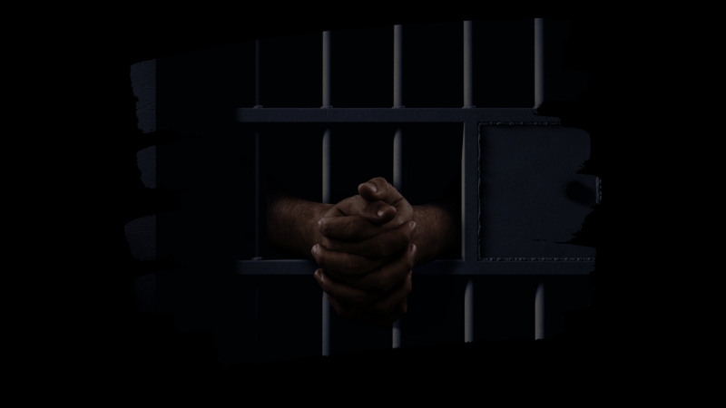
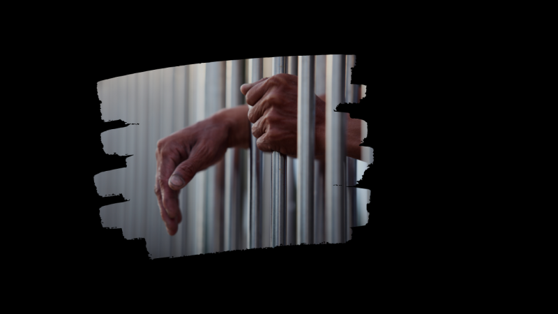
I have here two thumbnail ideas for my project on wrongful convictions. I was looking for something moody and dark. I felt like the really dark one would almost be impossible to see on the YouTube app. The lighter one one is better. I'm purposely not putting any text on it because I'm experimenting with letting the title tell the viewer what their about to see. My question is do either of these two work, or would you go for something ells entirely?
 

Attachments

  • Copy of Justice-denied .png
    Copy of Justice-denied .png
    278.3 KB · Views: 148
  • Justice-denied  (1).png
    Justice-denied (1).png
    289.5 KB · Views: 148

MediaMan

Very Well-Known Member
364
12
If it's down to these 2, then it's pretty easy since one of them is so dark I can hardly see anything. ;) If testing on your phone, make sure you test with the brightness levels at default levels. I'm on a PC and it's still pretty dark. I'm only looking at the thumbs here and not the full size image since it's a similar size to normal thumbs when viewing on YT.
 

jawadsoomro

Distinguished Poster
TubeBuddy User
644
19
Subscriber Goal
10000
I think first one. But make it a little brighter. It's hard to see what is going on. Also, people usually click those thumbnails that have high contrast and big texts. Even if your title says everything about video. But you would not be able to encourage your viewers to click on your video. Rest is all your choice.
 
  • Like
Reactions: The Boozebuddy

larvar

New Member
1
1
Thank you very much for the useful information that the blog has shared. it's pretty perfect you can try it whenever you want here.

( Pizza Tower ).​
 

rosab

New Member
TubeBuddy Pro
6
5
The second one stands out. The first one is quite dark and barely visible.