• Guest - Earn a FREE TubeBuddy Upgrade for being active on the forums! Click Here to learn how you earn free upgrades for TubeBuddy!
  • Guest - TubeBuddy has a discord! Click Here to join in the conversation!

Thumbnail Feedback Update Thumbnails

LibertyLinks

Known Member
TubeBuddy Pro
113
13
nbgrooms.com
Subscriber Goal
1500
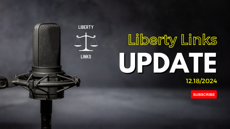
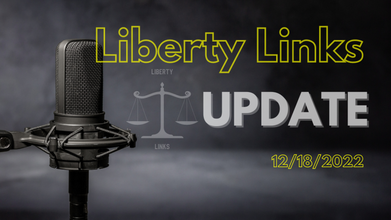
I'm looking for a generic thumbnail that I can reuse for each channel update I do. All I have to do is change the date. Below is a design I like pretty much. Once again, it should be something the goes with any topic I choose to talk about. What are some of the changes you'd make. What are some of the best practices for a thumbnail you know you're going to use multiple times.
 

Attachments

  • update-template .png
    update-template .png
    1 MB · Views: 121

Arvind

New Member
4
5
Subscriber Goal
100000
I think it looks pretty good. Very good contrast and easy to read. For me I like alignment. So the white liberty link graphic on the left could be enlarged to match the larger text? Meaning the height of the graphic should be the same height of the yellow and white text as a whole. The yellow Liberty Links can also be enlarged slightly to align with the "UPDATE" Text. To me if there is some alignment, it adds to the visual balance and appeal, IMHO. Otherwise, I like the overall layout.
 
OP
OP
LibertyLinks

LibertyLinks

Known Member
TubeBuddy Pro
113
13
nbgrooms.com
Subscriber Goal
1500
I think it looks pretty good. Very good contrast and easy to read. For me I like alignment. So the white liberty link graphic on the left could be enlarged to match the larger text? Meaning the height of the graphic should be the same height of the yellow and white text as a whole. The yellow Liberty Links can also be enlarged slightly to align with the "UPDATE" Text. To me if there is some alignment, it adds to the visual balance and appeal, IMHO. Otherwise, I like the overall layout.
Thanks for the great feedback. I've tried to implement some of your suggestions. I had a hard time making the Liberty Links logo bigger like you said without it getting in the way of the microphone. The podcast microphone is kind of the focal point. This is my second attempt with this.
 

Attachments

  • 12-18-2022-update.png
    12-18-2022-update.png
    1.1 MB · Views: 131

Arvind

New Member
4
5
Subscriber Goal
100000
Yes. Don't want the text to run into the microphone. I was thinking something like this. See how the text is aligned including the logo? You may not need to adjust the logo too much. I have added some lines to show how text can be aligned to each other. Hope this helps.
 

Attachments

  • LIBERTY.jpg
    LIBERTY.jpg
    136.8 KB · Views: 117