• Guest - Earn a FREE TubeBuddy Upgrade for being active on the forums! Click Here to learn how you earn free upgrades for TubeBuddy!
  • Guest - TubeBuddy has a discord! Click Here to join in the conversation!

Channel Review How can I improve

BraveStar

Life ain't no Nintendo Game
TubeBuddy User
2,113
24
Subscriber Goal
1000
Well, I just took a look at your channel but before I give you my thoughts let me first say that in the future make sure to read the rules of this section. Your self review is not the same as the link to the other review. You're supposed to actually point out what you believe you need to improve on on your own channel before the rest of us give you our opinion. So if you can, please update the post to reflect that. In the meantime I'll leave it open. But if I notice it's not corrected I will have to lock it.

As for your channel, here are my thoughts. I'll start by saying I am confused by the fact that you have over 1000 subs but you only have 34 videos an most have been uploaded in the past 5 months. On top of that most of your videos don't even break 30 views. I would hope you didn't use some kind of scheme to grow your sub count because as you can see that doesn't actually help your channel and if anything could potentially get the channel deleted by YouTube.

Your channel is new so basically you're dealing with the basics of a new content creator. How to improve? The only way to do that is to know who your audience is and just keep making content. Do the best you can to make the content as good as possible but focus more on simply making as much content as you can. You need to allow the YouTube algorithm to analyze your channel, to determine what kind of content you make and who this content is for. It's gonna take a whole lot more than 34 videos to do that. Most pro youtubers will tell to make 100 crappy videos for starters. The idea is not to get large numbers of views, it's to let the algorithm get used to your channel, to analyze it, to create a profile for your content. During this time you learn to make better edits, to try new ideas, to learn about SEO and thumbnails. It's about the learning experience.

Focus on that first and then worry about views and subs. Otherwise you're just gonna frustrate yourself wondering why no one is watching your videos.

That's my 2 cents. Hope it helps.
 
  • Like
Reactions: MattCommand1
OP
OP
Dysphasia PV

Dysphasia PV

Familiar Member
TubeBuddy Pro
Trusted User
52
10
www.dysphasia.co.uk
Subscriber Goal
10000
Well, I just took a look at your channel but before I give you my thoughts let me first say that in the future make sure to read the rules of this section. Your self review is not the same as the link to the other review. You're supposed to actually point out what you believe you need to improve on on your own channel before the rest of us give you our opinion. So if you can, please update the post to reflect that. In the meantime I'll leave it open. But if I notice it's not corrected I will have to lock it.

As for your channel, here are my thoughts. I'll start by saying I am confused by the fact that you have over 1000 subs but you only have 34 videos an most have been uploaded in the past 5 months. On top of that most of your videos don't even break 30 views. I would hope you didn't use some kind of scheme to grow your sub count because as you can see that doesn't actually help your channel and if anything could potentially get the channel deleted by YouTube.

Your channel is new so basically you're dealing with the basics of a new content creator. How to improve? The only way to do that is to know who your audience is and just keep making content. Do the best you can to make the content as good as possible but focus more on simply making as much content as you can. You need to allow the YouTube algorithm to analyze your channel, to determine what kind of content you make and who this content is for. It's gonna take a whole lot more than 34 videos to do that. Most pro youtubers will tell to make 100 crappy videos for starters. The idea is not to get large numbers of views, it's to let the algorithm get used to your channel, to analyze it, to create a profile for your content. During this time you learn to make better edits, to try new ideas, to learn about SEO and thumbnails. It's about the learning experience.

Focus on that first and then worry about views and subs. Otherwise you're just gonna frustrate yourself wondering why no one is watching your videos.

That's my 2 cents. Hope it helps.

With this bit, I didn't understand the instructions. The request asked me to give the link of my review which I did, unless I misunderstood (which happens with my disability constantly) and if so, I'm sorry and please explain further:

Well, I just took a look at your channel but before I give you my thoughts let me first say that in the future make sure to read the rules of this section. Your self review is not the same as the link to the other review. You're supposed to actually point out what you believe you need to improve on on your own channel before the rest of us give you our opinion. So if you can, please update the post to reflect that. In the meantime I'll leave it open. But if I notice it's not corrected I will have to lock it.

As for the videos, everything is an ongoing project. I feel that I started off wrong and getting it all sorted now (which is time-consuming but enjoyable and will get there soon). I have sorted out my SEO (hopefully) and am just started on sorting out the thumbnails, as you probably seen if you've looked at the earlier ones.
 

Stanley | Team TB

Amazingly Decent and Not-At-All Terrible Fishing
Administrator
TubeBuddy Staff
2,644
25
Subscriber Goal
250000
You organized your channel decent... the banner is good, you have your video shelf at the top, a good trailer and multiple shelves. But the overall appearance is lacking. I'm fine with the banner, but I feel there should be more playlists and more/different video shelves on your channel page. There needs to be more representation for your library of videos rather than just a single shelf to scroll through.

Speaking of variety, I would spice up the thumbnails. You have a certain aesthetic to them and they are are different... but unless I am really looking close I cant read the text and they don't stand out nor are they representative of the topic. You can definitely upgrade the thumbnail design and see some benefits from doing so.

Other than that I like everything you are doing; solid SEO research, you are consistent and conversational. You have the beginnings of a really good channel here!
 
  • Love
Reactions: Niki B

Kathleen

Recognized Member
TubeBuddy User
87
10
Greetings! I second everything Stanley said above. ^ I think that organizing the videos into different playlists and changing up the thumbnails (perhaps getting them to be a little more stylistically cohesive with your banner/branding or vice versa) would be helpful in terms of aesthetics.

I also think that you have the makings of a great channel, as you have a worthwhile mission and informative content. Your story and efforts are inspirational! :)

In taking a look at the SEO score and the tags you're using on some of your videos, I think that you could probably utilize the Keyword Explorer tool on TB a little more effectively. Your trailer video, for instance (
View: https://www.youtube.com/watch?v=EmzG5KMZJcc
), has a lot of tags regarding YouTube SEO and analytics, but that's not what your channel is about.

Your recent upload about driving (
View: https://www.youtube.com/watch?v=qSc0sAONlE0
) seems to have more related tags, but in a quick search I found some unweighted ones that seem to be relevant and scored "good" and above (I'd check these yourself since I don't have your channel; therefore I'm not able to see if the weighted score is better or worse): dyspraxia in adulthood, dyspraxia symptoms in adulthood, driving with a speech disorder, living with speech disorder, living with dyspraxia

I hope that helps!
 
  • Like
Reactions: Dysphasia PV
OP
OP
Dysphasia PV

Dysphasia PV

Familiar Member
TubeBuddy Pro
Trusted User
52
10
www.dysphasia.co.uk
Subscriber Goal
10000
Greetings! I second everything Stanley said above. ^ I think that organizing the videos into different playlists and changing up the thumbnails (perhaps getting them to be a little more stylistically cohesive with your banner/branding or vice versa) would be helpful in terms of aesthetics.

I also think that you have the makings of a great channel, as you have a worthwhile mission and informative content. Your story and efforts are inspirational! :)

In taking a look at the SEO score and the tags you're using on some of your videos, I think that you could probably utilize the Keyword Explorer tool on TB a little more effectively. Your trailer video, for instance (
View: https://www.youtube.com/watch?v=EmzG5KMZJcc
), has a lot of tags regarding YouTube SEO and analytics, but that's not what your channel is about.

Your recent upload about driving (
View: https://www.youtube.com/watch?v=qSc0sAONlE0
) seems to have more related tags, but in a quick search I found some unweighted ones that seem to be relevant and scored "good" and above (I'd check these yourself since I don't have your channel; therefore I'm not able to see if the weighted score is better or worse): dyspraxia in adulthood, dyspraxia symptoms in adulthood, driving with a speech disorder, living with speech disorder, living with dyspraxia

I hope that helps!

The last critique about video regarding Dyspraxia, Stanley has gone through that with me in the last stream, so small world! Lol. But, it's cool, I'll have a look into it.

For the channel trailer, I don't know what I was doing there. I thought that I had put tags in about the channel, not YouTube. So, thank you for alerting me to it. I think that I hadn't joined Tubebuddy Discord at the time of me doing that video, so didn't have a clue what I was doing (in fact, I still don't! Lol)

For the first bit (as in the quoted bit below), sorry, you need to explain what you're talking about because I didn't understand a word of it.

I think that organizing the videos into different playlists and changing up the thumbnails (perhaps getting them to be a little more stylistically cohesive with your banner/branding or vice versa) would be helpful in terms of aesthetics.

I also think that you have the makings of a great channel, as you have a worthwhile mission and informative content. Your story and efforts are inspirational! :)

But thanks for the input, and I look forward to hearing your thoughts.

Damo
 

Kathleen

Recognized Member
TubeBuddy User
87
10
Hey Damo!

Oh yes, now I remember - I was watching the stream, too!

No worries about not catching that sooner - sometimes it's helpful to have a fresh set of eyes looking at your stuff. :)

In terms of organizing the videos, I just meant perhaps having a couple playlists as their own sections on the front page (looking at your three playlists, I'd put the "Dyspraxia" and "Developmental Language Disorders" ones on your front page and you can always switch those out as you make more videos and playlists of course). Here's an example of a gamer I follow who has his videos organized into different sections to give you an idea: https://www.youtube.com/c/notOtzdarva

As for what I was saying about the thumbnails, I was just giving you a suggestion about making your thumbnails visually tie together with your banner and branding/logo (for instance, your thumbnails are mostly dark and purple while your banner and logo are lighter, blue, and green). Here are some examples of what I'm talking about:
https://www.youtube.com/channel/UCT2RrVhQhJBr6h-cfWCFhAA (similar photos and fonts used)
https://www.youtube.com/channel/UC_htUlq7eYumecIoQai4HzQ (similar fonts and colors)
https://www.youtube.com/c/TubeBuddy (even in ours you can see how the red to purple gradient is featured in both the banner and many of the thumbnails)

Of course, you can take or leave any of my suggestions - I hope that something I said was helpful to you, though!
 
  • Like
Reactions: Dysphasia PV

MattCommand1

On sabbatical
TubeBuddy Pro
Trusted User
1,020
25
Subscriber Goal
5000
Speaking of variety, I would spice up the thumbnails. You have a certain aesthetic to them and they are different... but unless I am really looking close I cant read the text and they don't stand out nor are they representative of the topic.

At least 6 people have said this about the lack of text readability of the thumbnails every time he solicits feedback. But he repeatedly writes that he reads them just fine on his phone. That obviously means everyone who has given him feedback has vision problems and he is sticking to his position on the text of his thumbnails.
 
  • Sad
Reactions: Dysphasia PV
OP
OP
Dysphasia PV

Dysphasia PV

Familiar Member
TubeBuddy Pro
Trusted User
52
10
www.dysphasia.co.uk
Subscriber Goal
10000
At least 6 people have said this about the lack of text readability of the thumbnails every time he solicits feedback. But he repeatedly writes that he reads them just fine on his phone. That obviously means everyone who has given him feedback has vision problems and he is sticking to his position on the text of his thumbnails.

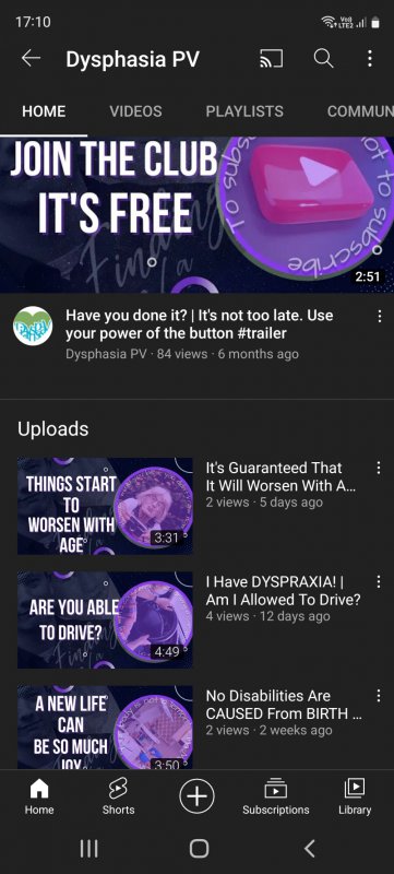
Only because this is what I see ⬇️ I don't know what it looks like on other people's fones!
Screenshot_20220519-171033_YouTube.jpg
 

GPx

Active Member
TubeBuddy User
35
7
Subscriber Goal
5000
Only because this is what I see ⬇ I don't know what it looks like on other people's fones!
View attachment 12237

It's not about how it looks on other peoples' phones. It's about other peoples' varying eye sights.

I think there's two issues here:

  1. YOU personally know what it says so regardless of how small it is you'll still think it's ok when you read it. It's kind of like confirmation bias in a way.
  2. Not everyone looking at their phone has the same eye sight quality as you.
When you make thumbnails, particularly the text part of it, you need to think can people sufficiently see what it says. Not just base it on your own sight, but you have to think about the wider audience.

Take this as another example. If you are writing about something technical, you need to consider your audience and dumb it down a bit to ensure everyone understands it. But when you read it yourself you know exactly what it is saying because you know the subject. So in that scenario you need to take yourself out of the equation and read it like an idiot and see where you need to explain it more.

So, with your scenario you need to stop basing it on what YOU can see, and listen to the people you are asking feedback from who have their own eye sight that likely differs from yours. Otherwise there's no point in asking for feedback.

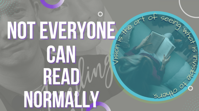
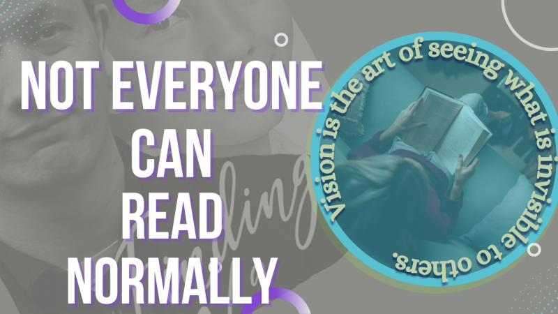
Just to be clear here, the big bold CAPS text is perfectly fine. It's the small squashed light-coloured text in a circle on light purple background that is being discussed here.
 
  • Love
Reactions: MattCommand1

GPx

Active Member
TubeBuddy User
35
7
Subscriber Goal
5000
I just wanted to add to my comments, as this might help with the understanding of where I am coming from.

Just to clarify, I don't browse Youtube on my phone, I can't stand it, I prefer the big PC screen to look at. So with that said, I just visited your channel and took a screengrab of a few videos as they appear on my 1920x1080 resolution monitor.

PC.png


Now I have inserted that image at 100% the size. It is not shrunken or enlarged, this is exactly what I see. I'm hoping the forum software doesn't enlarge it if you click on it.

But read the little text in the circle now.
 

MattCommand1

On sabbatical
TubeBuddy Pro
Trusted User
1,020
25
Subscriber Goal
5000
It's not about how it looks on other peoples' phones. It's about other peoples' varying eye sights.

I think there's two issues here:

  1. YOU personally know what it says so regardless of how small it is you'll still think it's ok when you read it. It's kind of like confirmation bias in a way.
  2. Not everyone looking at their phone has the same eye sight quality as you.
When you make thumbnails, particularly the text part of it, you need to think can people sufficiently see what it says. Not just base it on your own sight, but you have to think about the wider audience.

Take this as another example. If you are writing about something technical, you need to consider your audience and dumb it down a bit to ensure everyone understands it. But when you read it yourself you know exactly what it is saying because you know the subject. So in that scenario you need to take yourself out of the equation and read it like an idiot and see where you need to explain it more.

So, with your scenario you need to stop basing it on what YOU can see, and listen to the people you are asking feedback from who have their own eye sight that likely differs from yours. Otherwise there's no point in asking for feedback.

Just to be clear here, the big bold CAPS text is perfectly fine. It's the small squashed light-coloured text in a circle on light purple background that is being discussed here.

GPX pretty much covered everything here. Great job on providing a detailed explanation. I've never seen anyone defend so hard where so many people say "the text is unreadable" as THEIR experience but then get a response from the designer "Well.... I can read it fine."

Who is the video supposed to cater to then? People with long attention spans with perfect reading vision?

Hint: No viewer has long attention spans for a thumbnail. We are lucky if they pay attention for more than one second on a thumbnail.
 
  • Sad
Reactions: Dysphasia PV
OP
OP
Dysphasia PV

Dysphasia PV

Familiar Member
TubeBuddy Pro
Trusted User
52
10
www.dysphasia.co.uk
Subscriber Goal
10000
Hey Damo!

Oh yes, now I remember - I was watching the stream, too!

No worries about not catching that sooner - sometimes it's helpful to have a fresh set of eyes looking at your stuff. :)

In terms of organizing the videos, I just meant perhaps having a couple of playlists as their own sections on the front page (looking at your three playlists, I'd put the "Dyspraxia" and "Developmental Language Disorders" ones on your front page and you can always switch those out as you make more videos and playlists of course). Here's an example of a gamer I follow who has his videos organized into different sections to give you an idea: https://www.youtube.com/c/notOtzdarva

As for what I was saying about the thumbnails, I was just giving you a suggestion about making your thumbnails visually tie together with your banner and branding/logo (for instance, your thumbnails are primarily dark and purple while your banner and logo are lighter, blue, and green). Here are some examples of what I'm talking about:
https://www.youtube.com/channel/UCT2RrVhQhJBr6h-cfWCFhAA (similar photos and fonts used)
https://www.youtube.com/channel/UC_htUlq7eYumecIoQai4HzQ (similar fonts and colors)
https://www.youtube.com/c/TubeBuddy (even in ours, you can see how the red to purple gradient is featured in both the banner and many of the thumbnails)

Of course, you can take or leave any of my suggestions - I hope that something I said was helpful to you, though!

Is this any better?

I'm sure that someone won't like it...they usually don't.

All you need to (44).png
 

Kathleen

Recognized Member
TubeBuddy User
87
10
I do like the colors better in this thumbnail, yes! I do agree with what GPx and Matt are trying to explain about the text in the circle, though - that's a little harder to read as a thumbnail. Perhaps changing it to a thicker font and lightening the color?
 

MattCommand1

On sabbatical
TubeBuddy Pro
Trusted User
1,020
25
Subscriber Goal
5000
I'm sure that someone won't like it...they usually don't.

No one "dislikes" or "hates" your thumbnail. No one has a grudge against you, your topic, your channel, or your thumbnail.

You simply don't see or understand what EVERYONE has tried to explain multiple times in multiple ways. I think it is safe to say some of us are bewildered more than anything else.

It's your thumbnail and your channel. Do what you want. But if you keep asking, you are going to keep getting the same answers. No one is trying to hate on you. Everyone has tried to be very respectful but you are not getting it.

But it is abundantly clear, what is obvious to the rest of us, you just cannot or refuse to see.

You are too attached to the elements.

If you feel strongly, just do it. No need to keep soliciting feedback that disagrees with your sensibilities.