You are using an out of date browser. It may not display this or other websites correctly.
You should upgrade or use an alternative browser.
You should upgrade or use an alternative browser.
Thumbnail Feedback Thumbnail feedback
- Thread starter Hookem Fishing
- Start date
- 2,644
- 25
- Subscriber Goal
- 250000
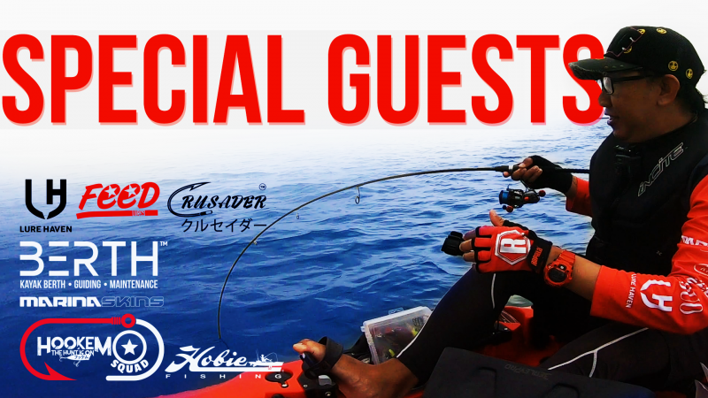
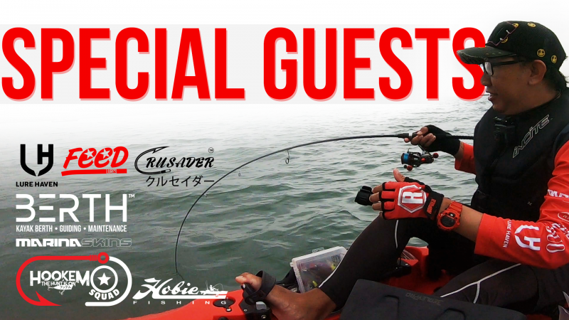
Man... I have a hard time with this. For starters it is very professional, very clean. That's a good picture, the coloring all works together and you have bright, bold text. I'm not a fan of all the logos, especially since they are so small noone can really read that... but I think both of us realize that they aren't meant to be read. Fishermen will recognize them and appreciate that this video is going to feature content that is being backed by companies and with any luck it is going to be companies that the viewer recognizes without reading.
But I'm going to get critical here... aside from the professional layout, good picture and bright text the thumbnail itself is bland. It doesn't scream at me, you know? It looks like one of the ads you would put in the corner of a page of ads in a magazine. Again, totally professional... but it doesn't create the intrigue that I would go for in trying to capture clicks. I push for more dramatic angles in my photos and I try to capture imagery that makes the viewer question what is happening or gives them a solid reason to want to watch what this video is about.
On it's own you really do have a good thumbnail... I am being really critical here. But I would push for a more grandiose design in future iterations. Aim for the cover of the magazine, not the inside ads!
As a non-fish person, I don't know what Special Guests mean. Is he referring to potential fishes in the waters or his sponsors?
Would all people who enjoy fishing understand all the brand logos? And even if they did recognize the logos, is that the draw?
The font is good, the color is good, the sizing is good. I am not a big fan of loading up any thumbnail with a bunch of logos.
Obviously, my opinion is to be taken very lightly since I am probably not the target audience.
Thanks for the insight! It really helps! Esp when feedback is given! Will try approach it from another angle this weekend! Appreciate it loads!!Man... I have a hard time with this. For starters it is very professional, very clean. That's a good picture, the coloring all works together and you have bright, bold text. I'm not a fan of all the logos, especially since they are so small noone can really read that... but I think both of us realize that they aren't meant to be read. Fishermen will recognize them and appreciate that this video is going to feature content that is being backed by companies and with any luck it is going to be companies that the viewer recognizes without reading.
But I'm going to get critical here... aside from the professional layout, good picture and bright text the thumbnail itself is bland. It doesn't scream at me, you know? It looks like one of the ads you would put in the corner of a page of ads in a magazine. Again, totally professional... but it doesn't create the intrigue that I would go for in trying to capture clicks. I push for more dramatic angles in my photos and I try to capture imagery that makes the viewer question what is happening or gives them a solid reason to want to watch what this video is about.
On it's own you really do have a good thumbnail... I am being really critical here. But I would push for a more grandiose design in future iterations. Aim for the cover of the magazine, not the inside ads!
No no no.. every feedback is crucial for me. As it tells me what a consumer is thinking so I can tweak on my end to cater to all.As a non-fish person, I don't know what Special Guests mean. Is he referring to potential fishes in the waters or his sponsors?
Would all people who enjoy fishing understand all the brand logos? And even if they did recognize the logos, is that the draw?
The font is good, the color is good, the sizing is good. I am not a big fan of loading up any thumbnail with a bunch of logos.
Obviously, my opinion is to be taken very lightly since I am probably not the target audience.
Everyday is a learning curve
I'm just curious what it would look like if you changed the color of just the water and made it blue, then ramped up the brightness/saturation to match the brightness of that red. It'd be an artificial look, but that could make the whole image really pop.
I'm just curious what it would look like if you changed the color of just the water and made it blue, then ramped up the brightness/saturation to match the brightness of that red. It'd be an artificial look, but that could make the whole image really pop.
Thanks I see where you are getting at. Cheers!

I'm just curious what it would look like if you changed the color of just the water and made it blue, then ramped up the brightness/saturation to match the brightness of that red. It'd be an artificial look, but that could make the whole image really pop.
Turning up the brightness & saturation is a great idea that I keep forgetting to do in my rush to get my video uploaded and online. Often, I have to retroactively make changes to my thumbnails.
You are correct it distorts reality a bit but it DOES make a thumbnail pop!
Thanks I see where you are getting at. Cheers!
If you are really daring, throw in some bright yellow text/logos/whatever as an accent over the blue and other dark areas. Bright yellows & golds are a great contrast to almost any dark colored backgrounds.
Or if you want to get crazy, have "Special" as one color and "Guests" as another color. Now, I confess a pro designer might cringe at my idea but it makes it more noticeable. I would not be offended if someone said it looks "tacky". For better or for worse, there are a lot of "tacky" thumbnails but they do catch the eye.
- 551
- 19
- Subscriber Goal
- 20000
My first impression is the same as Stanely's. It is very professional. For me personally, that is a turn-off because it screams PROMO. I am a person who like real things and I do not like things that appear scripted. But this is just me.
Your thumbnail will appeal greatly to those that are into the American Pro fishing circuit though. They will understand all the branding because those guys have more patches on their hats and shirts than Nascar drivers. If that is the crowd you are trying to appeal to, then I think you have done a good job. The only advice I can offer on that front is that, your thumbnail appears to be geared to your subscribers who know you and your channel, not to new viewers. Since your channel only has 1K subs, you might want to target new viewers more.
Your thumbnail will appeal greatly to those that are into the American Pro fishing circuit though. They will understand all the branding because those guys have more patches on their hats and shirts than Nascar drivers. If that is the crowd you are trying to appeal to, then I think you have done a good job. The only advice I can offer on that front is that, your thumbnail appears to be geared to your subscribers who know you and your channel, not to new viewers. Since your channel only has 1K subs, you might want to target new viewers more.
My first impression is the same as Stanely's. It is very professional. For me personally, that is a turn-off because it screams PROMO. I am a person who like real things and I do not like things that appear scripted. But this is just me.
Your thumbnail will appeal greatly to those that are into the American Pro fishing circuit though. They will understand all the branding because those guys have more patches on their hats and shirts than Nascar drivers. If that is the crowd you are trying to appeal to, then I think you have done a good job. The only advice I can offer on that front is that, your thumbnail appears to be geared to your subscribers who know you and your channel, not to new viewers. Since your channel only has 1K subs, you might want to target new viewers more.
Yes that's an issue that I've been facing with. In Singapore Kayak Fishing is quite a minority.
Alot of them are either luring for peacock bass via poaching in the reservoirs.. which i won't do it as it's illegal.
Was toying with the idea of launching a video in the US timing to see if it works out better for me for the next video.
Nonetheless, awesome feedbacks guys, making me look at it differently! Thanks!

