
You are using an out of date browser. It may not display this or other websites correctly.
You should upgrade or use an alternative browser.
You should upgrade or use an alternative browser.
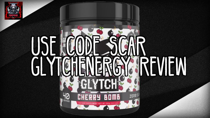
Thumbnail Feedback i took yal advice i Updated Thumbnails
- Thread starter YoBoyScar
- Start date


OP
OP
I'm not a fan of the fonts. At smaller sizes, the text is almost illegible, especially the third one. Remember, at full size a thumbnail may look cool, but it'll be pretty small when people are scrolling on their phones. So a font that's heavier/bolder and cleaner would make the words stand out better. The images in all four are on the muted, dark side, too, so a better font would help a lot.
- 551
- 19
- Subscriber Goal
- 20000
Getting better! One thing I do is personal A/B testing. I show my thumbs to my friends and ask them which ones they would be more likely to click on. Ask them to be honest.
OP
OP
i look at my phone and it seems fine to me i respect your opinion but people be complaining either they was small or too big i feel like is is good enoughI'm not a fan of the fonts. At smaller sizes, the text is almost illegible, especially the third one. Remember, at full size a thumbnail may look cool, but it'll be pretty small when people are scrolling on their phones. So a font that's heavier/bolder and cleaner would make the words stand out better. The images in all four are on the muted, dark side, too, so a better font would help a lot.
OP
OP
i respect your opinion but i did and they sid these was goodGetting better! One thing I do is personal A/B testing. I show my thumbs to my friends and ask them which ones they would be more likely to click on. Ask them to be honest.
- 551
- 19
- Subscriber Goal
- 20000
i respect your opinion but i did and they sid these was good
One thing you have to realize about the advice given on here is that it is all just opinion. Especially when it comes to the understanding of human behavior. There are no two people alike. I like classical music, my wife hates it. My son likes rap, I hate it. I will literally eat anything, (monkey, Muktuk (fermented whale blubber), rats, etc) my sons are the pickiest people on earth. The same holds true for thumbnails. What one person loves, another will hate. Human tastes are wide and varied.
What I suggest is that you develop several thumbnails for a video. Set a CTR goal you want to reach, say 10% (1 out of 10 people who see your thumbnail click on it). Use one thumbnail on a video for a month, then another for a month, so on and so forth. Then compare the CTR results from each thumbnail and see which one got you the highest CTR. If none of them achieve your goal CTR, then design new ones.
Here is one thing I do to help me choose Thumbnail designs. My most recent video was about a vintage RWS air rifle. I opened YouTube in a private browsing tab (important to receive non-weighted results), and typed in "Springer Air Rifle" I then sorted results by amount of views and found the most viewed video under the search term Springer Air Rifle, which was this one.

I then used this thumbnail as a basic guide to create a thumbnail for my new video which is this one.

So far this video has been my second highest viewed video on my last ten video releases in the first 48 hours.