You are using an out of date browser. It may not display this or other websites correctly.
You should upgrade or use an alternative browser.
You should upgrade or use an alternative browser.
Thumbnail Feedback Thumbnail
- Thread starter Theory Guitar
- Start date
- 2,644
- 25
- Subscriber Goal
- 250000
People are going to have trouble seeing this thumbnail on the phone. Every element is too small for mobile viewing. You have to make the elements pop more with the outline effect and higher-contrast colors.
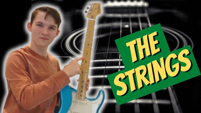
I threw this together in Canva as an example of what pops and can be seen both on desktop and mobile. You can change the font and colors to whatever you want. Notice I put a halo outline around your photo to make you pop out. I put in the dark guitar string image in the background to help make the foreground images stand out more.
I got rid of too extraneous text for people to read. The emphasis is "the strings", not the learning. Learning goes without saying.
I tilted the text to be more of an attention-getter than straight horizontal text.
I moved your image to the left because the strings are the centerpiece and theme.
Does this help you see what I mean?

Totally I really like that. I am going to look at Canva right now and start using it. I cant do that halo thing on the one I am using. Thanks so much for the help.I threw this together in Canva as an example of what pops and can be seen both on desktop and mobile. You can change the font and colors to whatever you want. Notice I put a halo outline around your photo to make you pop out. I put in the dark guitar string image in the background to help make the foreground images stand out more.
I got rid of too extraneous text for people to read. The emphasis is "the strings", not the learning. Learning goes without saying.
I tilted the text to be more of an attention-getter than straight horizontal text.
I moved your image to the left because the strings are the centerpiece and theme.
Does this help you see what I mean?
View attachment 11518
Could you by any chance share that project with me??
Glad you found my quickie mockup helpful. I sent you the template link privately (DM).
Canva makes it easy to make thumbnails pop.
You should do a video just on making thumbnails!!! This is so creative and looks amazing!I threw this together in Canva as an example of what pops and can be seen both on desktop and mobile. You can change the font and colors to whatever you want. Notice I put a halo outline around your photo to make you pop out. I put in the dark guitar string image in the background to help make the foreground images stand out more.
I got rid of too extraneous text for people to read. The emphasis is "the strings", not the learning. Learning goes without saying.
I tilted the text to be more of an attention-getter than straight horizontal text.
I moved your image to the left because the strings are the centerpiece and theme.
Does this help you see what I mean?
View attachment 11518
You should do a video just on making thumbnails!!! This is so creative and looks amazing!
Thanks for that! I appreciate it.
I might put up my personal checklist of my approach to thumbnails in a future post. My approach is heavily influenced by Derral Eves, his associates, and successful students. It is by no means the only style and approach but it resonates with me for now and is a template/formula that I can replicate.
I would outline you in white and add a shadow and would leave the word name straight instead of slantingOk here we go again. What does everyone think? Words too small? Boring?View attachment 11510
The second one is the way to go, it is much nicer. I would suggest cleaner photos of yourself in the future. Good job, 73
