You are using an out of date browser. It may not display this or other websites correctly.
You should upgrade or use an alternative browser.
You should upgrade or use an alternative browser.
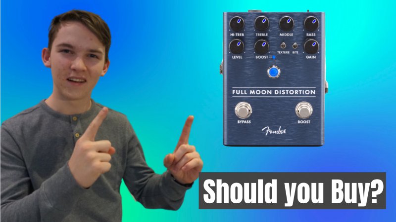
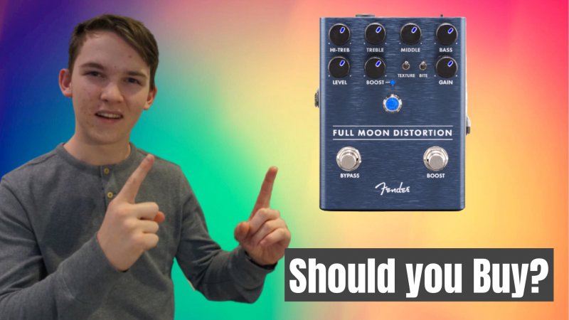
Thumbnail Feedback Ok, which thumbnail???
- Thread starter Theory Guitar
- Start date
- 2,644
- 25
- Subscriber Goal
- 250000
Yeah I will, I have to wait till tomorrow because it got locked for today.I always lean red... it's a more actionable color. Though I would suggest doing a search for your targeted keywords to see what the competition is doing. You'll learn a lot by seeing what you are up against.
- 2,644
- 25
- Subscriber Goal
- 250000
No... not keyword research. I mean an actual search in youTube. You want to see what the thumbnails you are competing against look like.Yeah I will, I have to wait till tomorrow because it got locked for today.
oh ok, got it. Thanks will doNo... not keyword research. I mean an actual search in youTube. You want to see what the thumbnails you are competing against look like.
A successful Derrel Eves student and real estate Ytuber often says viewers need to be able to see the "whites of your eyes" on your phone if you are going to use your face. So, that is something to look at. Also the lighting of your face should be looked at. It looks like you have lighting coming from the ceiling. You can also try making your image "pop" by using a halo effect.
I would make your device larger and the text larger. However, you may have to reposition things a bit.
Regarding coloring, it is always a bit subjective but high contrast colors between the object vs. background helps a lot. Your device is dark, hence a lighter background might help it pop. You could use an arrow to draw attention to the device and create illusion of movement/motion.
Out of the two, I prefer the one with the yellow/red background to start with.
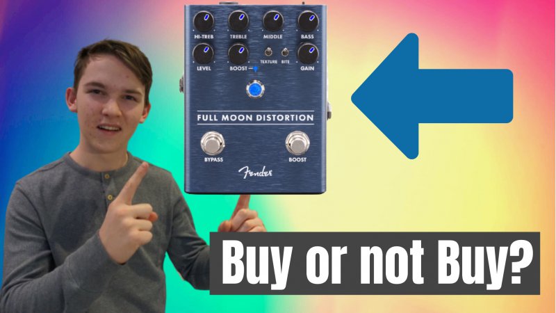
I had two slogans in mind "To Buy or Not to Buy!" or "Buy or Not Buy?"
Are you doing this on Canva? What software are you using?
However, you may want to center the device a bit more. Text still seems small to me. Remember, view your thumbnail on the phone. You may not care or it may not be your core audience but people over 45 might have a tougher time reading your thumbnail on their phone.
And your face probably needs to be larger. I would make the text box absolutely black to make the lettering pop even more.
I want to make sure people older people can read and see my thumbnail which is why I tend to skew everything as large as I can get away with.
I am using Snappa, which is kind of like Canva. Here is another update.Are you doing this on Canva? What software are you using?
However, you may want to center the device a bit more. Text still seems small to me. Remember, view your thumbnail on the phone. You may not care or it may not be your core audience but people over 45 might have a tougher time reading your thumbnail on their phone.
And your face probably needs to be larger. I would make the text box absolutely black to make the lettering pop even more.
I want to make sure people older people can read and see my thumbnail which is why I tend to skew everything as large as I can get away with.
I think I might have led you astray with the recent suggestions because the thumbnail looks disproportional and elements are too close to the borders. Additionally, the bottom right is an area to be careful because the timestamp often obstructs that area.
Design is not an exact science and requires trial and error and very difficult to explain on a forum. I asked if you used Canva because there is a way to share your work to let someone else tweak it. But since you have it on Snappa, I can't do anything for you. But if you are willing to bring the elements into a Free Canva account and then share it, I can take a few minutes and play with it. Or you can email or message me your photo and device image, I can put it into Canva and put something together for you to show you. I can't promise it will be better but I am willing to give it a shot.
In my mind, you have all the elements required for a decent thumbnail but the overall look right now doesn't look right because the proportions look off and I have no way of easily explaining it.


