You are using an out of date browser. It may not display this or other websites correctly.
You should upgrade or use an alternative browser.
You should upgrade or use an alternative browser.
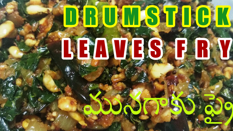
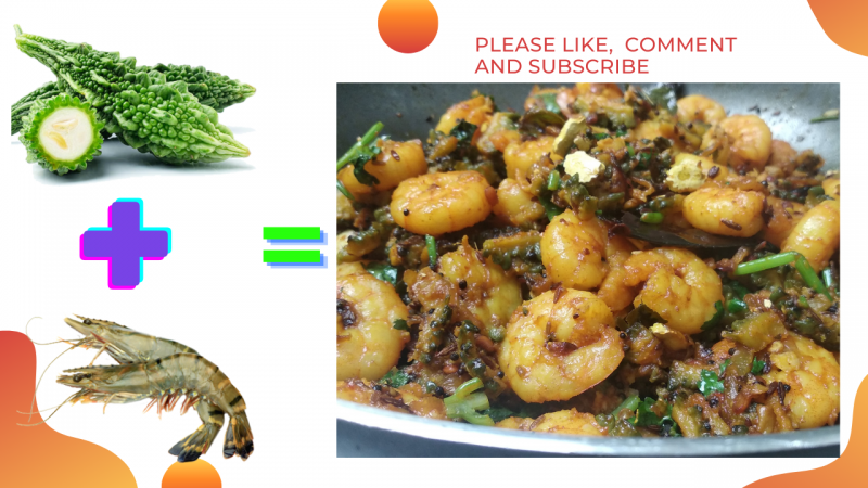
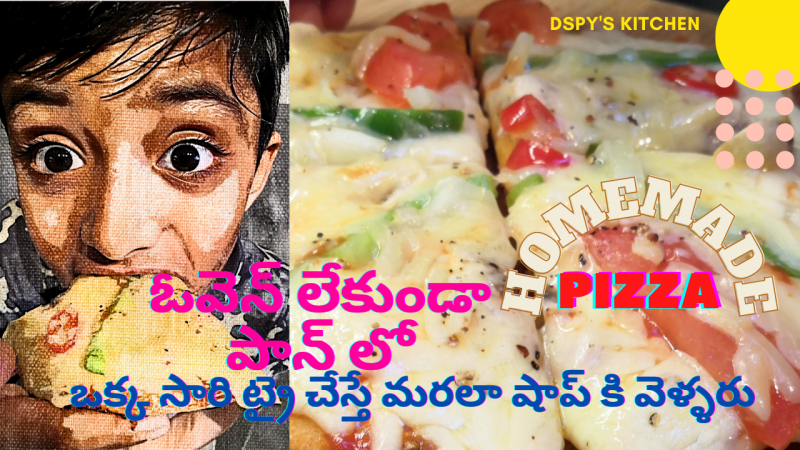
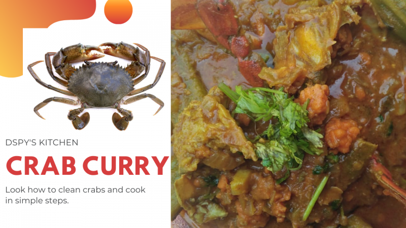
Thumbnail Feedback Please advice about my thumbnails.
- Thread starter dspy's kitchen
- Start date
A few thoughts...
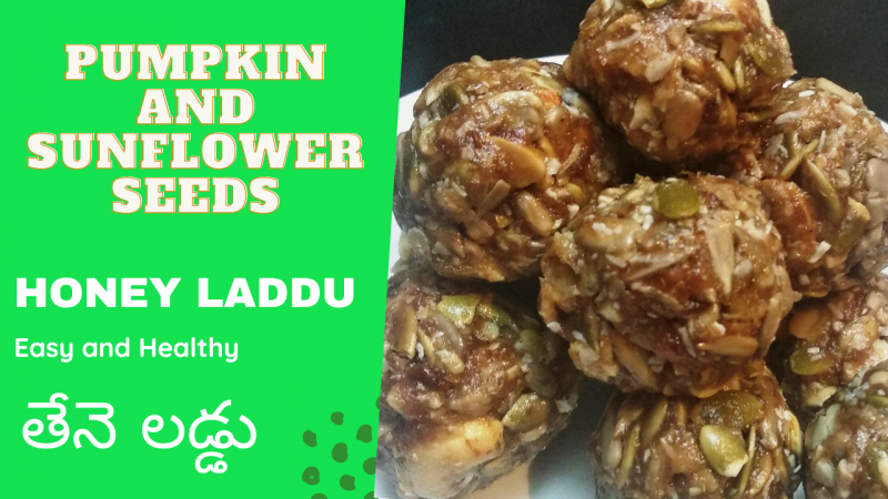
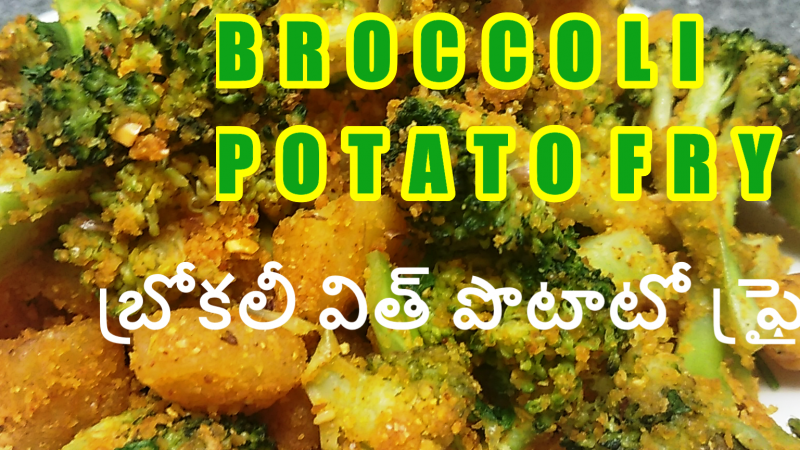
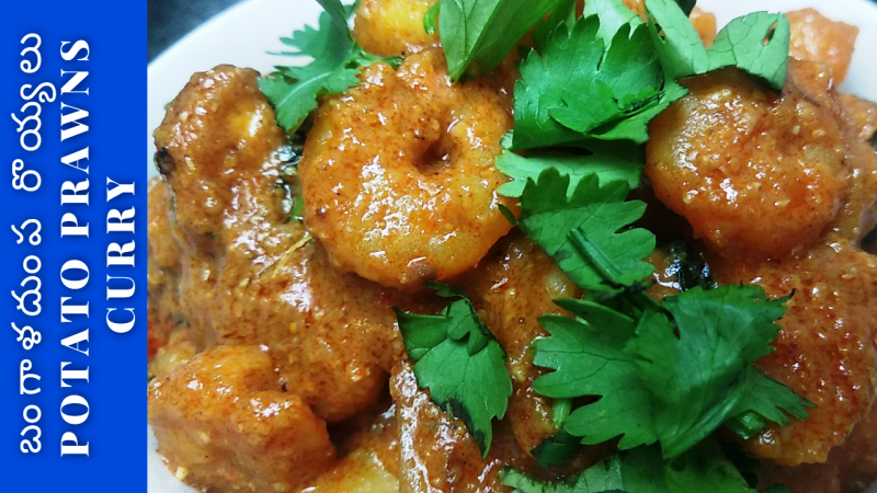
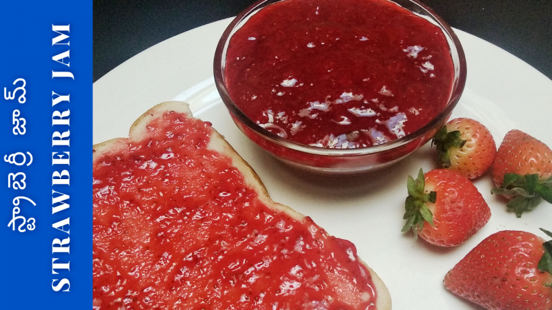
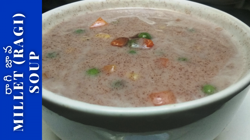
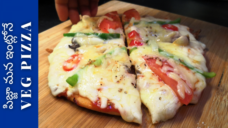
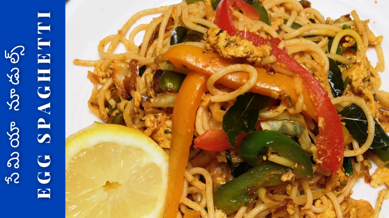
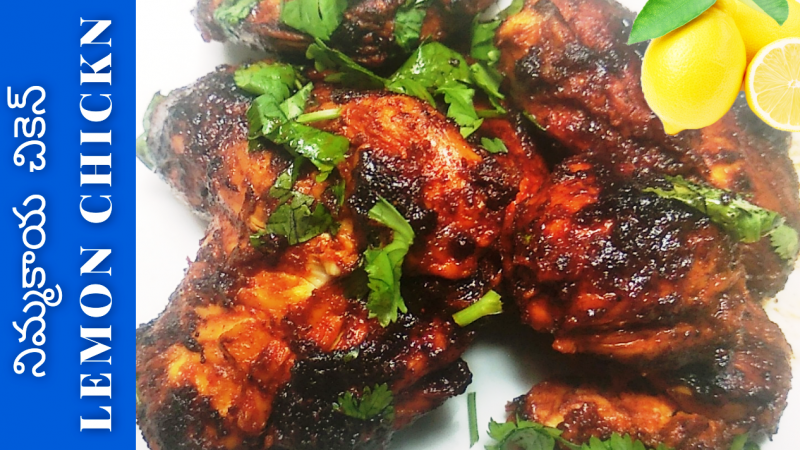
They lack consistency. If I saw these individually I would think they were from different channels. Next is text legibility. It is too small on many of these and lacks shadow and/or stroke to make it stand out from what is often a busy background.
I would start by focusing on those two things.
They lack consistency. If I saw these individually I would think they were from different channels. Next is text legibility. It is too small on many of these and lacks shadow and/or stroke to make it stand out from what is often a busy background.
I would start by focusing on those two things.
Thank you very much. I will try to maintain uniformity.I would pick 1 or two fonts and stay with that. Colours even as well. Just to keep it uniform. And when you're taking the thumbnail image. Try and keep them somewhat uniform if in a controlled environment
Thank you very much for your feedback, I am correcting now to make consistence.The quality of the thumbnail is not really good.
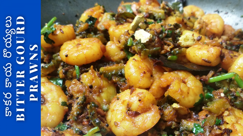
There is too much colour in your thumbnails. So the main content,i.e., the food, is not being able to captivate my attention. ItΓÇÖs getting lost among those colours. So try to keep the text and colour simple while allowing the food to stand out.View attachment 10281View attachment 10279View attachment 10277View attachment 10278View attachment 10276View attachment 10280
Hi Everyone, we would like to know if our thumbnails will work or not.
Your advice on any thumbnail will be a great help to us.
Thanks
DSPY'S KITCHEN
- 234
- 15
- Subscriber Goal
- 200
I feel as though the text and colored banner on the side is taking away from the food and then it just looks a bit overall busy.
I dont want to turn my head left side, to read what exactly is written. Also the background of the text is more colorful than the food item photo. Try to see some similar examples, you will get the idea.
Thanks
Thanks

