You are using an out of date browser. It may not display this or other websites correctly.
You should upgrade or use an alternative browser.
You should upgrade or use an alternative browser.
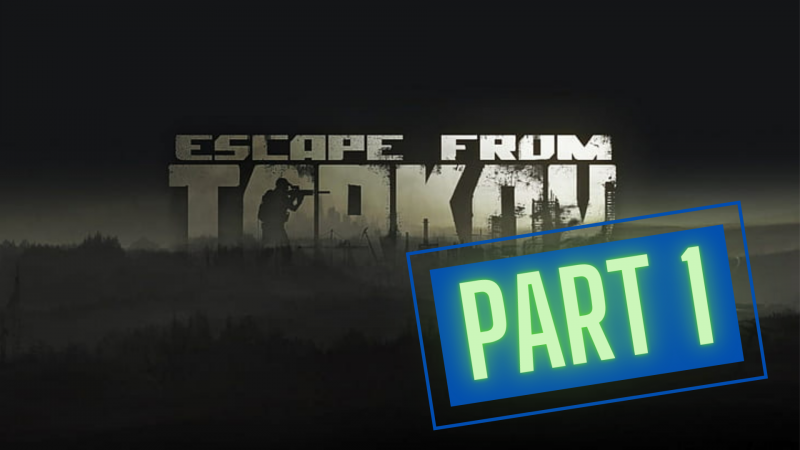
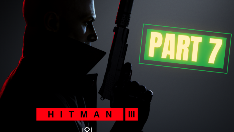
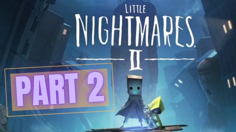
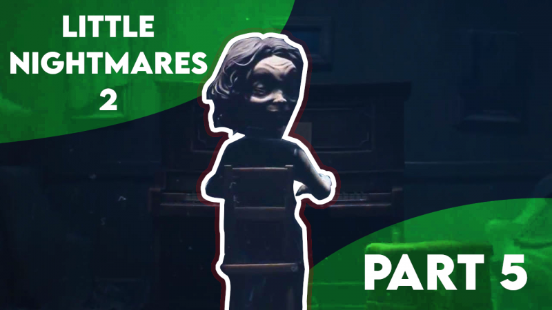
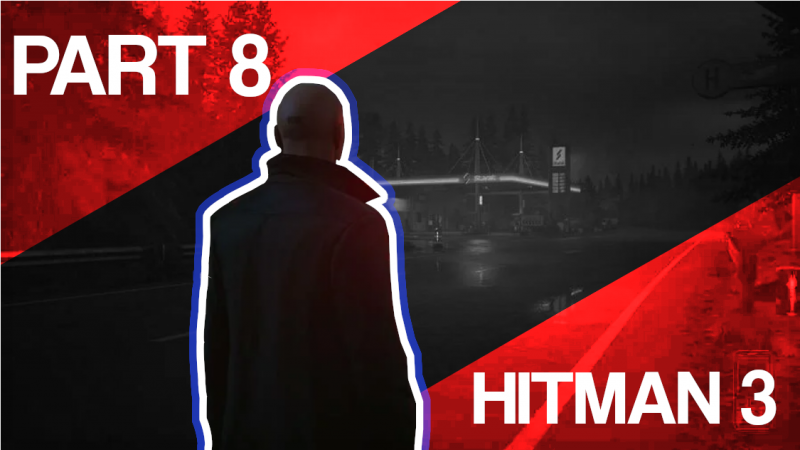
Thumbnail Feedback Would you click on these?
- Thread starter Dino93
- Start date
The text is difficult to read, but if I had to choose one, it would be the third option.
Unless you're a super fan of the series, unfortunately none of those thumbs are all that clickable because it gives zero indication of what's going to be seen in the video. Using the cover art and then slapping on "part 1" or "part 2" is pretty boring in terms of thumbnails. You want to convey what's going to happen in the video that's a key moment worth clicking. There's a million "hitman part 7" thumbnails. why should someone click your part 7 instead of some other channel's part 7 thumbnail?
Unless you're a super fan of the series, unfortunately none of those thumbs are all that clickable because it gives zero indication of what's going to be seen in the video. Using the cover art and then slapping on "part 1" or "part 2" is pretty boring in terms of thumbnails. You want to convey what's going to happen in the video that's a key moment worth clicking. There's a million "hitman part 7" thumbnails. why should someone click your part 7 instead of some other channel's part 7 thumbnail?
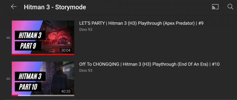
I appreciate this! I'm still learning on how to get the most out of my thumbnails. I've changed them since this and I've incorporated the story more into my thumbnails along with my titles. They're still not perfect, but I think I'm getting there!
Attachments
From what I've read, the clearer and less cluttered the better. So, my question is would these thumbnails make you click on my video? If no, why not? I'd love some feedback. Cheers
I wouldn't, I can't see what they say. Although I may click on your channel to see what Part 1 is
GotchaThey look good. Though I think adding a bit more bright images or text would make your thumbnails stand out more. You don't want to keep them too dark.
I have to agree with most of what's already been said. I would suggest picking up Affinity Photo, watching a few videos on YouTube about it, and learn to make better and more engaging thumbnails. That engagement is VERY important because it means views. And once they view you just have to make sure your video can hold there attention for at least 50% of your video. But it'll hard at first. You'll probably lose them around the 30 seconds to the 1-minute mark.

