You are using an out of date browser. It may not display this or other websites correctly.
You should upgrade or use an alternative browser.
You should upgrade or use an alternative browser.
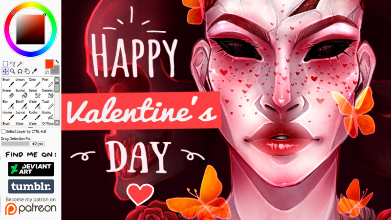
Thumbnail Feedback Would this be a good thumbnail for art video? Same style as I usually do
- Thread starter Varjopihlaja
- Start date
Visually it is fine. Competitively it may have high competition because the only text on it is "Happy Valentine's Day" and that keyword will be oversaturated.
Thanks! I often find it difficult to put text on art video thumbnails but I try to write something... I tried my best to optimise the SEO though, will find out tomorrow if it's bad or notVisually it is fine. Competitively it may have high competition because the only text on it is "Happy Valentine's Day" and that keyword will be oversaturated.
i heard.. Not to use so much red in thumbnails.. people less often have tendency to click on those..
Well, my art is red so little I can do about that..i heard.. Not to use so much red in thumbnails.. people less often have tendency to click on those..
Very culture specific. In China red is prosperity. In Korea and Japan, red can signify death, as a person's name was recorded in red in the family register when they died. The performance of a color is always very culture specific.i heard.. Not to use so much red in thumbnails.. people less often have tendency to click on those..
Looks like a clickable thumbnail. If I saw that pop up in my screen. You got me all the way. Way to go!So I'd like to hear if anyone has some improvement ideas! I'm publishing this videon on Friday
I usually don't like showing the whole artwork as I kinda feel lika it ''spoils'' the video.
Cheers!

