• Guest - Earn a FREE TubeBuddy Upgrade for being active on the forums! Click Here to learn how you earn free upgrades for TubeBuddy!
  • Guest - TubeBuddy has a discord! Click Here to join in the conversation!

Thumbnail Feedback Thumbnail and artwork feedback

CelticSpike

Active Member
TubeBuddy Pro
43
7
So I recently got an artist to do some artwork for my channel and I would appreciate feedback.
The idea I was going for was a celtic warrior playing video games.

Let me know what think
 

kitchen c/o ammama

Distinguished Poster
TubeBuddy User
648
18
Subscriber Goal
5000
Hi ! Is there any special thumbnail that you would like to us to give feedback on ?

I saw your channel ... For me.. all look same .. I am sorry .. the thumbnail looks good but I am not able to differentiate from one video to other. There is something written on the yellow background which can't be read.

1600061646649.png


and here again ... Thumbnail seems good but again cant differentiate which one is part 1 7 which one is part 2. Just because both look alike , I might think : oh ! I already watched this" and won't be clicking on the new video.

1600061831965.png


These are my instant thoughts. Sorry if I am wrong.. have no idea about gaming .
 
  • Like
Reactions: CelticSpike
OP
OP
CelticSpike

CelticSpike

Active Member
TubeBuddy Pro
43
7
Hi ! Is there any special thumbnail that you would like to us to give feedback on ?

I saw your channel ... For me.. all look same .. I am sorry .. the thumbnail looks good but I am not able to differentiate from one video to other. There is something written on the yellow background which can't be read.

View attachment 7440

and here again ... Thumbnail seems good but again cant differentiate which one is part 1 7 which one is part 2. Just because both look alike , I might think : oh ! I already watched this" and won't be clicking on the new video.

View attachment 7441

These are my instant thoughts. Sorry if I am wrong.. have no idea about gaming .
Thank you that's really helpful. I did not realize they were hard to read as I mainly use my a BIG monitor when working on my channel.
I will try and re-work them.
 

kitchen c/o ammama

Distinguished Poster
TubeBuddy User
648
18
Subscriber Goal
5000
Thank you that's really helpful. I did not realize they were hard to read as I mainly use my a BIG monitor when working on my channel.
I will try and re-work them.
Glad it's useful ! Try checking out on your mobile before finalizing.
 
OP
OP
CelticSpike

CelticSpike

Active Member
TubeBuddy Pro
43
7
Glad it's useful ! Try checking out on your mobile before finalizing.
Ok I have tweaked the thumbnails on the 3 digimon adventure videos. Let me know if they look any better.
I have also experimented with swapping the positions of the avatar and text on the first one, but not sure if looks better or not.
Would value your input.
 

kitchen c/o ammama

Distinguished Poster
TubeBuddy User
648
18
Subscriber Goal
5000
Ok I have tweaked the thumbnails on the 3 digimon adventure videos. Let me know if they look any better.
I have also experimented with swapping the positions of the avatar and text on the first one, but not sure if looks better or not.
Would value your input.
Much Better !!!

1600163036826.png


I observed the "swapping"

I liked it, Better to "Mirror" the whole thumbnail that just swapping at the bottom. My opinion only.

Just keep in mind the time stamps. If you keep the avatar right... the words will be clearly visible otherwise , will be hidden beneath the timestamp.
 
  • Like
Reactions: CelticSpike

Stanley | Team TB

Amazingly Decent and Not-At-All Terrible Fishing
Administrator
TubeBuddy Staff
2,644
25
Subscriber Goal
250000
This is REALLY nice work man. I am enjoying your channel top to bottom. SOLID approach to your niche here. Taking the Celtic angle and focusing on JRPG let's plays is a really cool concept.

I watched a bit of your last video, and I gotta say that your intro is next level. In fact the thing that actually captivates me most about your chennel is the storytelling aspect of your lets play. Now, I would like to see that 50 second intro become a 35 second intro (same material, just quicker transitions through the topics) and without spending my entire afternoon persuing your content I would venture to say that you may want to consider doing the same with your overall content. Do you make cuts/edits to your video or is each video a straight run through? 30-40 minute videos are a powerful way of getting watchtime, but you still need to focus on retention and keeping viewers as long as possible. Cutting out the less interesting portions of the video tend to help keep people watching.

Your thumbnails are talented... but talented doesn't always leaf to views. In fact some of my most artistic and talented thumbnails are LITERALLY my worst performing. Because all that skill is lost when they are viewed at 35 kmh on a phone! I suggest spending just a little time studying, improving and perfecting your thumbnail approach.

I foresee really good things with this channel if you can perfect thumbnails and master retention by your 100th video.
 
OP
OP
CelticSpike

CelticSpike

Active Member
TubeBuddy Pro
43
7
This is REALLY nice work man. I am enjoying your channel top to bottom. SOLID approach to your niche here. Taking the Celtic angle and focusing on JRPG let's plays is a really cool concept.

I watched a bit of your last video, and I gotta say that your intro is next level. In fact the thing that actually captivates me most about your chennel is the storytelling aspect of your lets play. Now, I would like to see that 50 second intro become a 35 second intro (same material, just quicker transitions through the topics) and without spending my entire afternoon persuing your content I would venture to say that you may want to consider doing the same with your overall content. Do you make cuts/edits to your video or is each video a straight run through? 30-40 minute videos are a powerful way of getting watchtime, but you still need to focus on retention and keeping viewers as long as possible. Cutting out the less interesting portions of the video tend to help keep people watching.

Your thumbnails are talented... but talented doesn't always leaf to views. In fact some of my most artistic and talented thumbnails are LITERALLY my worst performing. Because all that skill is lost when they are viewed at 35 kmh on a phone! I suggest spending just a little time studying, improving and perfecting your thumbnail approach.

I foresee really good things with this channel if you can perfect thumbnails and master retention by your 100th video.

thanks for the feedback and encouragement. In my last SMT and Karnage Chronicles videos I actually started to get more aggressive with editing to get the video length down and cut out any boring sections. I am aiming now for 35-40 minute runtime for each video from now on.
I think that will help get views and keep them around.
my most recent intro did run longer than most of the others which i try keep as snappy as possible.
 

Beanie Draws

Mythical Poster
2,883
27
www.youtube.com
Subscriber Goal
30000
You need an interesting screenshot of the actual game play I think. Using the same thumbnail over and over again except for title, is far too repetitive and might get you falsely seen as spam. People want variety, so go with a more interesting screenshot of the game play.
 
OP
OP
CelticSpike

CelticSpike

Active Member
TubeBuddy Pro
43
7
You need an interesting screenshot of the actual game play I think. Using the same thumbnail over and over again except for title, is far too repetitive and might get you falsely seen as spam. People want variety, so go with a more interesting screenshot of the game play.
a fair point. I will see what i can do going forward.

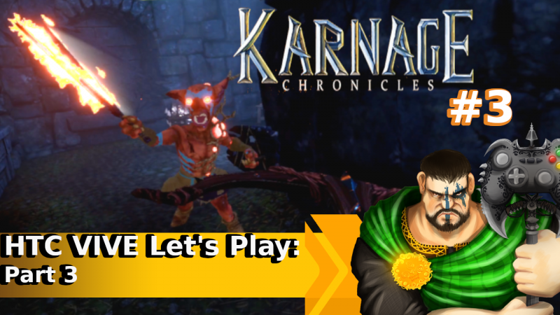
UPDATE:
here is something i threw together from my the video i just uploaded this morning. do you think this looks better than my standard thumbnail
 

Attachments

  • thumbnail KCtest.png
    thumbnail KCtest.png
    967.9 KB · Views: 158
Last edited:

Beanie Draws

Mythical Poster
2,883
27
www.youtube.com
Subscriber Goal
30000
Definitely more interesting. The next steps would be to play aroung with contrast and lighting settings to make it pop a bit more in small format :)