• Guest - TubeBuddy has a discord! Click Here to join in the conversation!

Thumbnail Feedback Which Thumbnail to use or change?

#ThreeQuotesThursday

Familiar Member
TubeBuddy User
60
8
Subscriber Goal
1000
Hi fellow tuberΓÇÖs!

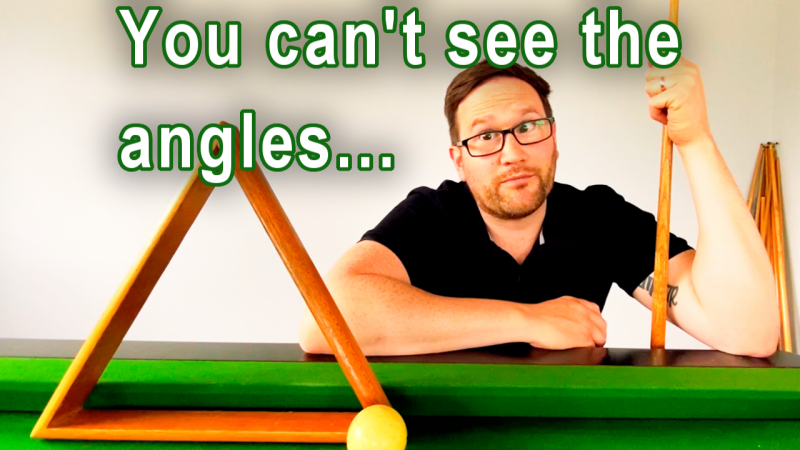
Can you give me some feedback on which thumbnail you prefer or what could be changed?

A:
3C9D9210-1FC1-4EF9-8A64-1DFBABF3CA22.png

B:
5A3FCC61-BE8C-4412-A2AC-87803E0D65D8.png

C:
A330B867-8BEE-4807-A31C-224E4F80FB6D.jpeg


Thank you in advance for your help with this!
 

Scott Fichter

Known Member
TubeBuddy User
115
12
Subscriber Goal
2000000000
Your facial expression is good in the first and third one. Your expression in the second one does not match the situation that the text explains. Go as big as you can with your face and the text. See all the air to the right of your arm in the first one? Move yourself to the far right. Open up as much space as possible to the left and make that text as big and bold as possible. White text with the green stroke rocks. Make the stroke way thicker. Put a big drop shadow on that text. Make it pop hard. Consider a font like Anton. It's better than Impact. It makes the characters slightly thinner which allows you to make the text larger. BIG IS THE BEST. Later homie.
 

Dr Pixel Plays

Known Member
TubeBuddy Pro
103
11
Fully agree with @Scott Fichter. If you use yourself in a thumbnail, use a strong expression and make sure you are easily visible on the thumbnail. I would make yourself a bit bigger, just zoom in on the image more. And what I often do with images, is to add some light effect and shift the saturation to focus on certain areas in the thumbnail.

Use as little text as possible. Try to only use 1 font. Using multiple fonts on one screen is a UI Designers' nightmare. You did that correctly. I'm just saying that because I see people making this mistake all the time. Always use a font that is easily readable(yours is fine), and use outlines or drop shadows to help text stand out. Keep in mind people are seeing your thumbnail on a small phone screen, so make the text big. You can try to go bigger, or increase the contrast more. I have a thumbnail with a dark background but white text, and although the text isn't big, it's still very readable. Maybe use white with a black outline for more contrast? Or black with a white outline, since the wall is black?
 
OP
OP
#ThreeQuotesThursday

#ThreeQuotesThursday

Familiar Member
TubeBuddy User
60
8
Subscriber Goal
1000
IΓÇÖve had a lot of feedback after also posting on Facebook groups which like the first photo and text colour but advise less words, since changing the title the SEO score is now 93!

65C39F5E-ABE7-466D-AA37-19502442D1CE.png
 
OP
OP
#ThreeQuotesThursday

#ThreeQuotesThursday

Familiar Member
TubeBuddy User
60
8
Subscriber Goal
1000
Your facial expression is good in the first and third one. Your expression in the second one does not match the situation that the text explains. Go as big as you can with your face and the text. See all the air to the right of your arm in the first one? Move yourself to the far right. Open up as much space as possible to the left and make that text as big and bold as possible. White text with the green stroke rocks. Make the stroke way thicker. Put a big drop shadow on that text. Make it pop hard. Consider a font like Anton. It's better than Impact. It makes the characters slightly thinner which allows you to make the text larger. BIG IS THE BEST. Later homie.

8DC7EC86-8DA4-42D0-988D-E1CDA4D8E5CC.jpeg
 
  • Haha
Reactions: Dr Pixel Plays
OP
OP
#ThreeQuotesThursday

#ThreeQuotesThursday

Familiar Member
TubeBuddy User
60
8
Subscriber Goal
1000
View attachment 6771
This is what I would do. Zoom in a little bit and add a slight drop shadow to help the text stand out more against the white wall.
ThatΓÇÖs great Dr Pixel! Is it ok to use this? WonΓÇÖt let me save on my phone for some reason. If ok to use IΓÇÖll share link to my computer so can download when at work?
 

Dr Pixel Plays

Known Member
TubeBuddy Pro
103
11
ThatΓÇÖs great Dr Pixel! Is it ok to use this? WonΓÇÖt let me save on my phone for some reason. If ok to use IΓÇÖll share link to my computer so can download when at work?
You can use it, no problem.

If you could send me the background image, I could make it better. There's still one line under the text. But that's not that noticeable.
 

Beanie Draws

Mythical Poster
2,883
27
www.youtube.com
Subscriber Goal
30000
the second thumbnail in the original post was probably a better one. The photo was more interesting (could have zoomed in a lot more though) and the font was better. There's no reason to have white text on a white basckground, it makes for poor visual contrast, and that green text was actually kind of interesting. the two other photos gives me a pretty "meh" first impression... it's just a guy with a pool cue and a triangle, but the middle photo, I'm thinking "why is he behind the triangle" which is more interesting and catches my eye in the first few seconds and is more inclined to get me to pause, question what's going on, and possibly click :)
 
OP
OP
#ThreeQuotesThursday

#ThreeQuotesThursday

Familiar Member
TubeBuddy User
60
8
Subscriber Goal
1000
the second thumbnail in the original post was probably a better one. The photo was more interesting (could have zoomed in a lot more though) and the font was better. There's no reason to have white text on a white basckground, it makes for poor visual contrast, and that green text was actually kind of interesting. the two other photos gives me a pretty "meh" first impression... it's just a guy with a pool cue and a triangle, but the middle photo, I'm thinking "why is he behind the triangle" which is more interesting and catches my eye in the first few seconds and is more inclined to get me to pause, question what's going on, and possibly click :)
Great feedback Beanie,

howΓÇÖs this?:

86E9A0F5-1224-4557-8572-2AAB3BED1E75.jpeg
 
  • Love
Reactions: Dr Pixel Plays

Dr Pixel Plays

Known Member
TubeBuddy Pro
103
11
howΓÇÖs this?:
This is even better than what I did!

That smile of yours is great! Kinda wants to make me smile as well. It also looks like you had a lot of fun. And the text that is rotated at the end makes it look even more playful.
The text is great! It's bold, larger, and easy to read.
The frame might also help your thumbnail to pop out on Youtube since everything else is white.

I'm really impressed! Good job!
 
OP
OP
#ThreeQuotesThursday

#ThreeQuotesThursday

Familiar Member
TubeBuddy User
60
8
Subscriber Goal
1000
This is even better than what I did!

That smile of yours is great! Kinda wants to make me smile as well. It also looks like you had a lot of fun. And the text that is rotated at the end makes it look even more playful.
The text is great! It's bold, larger, and easy to read.
The frame might also help your thumbnail to pop out on Youtube since everything else is white.

I'm really impressed! Good job!
Thank you Dr!
The thumbnail you did gave me some inspiration to make the letters pop and feedback from other that likes the second picture pushed me to do some research on how to make a good thumbnail and then inspiration struck this morning! Most likely will use this as it does pop off the page and the lettering is visible when picture is small too.
Thanks again for your help!
 
  • Like
Reactions: Dr Pixel Plays
OP
OP
#ThreeQuotesThursday

#ThreeQuotesThursday

Familiar Member
TubeBuddy User
60
8
Subscriber Goal
1000
IΓÇÖve posted the video now with a different thumbnail I created after lots of feedback on lots of sites, here, Facebook groups etc...

Here is the video, as you can see the thumbnail I went with...
 
Last edited by a moderator: