• Guest - Earn a FREE TubeBuddy Upgrade for being active on the forums! Click Here to learn how you earn free upgrades for TubeBuddy!
  • Guest - TubeBuddy has a discord! Click Here to join in the conversation!

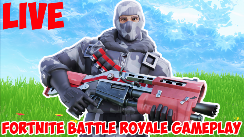
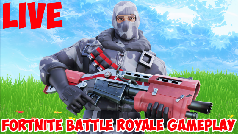
Thumbnail Feedback Does this thumbnail catch your attention?

Which thumbnail do you prefer?

  • Character with outline

    Votes: 0 0.0%
  • character without outline

    Votes: 0 0.0%

  • Total voters
    0
  • Poll closed .

JJisawesome25698

New Member
TubeBuddy User
24
8
Hey guys
I wanted to know if this thumbnail catches your attention. Also, is there anything that I could change to make it better? Finally, I want to know whether you guys prefer the thumbnail with the character outlined or the thumbnail where the character has no outline. Thanks!
 

Attachments

  • Havoc With Outline Fortnite Battle Royale Live Gameplay Thumbnail.png
    Havoc With Outline Fortnite Battle Royale Live Gameplay Thumbnail.png
    1.2 MB · Views: 162
  • Havoc Without Outline Fortnite Battle Royale Live Gameplay Thumbnail.png
    Havoc Without Outline Fortnite Battle Royale Live Gameplay Thumbnail.png
    1.3 MB · Views: 187

annalisacreate

New Member
1
2
I like The outlined character is quicker to draw in my attention. I would move your copy (text) to the center and to the right of the character to make it stand out more. The words are a little bit hard to read (IΓÇÖm looking at this on an iPhone) maybe have white bg color behind the red text and space the words out a bit to make it easier to read first pass.