• Guest - Earn a FREE TubeBuddy Upgrade for being active on the forums! Click Here to learn how you earn free upgrades for TubeBuddy!
  • Guest - TubeBuddy has a discord! Click Here to join in the conversation!

Thumbnail Feedback What do you think about my new thumbnails? (old-new)

Niki Proshin

Known Member
118
9
I am so glad to have lots of responses for my previous thumbnail post, it was quite useful for me! Maybe even useful for other people who saw the pieces of advice that I got.

My channel is mostly about traveling on a budget long term (vlogging + how-to) and videos with people I meet during my trips (about languages and culture in different countries).
I came up with new style for my thumbnails, and really curious what do you think about it. As my own eyes.. are very subjective and cannot be trusted well.
Being honest, I am still not sure if that works well or not - don't have enough numbers for analytics as my channel is still quite small.

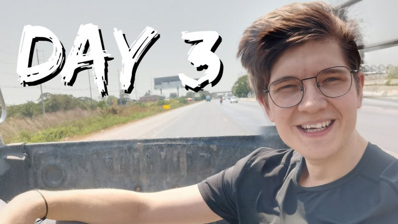
Here are some of the thumbnails. Left is the old version, right is the new one.

01 old.jpg 01 new.png

03 old.jpg 03 new.png

chiang mai $7 old.jpg chiang mai $7 new.png

And also the most recent one, which is a bit different too.
ver 6.png

Would be great to have your opinion!
 

Mario So

Known Member
TubeBuddy Star
169
12
Subscriber Goal
3000
I like the new versions! They stand out more than the old ones. I would even saturate yourself in those thumbnails more too to make yourself pop more too.
 
  • Love
Reactions: Niki Proshin

TubeBuddy

Legendary Poster
12,445
33
Subscriber Goal
5000
I am so glad to have lots of responses for my previous thumbnail post, it was quite useful for me! Maybe even useful for other people who saw the pieces of advice that I got.

My channel is mostly about traveling on a budget long term (vlogging + how-to) and videos with people I meet during my trips (about languages and culture in different countries).
I came up with new style for my thumbnails, and really curious what do you think about it. As my own eyes.. are very subjective and cannot be trusted well.
Being honest, I am still not sure if that works well or not - don't have enough numbers for analytics as my channel is still quite small.

Here are some of the thumbnails. Left is the old version, right is the new one.

View attachment 4786 View attachment 4785

View attachment 4788 View attachment 4787

View attachment 4790 View attachment 4789

And also the most recent one, which is a bit different too.

View attachment 4791

Would be great to have your opinion!

The new versions are MUCH more clickable IMO :D
 
  • Love
Reactions: Niki Proshin

Beanie Draws

Mythical Poster
2,883
27
www.youtube.com
Subscriber Goal
30000
Mate! What tutorials have you been watching/reading because these have come a LONG they're looking fantastic!

I've been experimenting with puttin a light yellow outline around the main character of some of my thumbs, it might help you stand out a little more in your thumbs, but I'd just test it because at this point it might be too much, but it's always worth testing little experiments like that :) Mario is right about saturating yourself more just to help you pop a little more.

Absolutely LOVING the colour gradient overlays. Great work mate!
 
  • Love
Reactions: Niki Proshin
OP
OP
Niki Proshin

Niki Proshin

Known Member
118
9
I like the new versions! They stand out more than the old ones. I would even saturate yourself in those thumbnails more too to make yourself pop more too.

I will try that! Thank you

The new versions are MUCH more clickable IMO :D

I hope so ;) thanks, Andrew

Mate! What tutorials have you been watching/reading because these have come a LONG they're looking fantastic!

I've been experimenting with puttin a light yellow outline around the main character of some of my thumbs, it might help you stand out a little more in your thumbs, but I'd just test it because at this point it might be too much, but it's always worth testing little experiments like that :) Mario is right about saturating yourself more just to help you pop a little more.

Absolutely LOVING the colour gradient overlays. Great work mate!

Thank you, my friend! I actually didn't watch any tutorials on thumbnails, just came up with my own vision and tried to do that in Photoshop. Appeared to be quite easy, just basic Photoshop things.

If anyone wants to know the process:
- Mask people and put them on a new layer (put it above)
- Apply color or gradient on the original layer
- Fit in the text

DONE! Once I am satisfied with the thumbnail, I also do different colors or other minor changes, compare different versions and then choose one.
 

W00tkaeppi

New Member
11
4
Subscriber Goal
1000
You are not in sight. Could be even better when you are in sight :)

You have to look to make your pictures more harmonious so that the color is on one level. And have more courage to contrast, I wrote that to you in the other topic :)
 

Attachments

  • 4785-4571f92f898450321561e9763e2abc20.jpg
    4785-4571f92f898450321561e9763e2abc20.jpg
    216 KB · Views: 177
  • 4785-4571f92f898450321561e9763e2abc20.jpg.png
    4785-4571f92f898450321561e9763e2abc20.jpg.png
    546.8 KB · Views: 191
  • Like
Reactions: Niki Proshin

AJ Faith & Fitness

Active Member
TubeBuddy User
28
8
These are awesome! Love the new ones! A perfect example on how practice will help sharpen our skills and we will continue to evolve in our talents as long as we keep at them! Keep it up!