
You are using an out of date browser. It may not display this or other websites correctly.
You should upgrade or use an alternative browser.
You should upgrade or use an alternative browser.
Thumbnail Feedback How is my Thumbnail
- Thread starter Calif Coder
- Start date
Hey Calif-
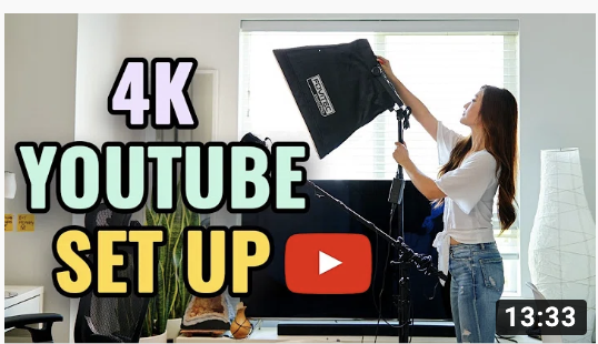
What I usually do to test my thumbnails is to reduce them down to the actual size. I check to see if I can read the text and understand the composition. Typically, in a composition, you want to use the power of 3: Three elements that are different and complement each other.
A strong graphic
Text header
Contrasting background
For your specific comp, try
-removing one of the hands (two too many hands -my eye doesn't know which one is important)
-removing the black fuzzy frame (keep your comp crisp and bright)
-remove the stop words from your title (in, from, on, to...)
Take a look at some of these examples to get some ideas.
HTH.
Attachments
-
 Screen Shot 2020-01-21 at 5.12.39 PM.png319.1 KB · Views: 242
 -
 Screen Shot 2020-01-21 at 5.12.59 PM.png268.8 KB · Views: 237
 -
 Screen Shot 2020-01-21 at 5.13.10 PM.png282.3 KB · Views: 261
 -
 Screen Shot 2020-01-21 at 5.13.50 PM.png259.9 KB · Views: 244
 -
 Screen Shot 2020-01-21 at 5.14.38 PM.png332 KB · Views: 246
 -
 Screen Shot 2020-01-21 at 5.14.48 PM.png211.5 KB · Views: 237

OP
OP
OP
OP
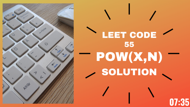
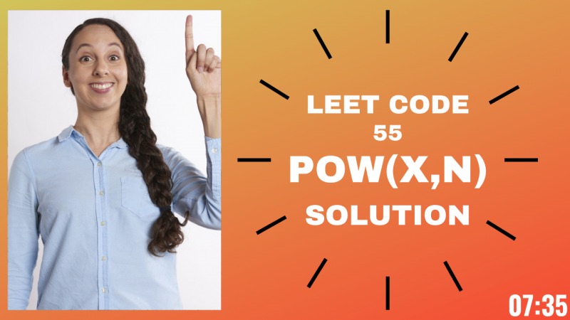
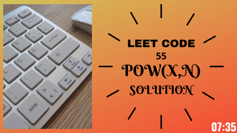
MUCH better!!
I like the white text against the orange -very strong contrast - and this is what you want.
Try to enlarge the text as humanly possible.
Reduce the opacity of the black clock dial lines that surround the text (the text is your hero) Maybe convert them to a darker orange.
Now for the image:
For coding purposes, I understand using the keyboard. Is there a button that you could focus on? Say the tab key? (I'm binge watching Silicon Valley where they had a fight over tabs vs spaces) So perhaps a meme you could highlight?
For the woman, can you enlarge her to show only her head and shoulders? Her body gets lost.
By enlarging the text, emphasizing contrast, focusing on a smaller part of the photo, you are creating a more strong, dynamic comp.
Great job!
HTH