You are using an out of date browser. It may not display this or other websites correctly.
You should upgrade or use an alternative browser.
You should upgrade or use an alternative browser.
Thumbnail Feedback Need a Opinion
- Thread starter I Love Family ASMR
- Start date
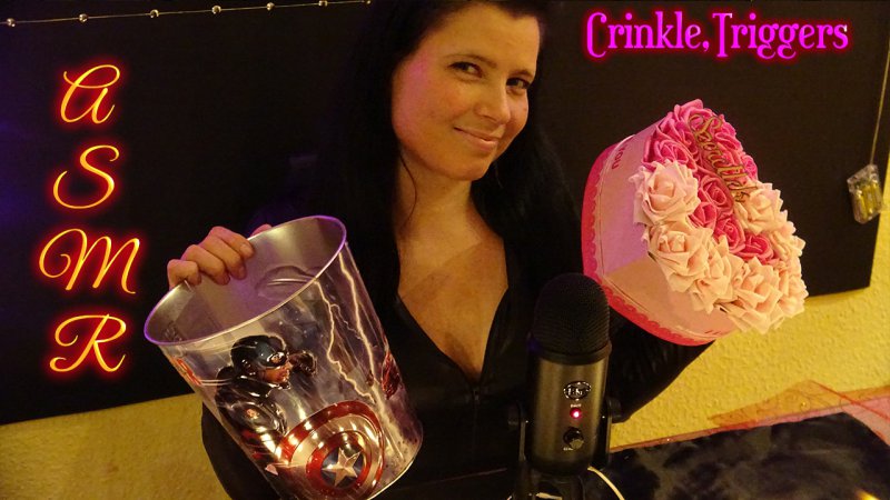
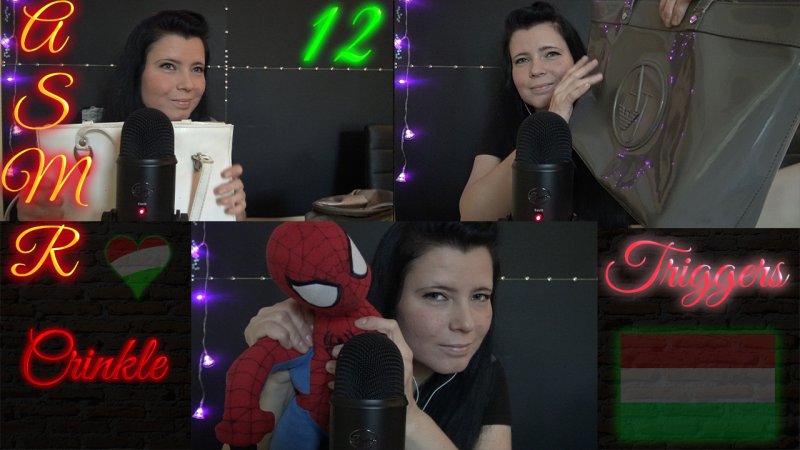
I'm going to be real, You have an inviting smile, but the thumbnails are hard to read visually. the ASMR is just readable, but I'd go with a simpler font, because why it may look nice to you while you'd designing the thumbnail, in small view it can be a little tricky to see. the first thumbnail on the left is easier to read. The second on the right has too much going on.
There's a lot of black going on as well, it's difficult to make out any of the details in thethumbnail.
I'd suggest trying to have the microphone a lot bigger in the frame, your face next to it, and an object close to it. We don't need to see the whole object, but the focus I personally think should be on the mic, your smile, and a portion of the object that's causing the ASMR.
I'd also try experiment with some nice coloured lighting behind you, and seeing if you can shine a light between you and the mic to help the mic stand out more. You could just do that in photoshop but I think it would be visually interesting doing it with lights.
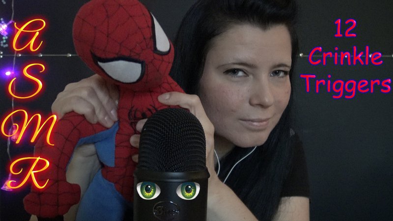
it looks like you have 3 thumbnails inside the second one, but if you had JUST the spiderman thumbnail on it's own, that's a good example of how it would look better, simpler and bolder
Also, with a good clear simple photo, you won't even need any text in your thumbnails. The text probably over complicates things. Just focus on your lovely face, your mic, and the object close to the camera with nothing else to distract
Hopefully that's helpful
now good ?
I think it's much improved, but a little hard to see you still IMO, maybe brighten up your face just slightly
Or just do what I do and outline yourself to make you pop out haha.I think it's much improved, but a little hard to see you still IMO, maybe brighten up your face just slightly
Or just do what I do and outline yourself to make you pop out haha.
That's true! Would help with the blending into the BG issue I currently have


