• Guest - TubeBuddy has a discord! Click Here to join in the conversation!

Thumbnail Feedback New thumbnails

Senior Notions

Known Member
TubeBuddy User
113
11
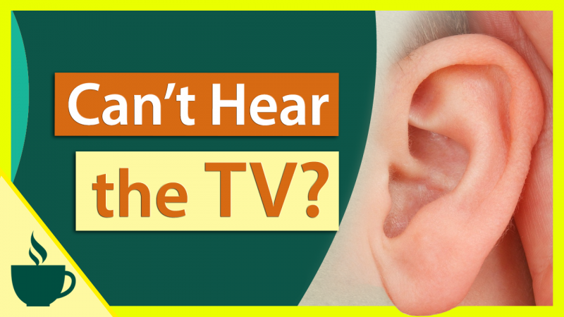
Hi Everyone. I made new thumbnails following Nick Nimmin's tutorials and hope to get your opinions. I integrated our cup logo to the bottom of each one and made the words prominent and added a related image. This one's for the latest video that shows a way to help older people hear the TV better, but they all follow the same template pretty much.

Thanks in advance for your comments and critiques!

Hear-TV-Without-DIsturbing-Others-thumbnail.png
 

Aaron

Reputable Poster
TubeBuddy Legend
739
26
Subscriber Goal
1000
Recognizable branding and its clear and visible! I'd say wonderful job overall but I'd change the lime green boarder *possibly* to a different less punchy color.
 
  • Like
Reactions: Senior Notions

Ikerot

Not a mod
TubeBuddy User
2,398
32
Subscriber Goal
5000
I like the bright color scheme of this thumbnail, it's very eye-catching :) You've got your logo, and the color scheme continues with your other thumbnails, so I think that gives you a good brand. Although, is that logo personally drawn or?

Anyways, without context, I don't know what this thumbnail is trying to tell me. I know that it's asking me if I can't hear the TV, but it doesn't provide a follow-up. Why should I click on this?

I checked the video and saw that it has a lot to do with electronics you gotta buy, so perhaps add those into the thumbnail as well? I didn't expect to have to buy a speaker and a Bluetooth headphone. I thought it might've just been a remedy for hard of hearing... if that makes any sense.

I found a somewhat similar video with this thumbnail:
3022


I feel like the thumbnail here showcases the problem, it gives you a follow-up, and it shows the item they used. Albeit, both solutions (from this video and yours) are different.
 
OP
OP
Senior Notions

Senior Notions

Known Member
TubeBuddy User
113
11
Recognizable branding and its clear and visible! I'd say wonderful job overall but I'd change the lime green boarder *possibly* to a different less punchy color.

omg you are right, Aaron! It's supposed to be bright yellow, but it does appear lime green now that you mention it! I'll change that to something more sedate :)

Thank you!

I like the bright color scheme of this thumbnail, it's very eye-catching :) You've got your logo, and the color scheme continues with your other thumbnails, so I think that gives you a good brand. Although, is that logo personally drawn or?

Anyways, without context, I don't know what this thumbnail is trying to tell me. I know that it's asking me if I can't hear the TV, but it doesn't provide a follow-up. Why should I click on this?

I checked the video and saw that it has a lot to do with electronics you gotta buy, so perhaps add those into the thumbnail as well? I didn't expect to have to buy a speaker and a Bluetooth headphone. I thought it might've just been a remedy for hard of hearing... if that makes any sense.

I found a somewhat similar video with this thumbnail:
View attachment 3022

I feel like the thumbnail here showcases the problem, it gives you a follow-up, and it shows the item they used. Albeit, both solutions (from this video and yours) are different.


Thanks, Ikerot! The cup logo is an icon we purchased, then modified. The hot beverage represents our original online group. It was kind of like everyone getting together for coffee, only virtually (back when virtual was a new thing).

Your comments about the electronics make so much sense. I'll fix it to include the products. I can't tell you how helpful your example thumbnail is!

Thank you for your thoughtful analysis! :)
 
  • Like
Reactions: Aaron
OP
OP
Senior Notions

Senior Notions

Known Member
TubeBuddy User
113
11
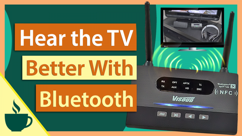
I changed the lime border out and changed the images and text to indicate the video is about connecting with Bluetooth.

Thanks again for your helpful comments! :)

Hear-the-TV-Without-Disturbing-Others-thumbnail.png