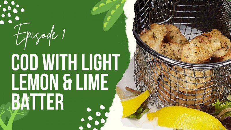
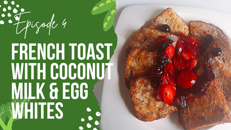
I upload cooking tutorial videos and use the same template for my thumbnails. Not sure if it stands out? What should I add or change? The pictures are from my first and most recent video. Any and all feedback will be appreciated 
They're good as a starting point as they utilise colour, angles etc but the French Toast is looking a bit washed out/overexposed.I upload cooking tutorial videos and use the same template for my thumbnails. Not sure if it stands out? What should I add or change? The pictures are from my first and most recent video. Any and all feedback will be appreciated
what app you are using to making them?I upload cooking tutorial videos and use the same template for my thumbnails. Not sure if it stands out? What should I add or change? The pictures are from my first and most recent video. Any and all feedback will be appreciated
Affinity Photo 2what app you are using to making them?
They're good as a starting point as they utilise colour, angles etc but the French Toast is looking a bit washed out/overexposed.
I would say you could read the book How to Photograph Food which is an amazing read and heaps to teach but also YouTube tutorials as well.
It just comes down to practice and developing your style.
Just my two cents on it.
Could you please post some example hereI agree. The food images are a bit washed out. Perhaps a bit of improvement on the food images would be a great way to start. My other advice, make the food the main focus of the thumbnails. While the half and half style looks good, I would suggest more of a 30/70 look. Make the food space bigger and the text/description area a bit smaller. That way the food will get the eats of potential viewers first. Hope this helps.
Could you please post some example here
Really sorry for the delayed response, I was on holiday but back now. I use Canvawhat app you are using to making them?
Really sorry for the late response, I was on holiday, but I'm back nowThey're good as a starting point as they utilise colour, angles etc but the French Toast is looking a bit washed out/overexposed.
I would say you could read the book How to Photograph Food which is an amazing read and heaps to teach but also YouTube tutorials as well.
It just comes down to practice and developing your style.
Just my two cents on it.
Apologies for the late response, I was on holiday, but I'm back nowI agree. The food images are a bit washed out. Perhaps a bit of improvement on the food images would be a great way to start. My other advice, make the food the main focus of the thumbnails. While the half and half style looks good, I would suggest more of a 30/70 look. Make the food space bigger and the text/description area a bit smaller. That way the food will get the eats of potential viewers first. Hope this helps.
Entschuldigung für die späte Antwort, ich war im UrlaubGrün ist sehr einfach, ich würde eine auffälligere Farbe wählen, wenn Sie in der Nische wirklich hervorstechen möchten.
.