Hi guys,
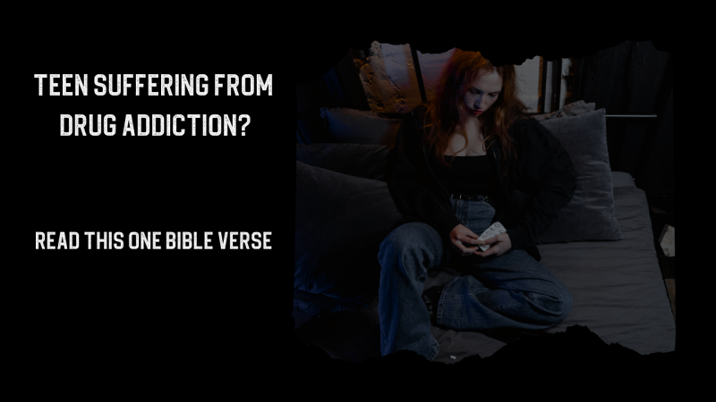
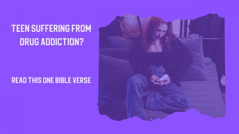
These are two different versions of my latest project thumbnail. The black one is very similar to some of the others I've done so I experimented with something different. Which of these two work best for you? I tried make the text of the thumbnail lead the person to click on it. "What verse is this?" I just want feedback on whether the purple is a little harsh or not. I might be getting better at coming up with text that kind of sparks a person's curiosity, that's kind of the goal in my mind. Also any rephrasing of the text you might can come up with would be helpful.
These are two different versions of my latest project thumbnail. The black one is very similar to some of the others I've done so I experimented with something different. Which of these two work best for you? I tried make the text of the thumbnail lead the person to click on it. "What verse is this?" I just want feedback on whether the purple is a little harsh or not. I might be getting better at coming up with text that kind of sparks a person's curiosity, that's kind of the goal in my mind. Also any rephrasing of the text you might can come up with would be helpful.