
You are using an out of date browser. It may not display this or other websites correctly.
You should upgrade or use an alternative browser.
You should upgrade or use an alternative browser.
Thumbnail Feedback How To Improve My Thumbnails?
- Thread starter Xolaris
- Start date
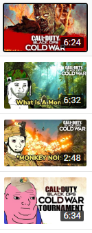
I think that The zombie thumbnail is very good. It is simple, and though i have not play call of duty, the picture i think describes it. And Your branding does not need to be a logo or character in each thumbnail. maybe just the color red and the color blue could be your branding. But back to your thumbnails, the zombie one is easy to understand because it supplements the title. The title and thumbnail should supplement each other.

OP
OP
Thanks for the feedback, the zombie one is the latest one so I guess that hints that I am improving. Happy thanksgiving brotherI think that The zombie thumbnail is very good. It is simple, and though i have not play call of duty, the picture i think describes it. And Your branding does not need to be a logo or character in each thumbnail. maybe just the color red and the color blue could be your branding. But back to your thumbnails, the zombie one is easy to understand because it supplements the title. The title and thumbnail should supplement each other.
I am an occasional PC Gamer and only visit Gaming YT channels once in a while. I stopped by your channel to see your thumbnails.
I am from the school of thought that if you are going to use text in a thumbnail, it needs to be large enough to be readable! Personally, I do like a little bit of text to help describe the video (but don't get wordy).
I also tend to like thumbnails that pop out with high contrast colors. If you are using an image that is kind of bland in colors, you can make your thumbnail pop by using a "loud" color like Bright Red, Bright Green, Bright Yellow, etc. on a darker background.
I am a big believer in visual branding. That means you should try to work towards a reasonably consistent style. Your thumbnails vary a lot in style. So it gives the impression you are sporadic in your channel.
I am with everyone else, your Zombie thumbnail is clearly the best one. Keep studying and watching other people's thumbnails. Over time, you will evolve to your own thumbnail style.
OP
OP
Alright! THX for the adviceYes keep it simple and make sure it works on a small image version for mobiles

OP
OP
Thanks! I'll try to make the text more readableI am an occasional PC Gamer and only visit Gaming YT channels once in a while. I stopped by your channel to see your thumbnails.
I am from the school of thought that if you are going to use text in a thumbnail, it needs to be large enough to be readable! Personally, I do like a little bit of text to help describe the video (but don't get wordy).
I also tend to like thumbnails that pop out with high contrast colors. If you are using an image that is kind of bland in colors, you can make your thumbnail pop by using a "loud" color like Bright Red, Bright Green, Bright Yellow, etc. on a darker background.
I am a big believer in visual branding. That means you should try to work towards a reasonably consistent style. Your thumbnails vary a lot in style. So it gives the impression you are sporadic in your channel.
I am with everyone else, your Zombie thumbnail is clearly the best one. Keep studying and watching other people's thumbnails. Over time, you will evolve to your own thumbnail style.
Less is more, less text, straight to the point or something provocative to catch attention. One word could make tons of more people click compared to a bunch of smaller details. The first one looks good, but also looks generic. Try and put something in of your own, check other thumbnails, get inspiration and make it your own.