
Would you watch the video based on the thumbnail?

You are using an out of date browser. It may not display this or other websites correctly.
You should upgrade or use an alternative browser.
You should upgrade or use an alternative browser.
Thumbnail Feedback Feedback on my thumbnail
- Thread starter mrinal90
- Start date


- 234
- 15
- Subscriber Goal
- 200
OP
OP
Thank you for your feedbackThat's a good thumbnail but I'm the same as Brave Starr with the find being hard to read but apart from that it's a good thumbnail.
Well showing the end result, with a very good up-close photo is great. But 36 characters of text on the image not so much (I'm going off average's here from what I know and have observed, always check your competition to see what they are doing and how you measure up and if they're doing the same thing as you). Other words are a lot of them using over 30 characters, etc. The dominant color would probably come out to be purple or maroon which is "Ok." White would be better, and there is a close-up of the plate but I don't think it's enough white to overcome the color of the food itself and the background, plus the background of the "Mrinal's FoodHub."
Just my two cents.
Just my two cents.
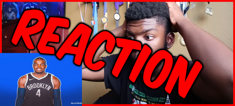
Is this a good thumbnail?
I'm not sure what this is about. Reaction to what? A normal picture of a basketball player? Also, not a gd idea to cover your expression with the words.
A good thumbnail either has self-explanatory pictures or a title that arouses curiosity. Attached is a few examples.
Your video is a reaction video, so maybe thumbnail1 is a good reference.
Attachments


if you think the thumbnail is really good, then you don't need anyone's opinion on it or you should be open to any kind of criticism.Except for what @Brave Starr mentioned about the font, I think this thumbnail is really good!
it looks good defiantly, but it could be better, just like everyone said, fonts could make a big change, and I would say color tone didn't get it.
if you want to make a better thumbnail, I think colors could make a big change
I would suggest considering off set colors like the white/red colors with the middle. It stands out more and doesn't blend with the organic colors of the focus point.