
You are using an out of date browser. It may not display this or other websites correctly.
You should upgrade or use an alternative browser.
You should upgrade or use an alternative browser.
Thumbnail Feedback Feedback for my thumbnail
- Thread starter Yoyo
- Start date
.png")
There's a lot of potential in this one. I like the photo of you, but the background is distracting. I don't hate the background, but I'd rather see some bokeh in it, depending on how skilled you are with photoshop you could easily do this in post-production. I'd add a background blur so the background is a lot less in focus. I do quite like the fact you can see the background, and the warm light over the edge of you brings a really nice comforting evening vibe.
You could probably afford to crop in even further. I'd consider cropping in so that the top of the frame ends at your hairline, and the bottom of your the frame ends at where the xlr cable goes into your mic (or the bottom of the pop filter arm) that would give an even tighter zoom on your face, and you want to be the star of the show, not the houses in the background (add extra blur to the background, I'd blur it up to about 50%-75%)
And finally I don't like the font. It really feels like an afterthought. I don't mind the text style on the right, but for a thumbnail that feels so fresh and even a bit arty and homely, I'd go with an organic handwritten style font that's possibly cursive, and I'd do it in white with a black drop shadow. I just think this thumb would look extra amazing with a nice white arty handwritten style font.
The rest of the photo however with you and the mic is fantastic, and I love the warm lighting.
I'd echo what @Beanie Draws says. I think blurring the background a bit more would help you to stand out. I'm going to give out one of my big secrets... I find FaceTune2 to be one of the fastest, no fuss ways to quickly blur the background of an image. I know how to do it using Photoshop and many other tools, but I find FaceTune's AI to be very good and it takes me seconds to do that. It takes more than seconds in Photoshop or other tools.
On Text, it's about legibility. I would increase the size of the text in the bottom right (assuming that's your logo), but realize the timestamp will cover part of it in preview. The font and color of the text in the upper left cause it to blend into the background. That's a function of size (small), font (a font that is hard to read at small sizes) and color (black bends with the brown of the roof). Pick a more legible font, use stroke and shadow to pull it off of the background, and choose a color that doesn't blend with the background. Then make it as large as you can without obscuring the rest of the image. If you have enough image, I might cheat it to the right even more so you have room to increase the text size without covering you or the mic.
On Text, it's about legibility. I would increase the size of the text in the bottom right (assuming that's your logo), but realize the timestamp will cover part of it in preview. The font and color of the text in the upper left cause it to blend into the background. That's a function of size (small), font (a font that is hard to read at small sizes) and color (black bends with the brown of the roof). Pick a more legible font, use stroke and shadow to pull it off of the background, and choose a color that doesn't blend with the background. Then make it as large as you can without obscuring the rest of the image. If you have enough image, I might cheat it to the right even more so you have room to increase the text size without covering you or the mic.
.png")
- Text is too small, and blending into the photo. When you make a thumbnail, resize it to see what it looks like in the smallest form. That is what people will see.
- Neon stroke on Black is not helping me see the text.
- Cursive is a dying style. They don't teach it anymore in some areas. It might look good, but cursive is hard to read.
- On both photos, the lighting and contrast should be fixed.
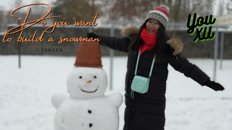
- On the second thumb, you can zoom that in a little more. We don't need to see half of the snowman's torso to know it's a snowman.
- Neon stroke on Black is not helping me see the text.
- Cursive is a dying style. They don't teach it anymore in some areas. It might look good, but cursive is hard to read.
- On both photos, the lighting and contrast should be fixed.
- On the second thumb, you can zoom that in a little more. We don't need to see half of the snowman's torso to know it's a snowman.
ItsTom on Discord just shared a really cool site. https://thumbsup.tv/
You upload your thumbnail and it shows it at all different sizes
You upload your thumbnail and it shows it at all different sizes

I find it
Attractive
I'm obsessed with good lighting, is that a natural sunlight on your hair? love it!
The touch one with this one is I like the snowman, but because of the Hight differences, it ends up up being that we can't really see your face much. If I were taking this photo, I'd actually get you to gently hug or give the side of the snowman a kiss, and that way you'd be level so that you can zoom right in without losing the snowman, and you'd be much fuller in the frame so you'd get more expression.This is possibly my next thumbnail. I tried to follow your instructutions. I tried a different art and tried to blur the backround more and moved my name up. Is it better or worse than before?
View attachment 8728
I like the colour choices in the fonts, but the font for "do you want to build a snowman" is small and hard to read. Font choosing is definitely tricky sometimes because some fonts work better for some situation than others.
I love the shallow depth of field in the photo.
So the font is hard to read, to the point where you really almost don't need the words at all because the snowman is cute enough as is, but I do like it overall.
Pic is perfect. Text is not easily readable though. I would suggest increase text size and on a readable background
I definitely prefer the first one, apart from the B/G which could be blurred out much more.
Then Improve the fonts and I think it would be great.
Then Improve the fonts and I think it would be great.
ItsTom on Discord just shared a really cool site. https://thumbsup.tv/
You upload your thumbnail and it shows it at all different sizes
Great site, thanks Silthw