• Guest - Earn a FREE TubeBuddy Upgrade for being active on the forums! Click Here to learn how you earn free upgrades for TubeBuddy!
  • Guest - TubeBuddy has a discord! Click Here to join in the conversation!

Thumbnail Feedback Feedback on thumbnails for my last 3 videos

Niki Proshin

Known Member
118
9
Looks like I am getting a frequent poster in this sub-forum, hah. I've been constantly working on my thumbnails (and enjoying the process of that) and would appreciate your opinion about the most recent ones. The most valuable feedback will be telling what kind of a thumbnail you'd do for the title I chose, and also telling what you dislike/would improve about my thumbnails.
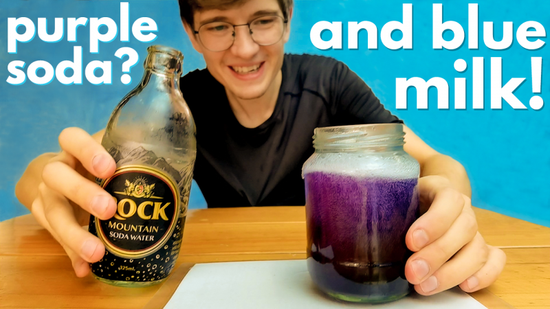
Butterfly Pea TN.png Asian Color Changing Tea Experiments (another way how to make Star Wars blue milk)
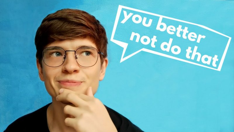
illegal in thailand TN.jpg 5 Illegal Things in Thailand (and yet foreigners do them) | Thailand Travel Tips

Stuck in Thailand TN.jpg The Cost of Being STUCK in THAILAND | What I Spend in a Week as a Budget Traveler

Thank you guys!
 

BraveStar

Life ain't no Nintendo Game
TubeBuddy User
2,113
24
Subscriber Goal
1000
Hello @Niki Proshin,

I get a kick out of working on my own thumbnails as well. It just feels great knowing they were made by you. I'll tackle each image in a separate paragraph with my thoughts. But before I do one thing you should always remember is that when people do searches the first thing they see is the thumbnail thus if thumbnail doesn't convey what the video is about the title may not matter as much. Some people use text and others don't, it depends on their style. But the thumbnails should always hint at what the video is about because people always see the thumbnail before they read the title and may not even bother reading the title if the thumbnail doesn't catch their attention first. With that said...

Your first image looks good. It shows what you are trying to accomplish in the video and the text has a question that can pique people's interest.

Your second image looks good but your question and the image lacks what the video is about. Not do what? There are so many things one should not do but if I'm not, say, interested in cars then why would I care about a "you shouldn't do this" about cars? But I wouldn't know cause they image doesn't convey it's about cars. And if someone clicks and they don't have any interest in the topic they might leave immediately and clicks with low view times can hurt your analytics.

Your third image also looks good but I would suggest movie the text a bit lower, away from the edges of the thumbnail in case they get cut off a bit, and then the text looks weird. Also not sure putting some of the words behind your head, while a cool effect, wouldn't be good because remember that thumbnails are often small even on desktop browsers (and especially on mobile devices) and thus can make it harder to read the text.

These are just my thoughts. Hopefully, they can provide some help.
 
  • Love
Reactions: Niki Proshin

Mario So

Known Member
TubeBuddy Star
169
12
Subscriber Goal
3000
I like the first one. I wouldn't click on the second one just because I would have to read over the title to make sense of the video but if the thumbnail doesn't catch my attention I wouldn't read the title. The third one is good but I would lower the text more. Good job you're improving!
 
  • Like
Reactions: Niki Proshin
OP
OP
Niki Proshin

Niki Proshin

Known Member
118
9
I like the first one. I wouldn't click on the second one just because I would have to read over the title to make sense of the video but if the thumbnail doesn't catch my attention I wouldn't read the title. The third one is good but I would lower the text more. Good job you're improving!

Thank you~ Basically, similar thoughts with @BraveStarrTG, you both are right guys
 
  • Like
Reactions: Mario So

Dragon Value Home

New Member
TubeBuddy Pro
19
4
Subscriber Goal
1000
Looks like I am getting a frequent poster in this sub-forum, hah. I've been constantly working on my thumbnails (and enjoying the process of that) and would appreciate your opinion about the most recent ones. The most valuable feedback will be telling what kind of a thumbnail you'd do for the title I chose, and also telling what you dislike/would improve about my thumbnails.

View attachment 5164 Asian Color Changing Tea Experiments (another way how to make Star Wars blue milk)
View attachment 5165 5 Illegal Things in Thailand (and yet foreigners do them) | Thailand Travel Tips
View attachment 5166 The Cost of Being STUCK in THAILAND | What I Spend in a Week as a Budget Traveler

Thank you guys!
The top first one I like best, In my humble opinion
 
  • Like
Reactions: Niki Proshin

Beanie Draws

Mythical Poster
2,883
27
www.youtube.com
Subscriber Goal
30000
So out of these, the middle is my favourite, and the bottom is my least favourite.
I would say the top is my favourite but there's too much text going on for my liking. but gotta say your photography is right on point!

As for the frequent flyer :p hehe this is true, but it's nice to have a frequent flyer with good base thumbnails where we also see marked improvements too so it's all good! :D
 
  • Like
Reactions: Niki Proshin

TheRoutineInstructor

Recognized Member
TubeBuddy User
82
7
The top 1 is my favorite but can I ask is the tx on opposite sides to the actual items as the glass on right looks like it's purple liquid in it and above says blue milk?
That's first impression i get when I look at the thumbnail.
But thumbnail looks good otherwise.
2nd thumbnail maybe add photo in bottom right corner hinting what better not do. To interest people to click as no way just going to click it to see what it is unleas got a clue of what could be. Just my opinion.
3rd thumbnail is ok nice and simple to.
Keep up the good work.
 
  • Love
Reactions: Niki Proshin
OP
OP
Niki Proshin

Niki Proshin

Known Member
118
9
The top 1 is my favorite but can I ask is the tx on opposite sides to the actual items as the glass on right looks like it's purple liquid in it and above says blue milk?
That's first impression i get when I look at the thumbnail.
But thumbnail looks good otherwise.
2nd thumbnail maybe add photo in bottom right corner hinting what better not do. To interest people to click as no way just going to click it to see what it is unleas got a clue of what could be. Just my opinion.
3rd thumbnail is ok nice and simple to.
Keep up the good work.
Thank you for the opinion!
 

Octorious

Familiar Member
TubeBuddy Legend
64
11
Subscriber Goal
5000
These are all really good! Number 1 is definitely my favourite and I think that is due to the wider range of colours, contrast and realism so maybe take that approach with your other thumbs too. Keep it up! :D