• Guest - Earn a FREE TubeBuddy Upgrade for being active on the forums! Click Here to learn how you earn free upgrades for TubeBuddy!
  • Guest - TubeBuddy has a discord! Click Here to join in the conversation!

Thumbnail Feedback Constructive criticism

TakeEachDay

Known Member
TubeBuddy User
153
9
Subscriber Goal
1000
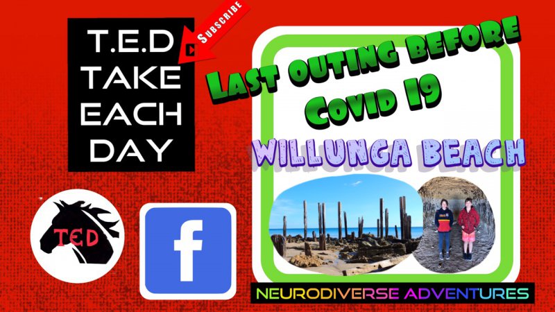
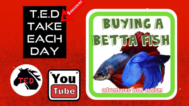
IΓÇÖm wanting to change up my thumbnails but I like the colour scheme would you click on these or are they just showing too much information. Thumbnails are hard work to get right and I do get a reasonable click rate just what would you do differently. IΓÇÖm a bit of a sook when it comes to critique lol but you canΓÇÖt improve without it please be kind though lol

B987143E-68D5-465D-BCD3-B62D442C0A8C.jpeg
 
Last edited by a moderator:
  • Love
Reactions: TubeBuddy

Ikerot

Not a mod
TubeBuddy User
2,400
32
Ikerot.com
Subscriber Goal
5000
There's too many things happening in that thumbnail >_<

I went to see how it looks on your channel:
1586979449548.png


I can barely read any of the text.

A good guide to thumbnail is to have less than 3 - 4 words :)
Let the imagery do the talking! Also, since you're still a new channel, I don't recommend pulling people away from YouTube. Keep them on the platform, instead of redirecting them to FB.

It's a little redundant to have your logo and the channel name on the thumbnail. I'd recommend keeping the logo and removing the title box, and use the rest of the empty spaces for a full-width picture.
 
OP
OP
TakeEachDay

TakeEachDay

Known Member
TubeBuddy User
153
9
Subscriber Goal
1000
There's too many things happening in that thumbnail >_<

I went to see how it looks on your channel:
View attachment 4855

I can barely read any of the text.

A good guide to thumbnail is to have less than 3 - 4 words :)
Let the imagery do the talking! Also, since you're still a new channel, I don't recommend pulling people away from YouTube. Keep them on the platform, instead of redirecting them to FB.

It's a little redundant to have your logo and the channel name on the thumbnail. I'd recommend keeping the logo and removing the title box, and use the rest of the empty spaces for a full-width picture.
Thankyou I was thinking similar about log and text IΓÇÖm going to tweak with them over coming weeks.
 
OP
OP
TakeEachDay

TakeEachDay

Known Member
TubeBuddy User
153
9
Subscriber Goal
1000
I changed one of my thunmbnails using your advice because I did agree with the busy factor and something interesting happened. It put mine at the top of the search for that item how interesting. It goes to show youtube does read the thumbnails and it just didnΓÇÖt know what to do with mine lol first is new last is old. Thankyou for the push to change. Having autism myself makes change very difficult. ItΓÇÖs not quite how I want it but I like colour and something a little different because thatΓÇÖs me. Not plain but any means
 

Attachments

  • A74AEFD3-BEB0-4029-BF32-012BD433099D.jpeg
    A74AEFD3-BEB0-4029-BF32-012BD433099D.jpeg
    270.7 KB · Views: 178
  • C574D4E7-4384-4049-B56B-85762D775A19.jpeg
    C574D4E7-4384-4049-B56B-85762D775A19.jpeg
    258.2 KB · Views: 174

FHFanatics

New Member
TubeBuddy Pro
11
8
blog.familyhistoryfanatics.com
Subscriber Goal
50000
I think you're headed in the right direction, but I'm not sure what you want me to notice.

Pick ONE picture and make that fill the entire thumbnail. (The people aren't doing anything exciting, so use the beach scene)

You still have too much text on the slide. Answer this "Why is Willunga Beach so great?" Cool trees? Awesome Adventure? Sensory Overload?
As @Ikerot suggested use 3-4 words, but make them click-worthy.

Finally. Your logo is way too big. You're a small channel and Take Each Day in a horse head with T.E.D. resembling TED talks so distracting from your thumbnail. Make the logo much smaller.
 
  • Like
Reactions: TakeEachDay
OP
OP
TakeEachDay

TakeEachDay

Known Member
TubeBuddy User
153
9
Subscriber Goal
1000
I think you're headed in the right direction, but I'm not sure what you want me to notice.

Pick ONE picture and make that fill the entire thumbnail. (The people aren't doing anything exciting, so use the beach scene)

You still have too much text on the slide. Answer this "Why is Willunga Beach so great?" Cool trees? Awesome Adventure? Sensory Overload?
As @Ikerot suggested use 3-4 words, but make them click-worthy.

Finally. Your logo is way too big. You're a small channel and Take Each Day in a horse head with T.E.D. resembling TED talks so distracting from your thumbnail. Make the logo much smaller.
Thankyou for the feed back I appreciate it
 

AurigaDave

Known Member
TubeBuddy Pro
149
13
www.astronomyshows4schools.co.uk
Subscriber Goal
5000
IMHO, a thumbnail should reflect the content, looking at yours (I have not gone to your channel deliberately) it looks like your channel is a sort of 'wacky science' one...is this correct? I only ask because some aspects of your site are about life with Autism and others about making rockets...you need to focus and make your thumbnails fit your channel.
 
  • Like
Reactions: TakeEachDay
OP
OP
TakeEachDay

TakeEachDay

Known Member
TubeBuddy User
153
9
Subscriber Goal
1000
IMHO, a thumbnail should reflect the content, looking at yours (I have not gone to your channel deliberately) it looks like your channel is a sort of 'wacky science' one...is this correct? I only ask because some aspects of your site are about life with Autism and others about making rockets...you need to focus and make your thumbnails fit your channel.
Correct our site is mostly about autism we just started doing these others due to the lockdown. I donΓÇÖt really have a decision on a niche but will likely go back to our outdoor adventures when corona virus lockdown restrictions are lifted. Part of my son is the quirky making side of him. He is highly intelligent and IΓÇÖm always trying to find ways to entertain him especially since weΓÇÖve been stuck at home. Our channel is really about getting out despite the challenges of autism. As a fledgling channel IΓÇÖm not as concerned about having thousands of subscribers. DonΓÇÖt get me wrong that is nice but mostly to bring autism awareness and show that those with autism can be productive they are not shy hermits who donΓÇÖt socialise. Lastly that they are smart. This channel started out as a way to socialise my son and help him learn to communicate. We are still navigating our direction. It will happen. I appreciate your advice it means a lot and most of what IΓÇÖm told I totally agree with and itΓÇÖs all being taken on board. Thankyou so much
 

Dimi

Recognized Member
TubeBuddy User
89
11
Subscriber Goal
1000000
Write down 5-10 of your favorite Youtubers, within the same niche, and go look at their thumbnails.
It will give you a lot of inspiration on how simple great thumbnails often are.
 
OP
OP
TakeEachDay

TakeEachDay

Known Member
TubeBuddy User
153
9
Subscriber Goal
1000
Write down 5-10 of your favorite Youtubers, within the same niche, and go look at their thumbnails.
It will give you a lot of inspiration on how simple great thumbnails often are.
Thankyou I will itΓÇÖs a tough one as many of the good types are taken and even when I look I often think they all Look the same. I tend to go for the ones that pop or have colour rather than just words. When it my fave YouTubed I kinda think they've done the hard yards and could put anything on their thumbnails lol IΓÇÖd still
Click. I have taken on board some advice and have adjusted a couple of things and I admit they are a lot better they need workbut IΓÇÖm happy with them atm and I need a break from thumbnail stress lol.
 
  • Like
Reactions: Dimi

AurigaDave

Known Member
TubeBuddy Pro
149
13
www.astronomyshows4schools.co.uk
Subscriber Goal
5000
Just a thought...IF your aim is Autism Awareness, look at the other Autism Awareness channels...Most look quite serious, and I understand that is not your aim, BUT if that is your aim, having thumbnails that look 'wacky' may not work...unless you have some standardization. i.e. the template is the same, just the subject changes. Do NOT be afraid of saying what you are doing...after all that is what you want to do, and what your subs expect from you. having a title like 'making a kite' will pull in people who want to see a kite being made, when in reality, you are showing that an autistic person can make a kite...two very different things.
As you say Sub number are not your main concern, so concentrate on what you want to show, create a thumbnail with that on it...and good luck :)
 
  • Like
Reactions: Dimi
OP
OP
TakeEachDay

TakeEachDay

Known Member
TubeBuddy User
153
9
Subscriber Goal
1000
Have used your advice and IΓÇÖm happy with my thumbnails now here are now and before pictures.UPDATE[ I actually used different photo this one was not popping enough] I have decided to make the channel more uniform as suggested. Thankyou to everyone who has helped me through this learning. IΓÇÖm so grateful

Just a thought...IF your aim is Autism Awareness, look at the other Autism Awareness channels...Most look quite serious, and I understand that is not your aim, BUT if that is your aim, having thumbnails that look 'wacky' may not work...unless you have some standardization. i.e. the template is the same, just the subject changes. Do NOT be afraid of saying what you are doing...after all that is what you want to do, and what your subs expect from you. having a title like 'making a kite' will pull in people who want to see a kite being made, when in reality, you are showing that an autistic person can make a kite...two very different things.
As you say Sub number are not your main concern, so concentrate on what you want to show, create a thumbnail with that on it...and good luck :)
Thankyou your advice has been extremely helpful in finding uniformity of my channel. I was trying to put many different areas into channel rather than tying them into autism. You have been more help than you realise thankyou so very much
 

Attachments

  • 5DD4A95C-0EE7-40E1-BE6D-10E98DEF23B3.jpeg
    5DD4A95C-0EE7-40E1-BE6D-10E98DEF23B3.jpeg
    217.7 KB · Views: 169
  • 77857F7A-D3F2-4978-BCAD-5AAB149F96E9.jpeg
    77857F7A-D3F2-4978-BCAD-5AAB149F96E9.jpeg
    253.4 KB · Views: 190
Last edited:
  • Like
Reactions: AurigaDave

Manofgod91

New Member
21
5
Those are way better. However still too much ! You dont need channel name on your thumbs, just your logo is good enough for branding. The beta is your best so far but try to create contrast with the text and picture. Everything is kinda neon.. try to make only one thing neon and the rest muted. Does that make sense ?
 
  • Like
Reactions: TakeEachDay