I am so glad to have lots of responses for my previous thumbnail post, it was quite useful for me! Maybe even useful for other people who saw the pieces of advice that I got.
My channel is mostly about traveling on a budget long term (vlogging + how-to) and videos with people I meet during my trips (about languages and culture in different countries).
I came up with new style for my thumbnails, and really curious what do you think about it. As my own eyes.. are very subjective and cannot be trusted well.
Being honest, I am still not sure if that works well or not - don't have enough numbers for analytics as my channel is still quite small.
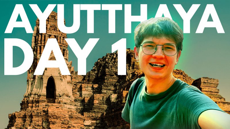
Here are some of the thumbnails. Left is the old version, right is the new one.


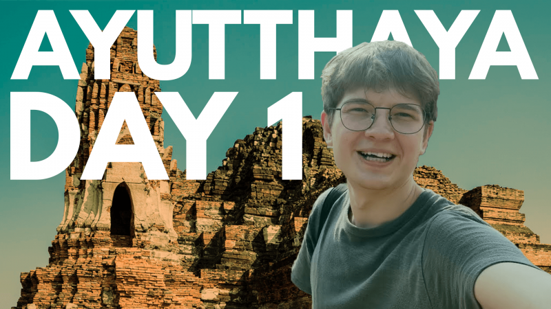
And also the most recent one, which is a bit different too.

Would be great to have your opinion!
My channel is mostly about traveling on a budget long term (vlogging + how-to) and videos with people I meet during my trips (about languages and culture in different countries).
I came up with new style for my thumbnails, and really curious what do you think about it. As my own eyes.. are very subjective and cannot be trusted well.
Being honest, I am still not sure if that works well or not - don't have enough numbers for analytics as my channel is still quite small.
Here are some of the thumbnails. Left is the old version, right is the new one.
And also the most recent one, which is a bit different too.
Would be great to have your opinion!